Overview
Sensibull is the biggest Futures & Options trading platform in India. This project rethinks its single most important feature — the Strategy Builder — the place traders analyse and place option strategies.
First, the basics
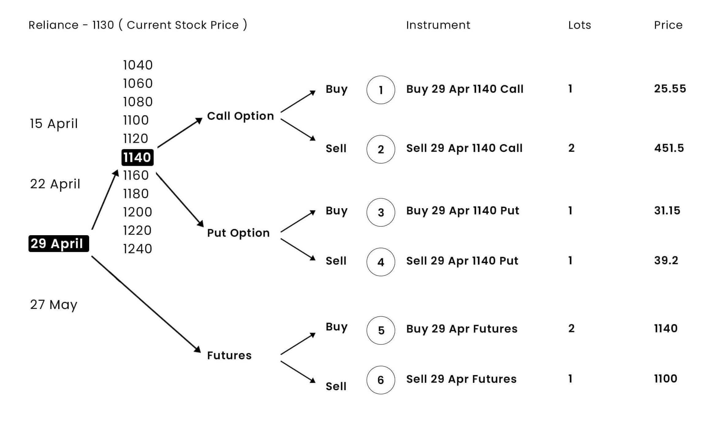
Combinations of options make a strategy. A call makes money if the price goes up; a put if it goes down. Expiry is the contract's end date, and a lot is a fixed multiple of stock set by SEBI. The builder is where a trader assembles and analyses these strategies.
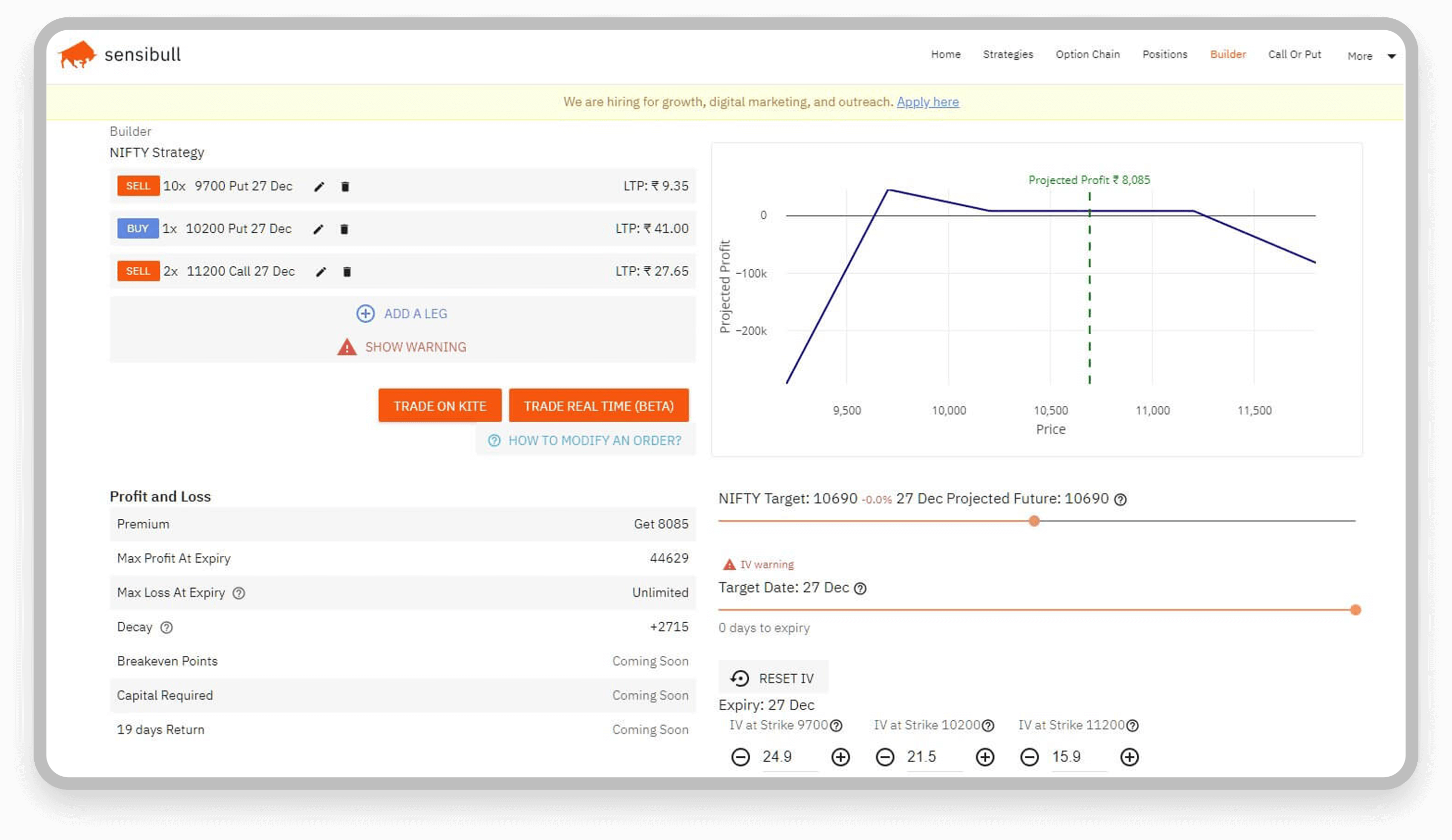
The old version
A designer's job is to bridge business and the user's needs with product experience.
Stakeholder interviews
With experienced F&O traders as stakeholders, you're halfway to a user test — they carry both empathy and business context. Three things stood out:
- The builder should be the most intuitive feature.
- Clarity while trading comes first.
- The mobile experience should be simplified too.
Users & pain points
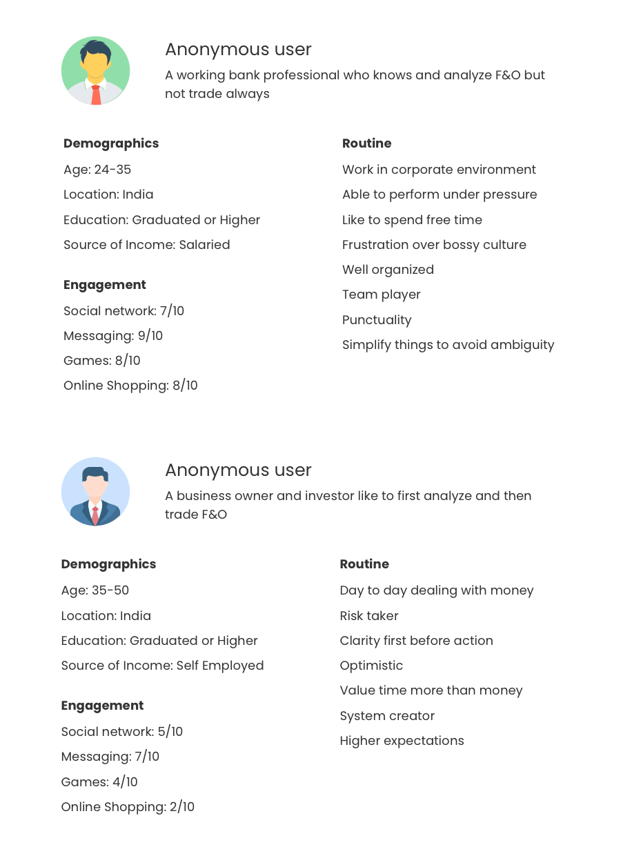
We interviewed 8 users — 6 pro traders and 2 non-pros, since stakeholders wanted new users to adopt the builder too.
Pro F&O traders
- Selecting and editing a leg is difficult and time-consuming.
- Constant scrolling between the graph, key data and sliders.
- The graph and the strategy are the primary focus.
- Clarity on max profit and max loss matters before hitting trade.
- Reading data in a table is hard; mobile is a no-go for building.
Simple equity traders
- Legs and options terminology are confusing coming from equity.
- They understand cost, potential earnings and clear max loss.
- Reassurance about small max losses would get them to try once.
- They'd need to learn first before trading F&O.
Competitive analysis
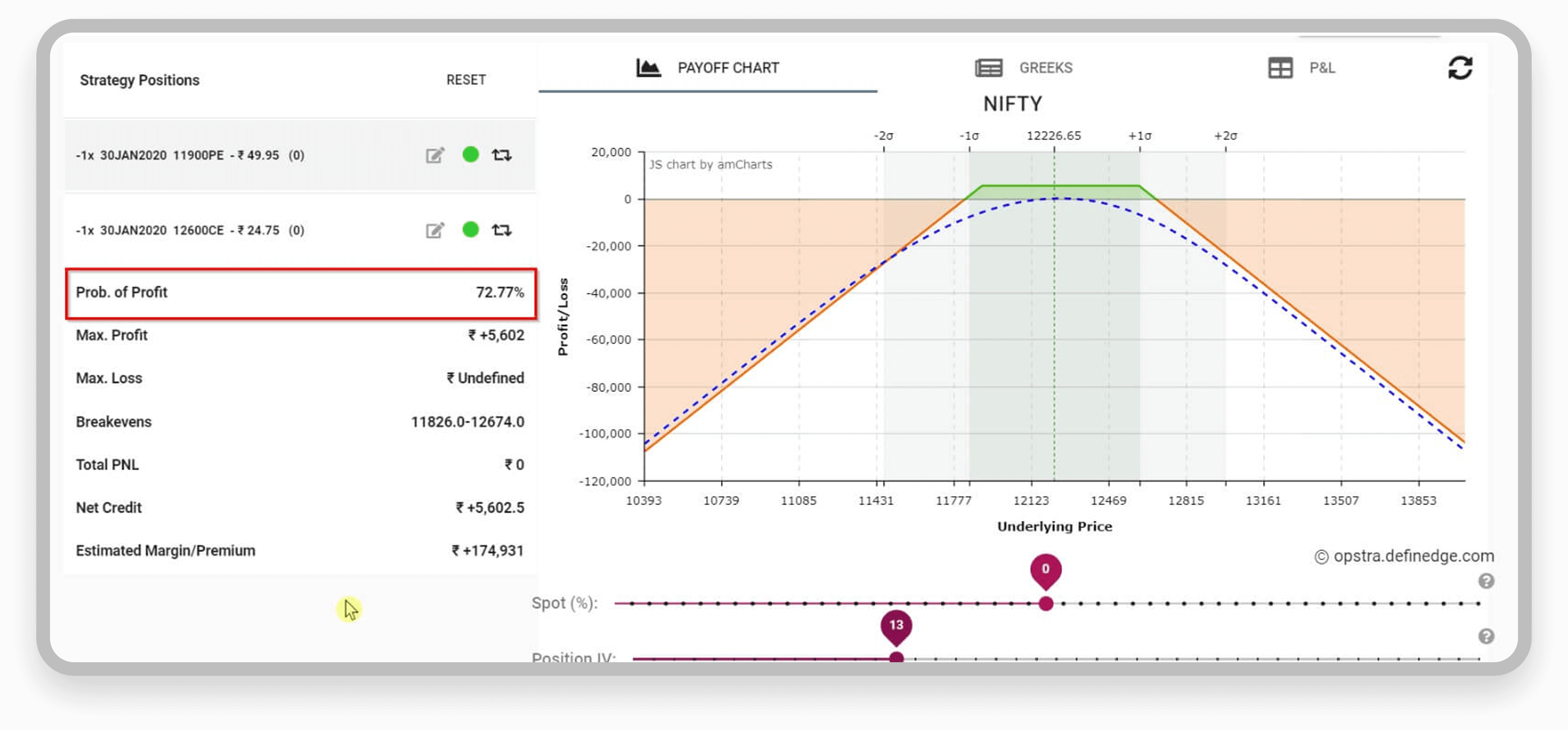
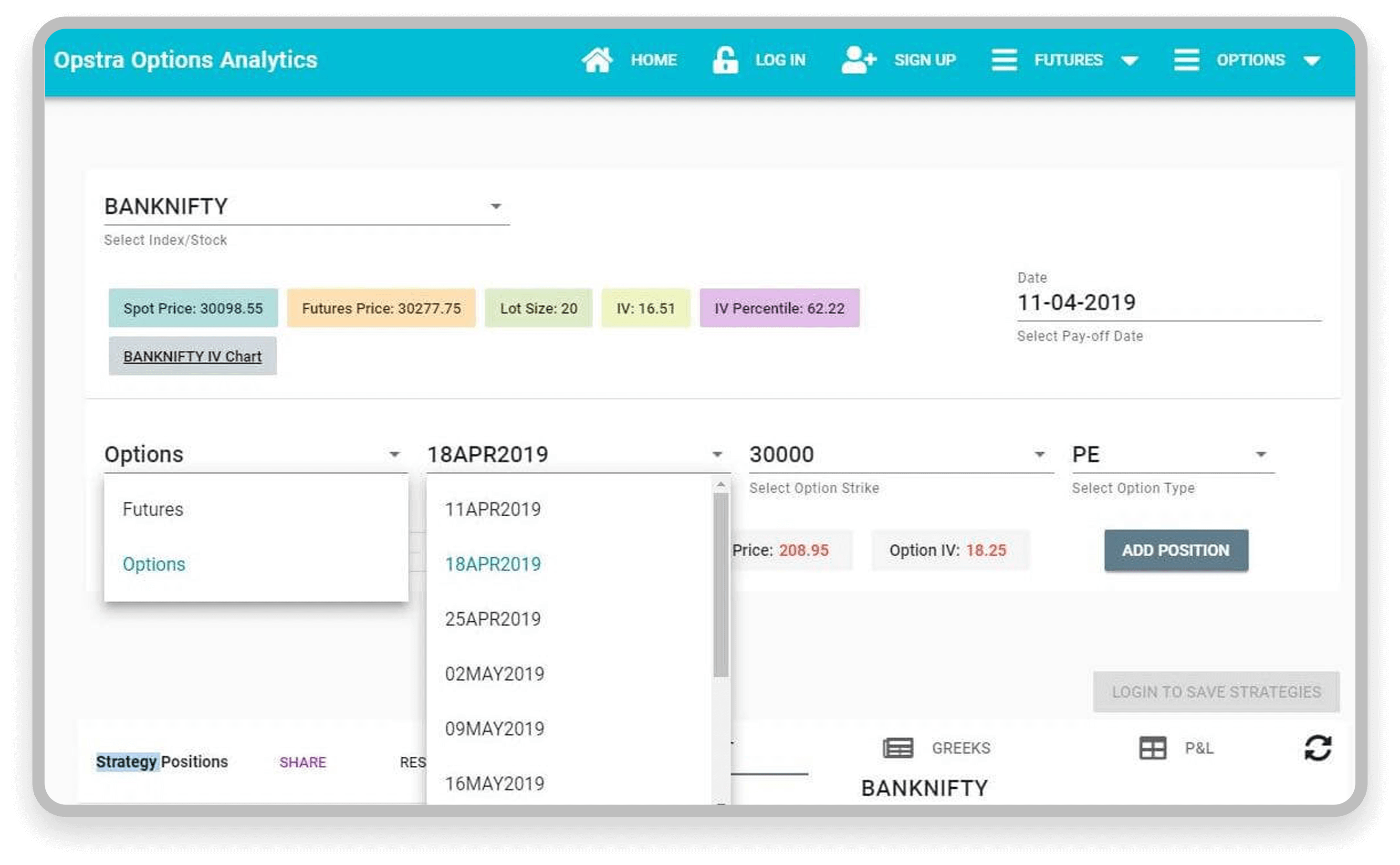
Opstra offers a similar strategy-builder flow. Interestingly, users were happy to edit a single leg in a completely new window — the focused attention on the in-process action made it acceptable.
Key insights
- High mental burden and hard-to-read, complex data.
- The graph is the most important part.
- A steep learning curve even for a simple trade.
- Clarity in live data is essential.
- Fear of bi-directional trades; non-pros will try once if it's clearer.
- All major aspects should be visible at a single glance.
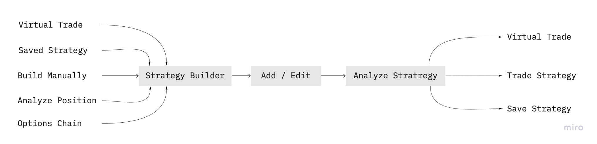
Two major problems
1. Create & edit a strategy
New traders won't learn F&O first and then build a strategy — so the goal was to make manual creation intuitive enough to trade without deep knowledge.
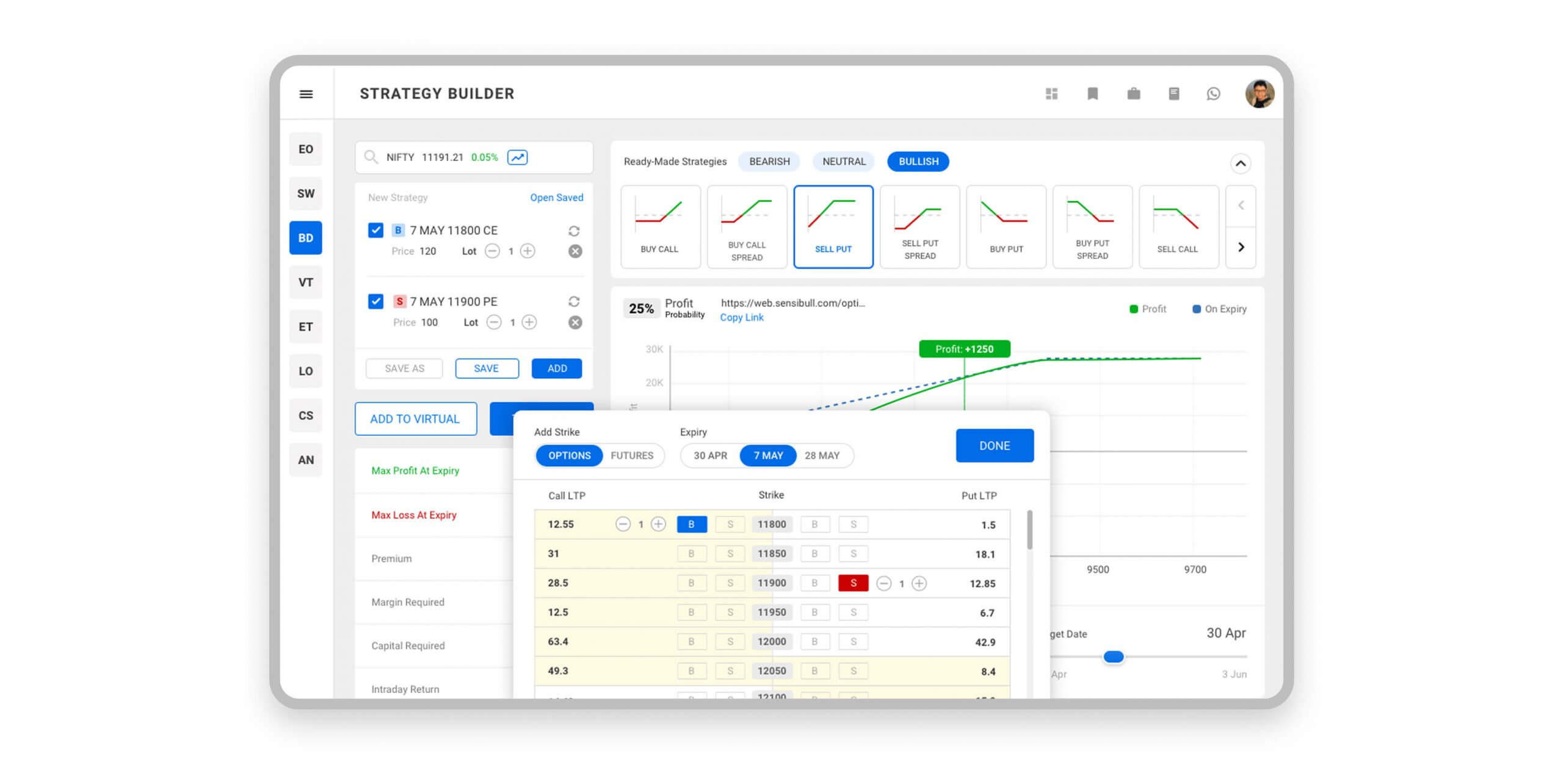
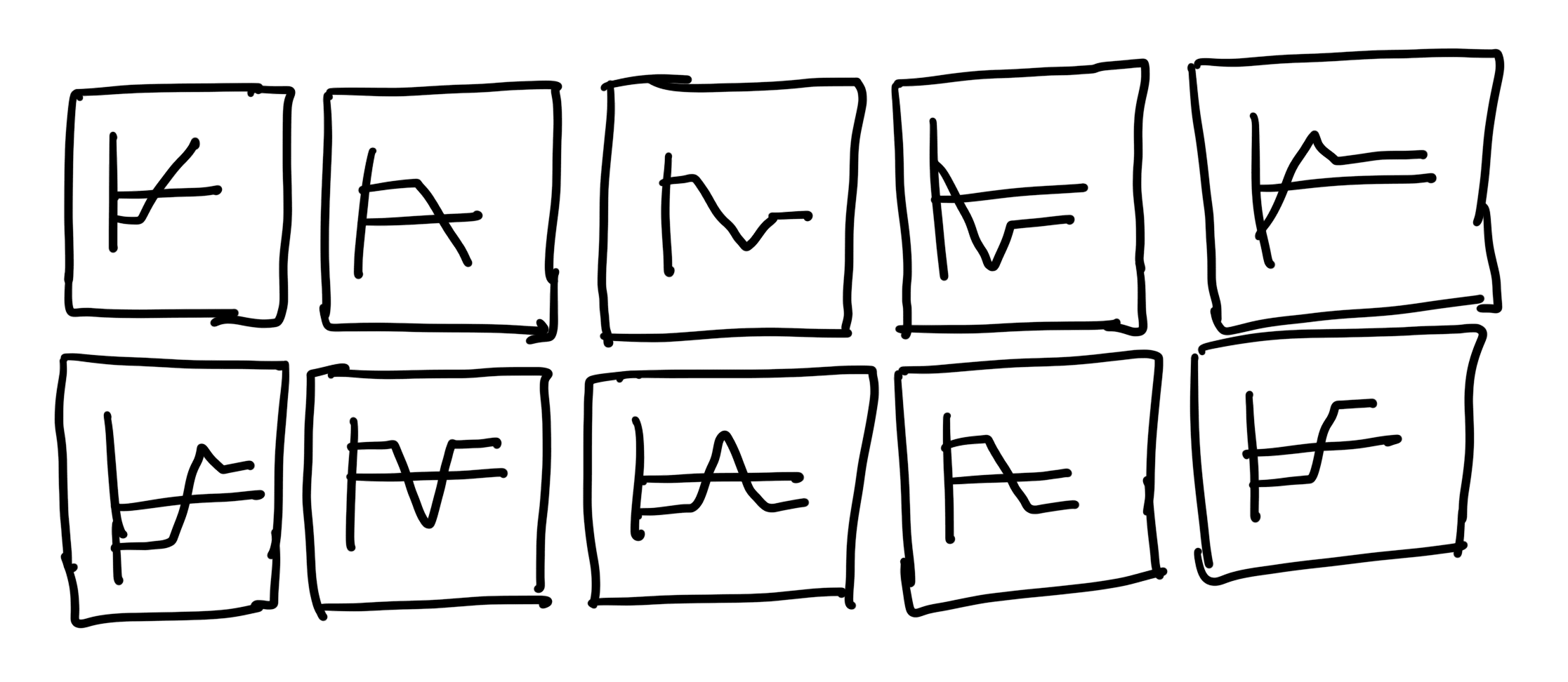
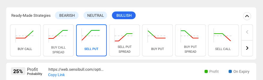
Ready-made strategies: known F&O patterns, each with a name and a graph showing how it performs. Users pick one and the system builds the rest — helping newcomers learn and giving pros a fast start.
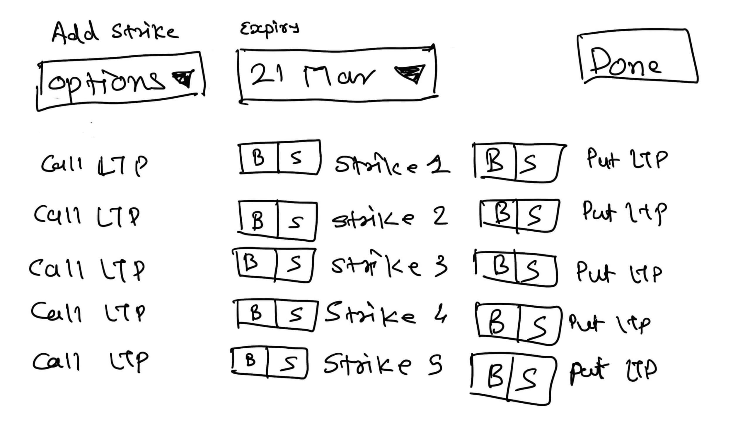
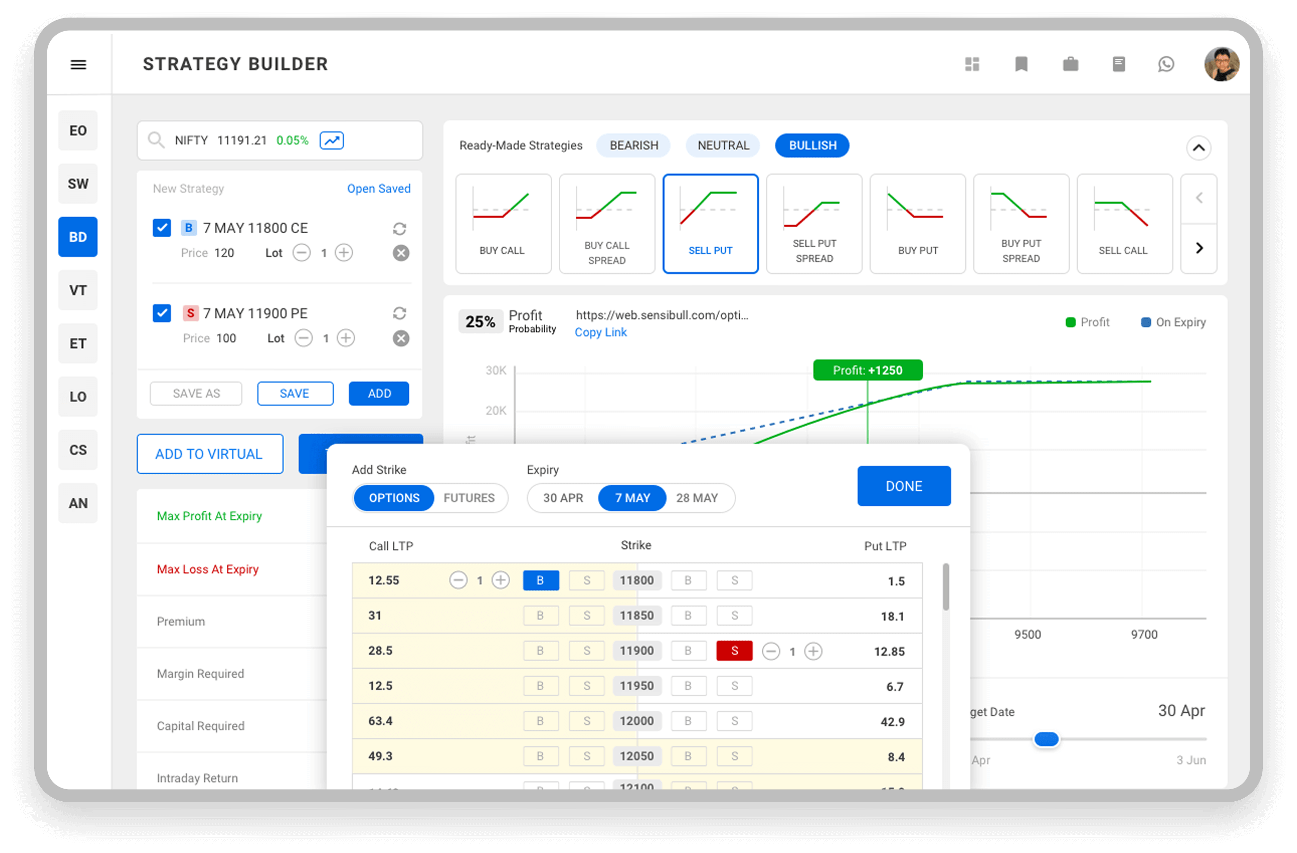
Adding & editing legs is the heart of the feature. A leg needs underlying, strike, expiry, call/put, buy/sell and lots. During market hours that's too many clicks — so the flow was reduced to a single click to add a buy/sell leg, and kept reviewable so users can build and check at once.
2. Analysis with different targets
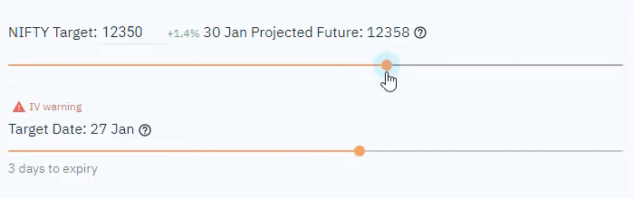
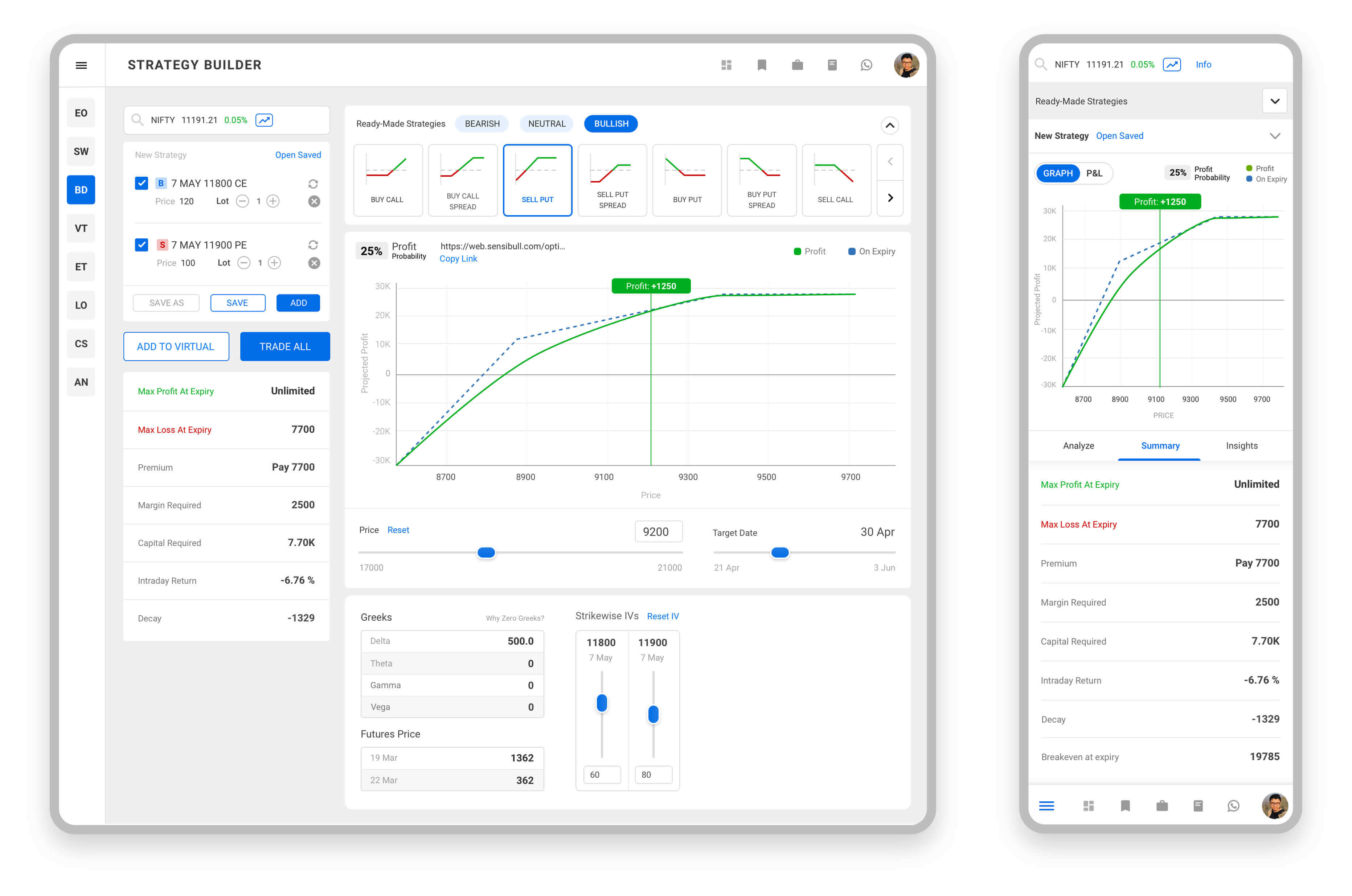
Once a strategy is set, its legs don't need much space — but the graph and sliders do. So the layout gives ⅓ to strategy and summary, and ⅔ to the graph and target sliders.
Wireframing the layout
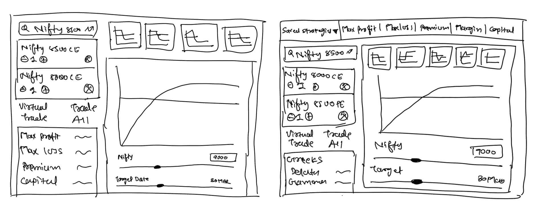
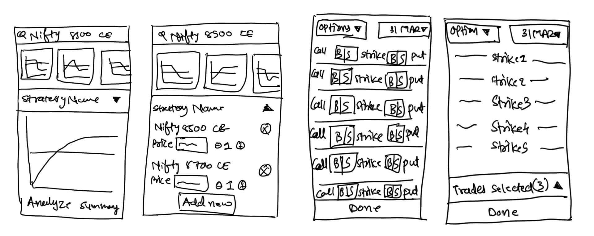
Users were used to building on the left and analysing on the right, so the desktop and mobile layouts were frozen around that familiar model after stakeholder discussion.
UI components
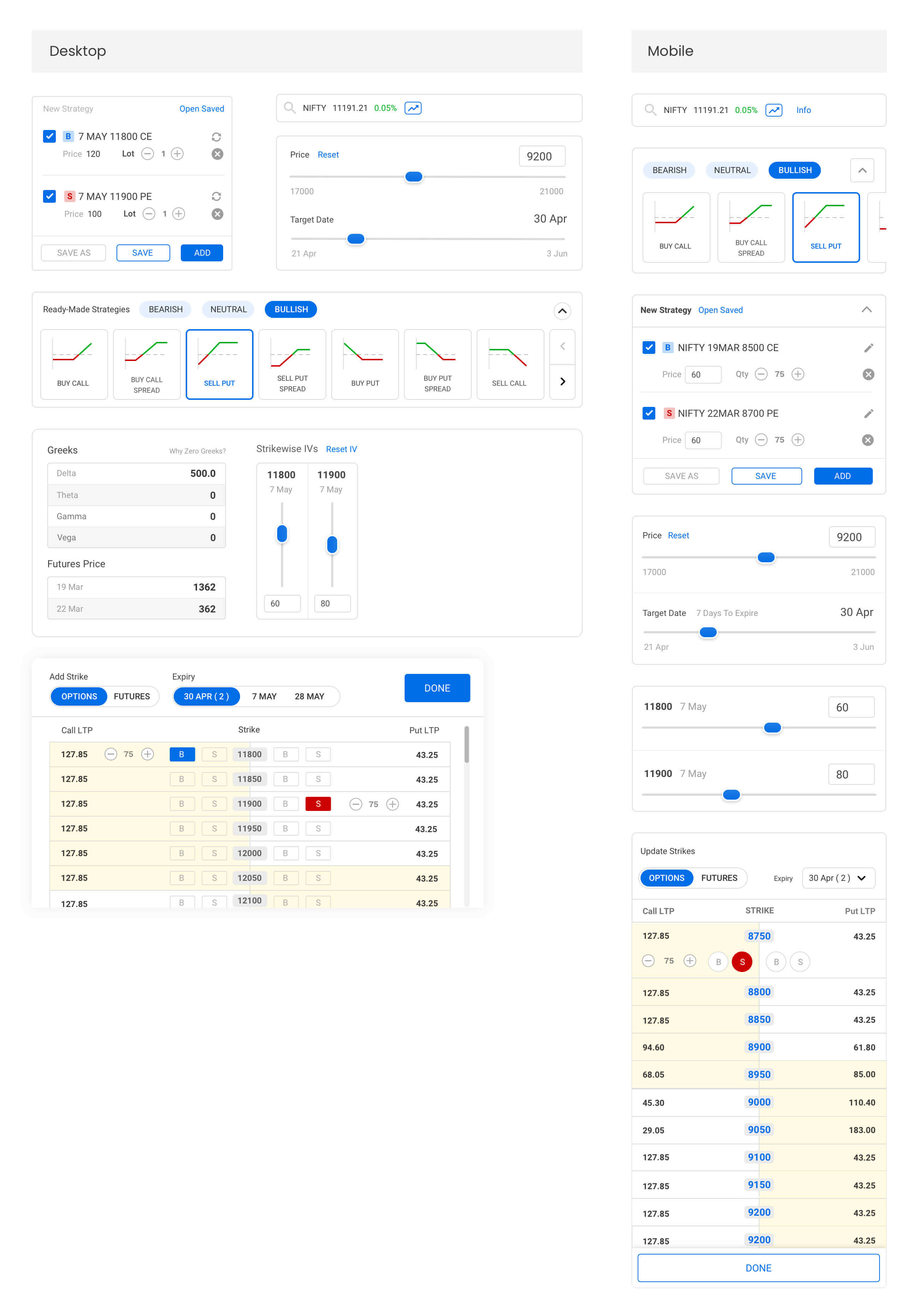
A grey background with white widgets helps users focus on one thing at a time and reduces cognitive load — the old flat visual made it hard to find relatable actions and information.
Final version
Easy add / edit legs
A drawer slides up from the bottom to manage all legs at a single glance — appearing in-context and leaving without breaking the flow. Adding a buy/sell leg is a single click.
Ready-made strategies
Three categories — bullish, bearish and neutral — let users pick a direction and the system generates a strategy. A collapse interaction removes the prominence once selected.
Impact

Iteration is a never-ending game.
Takeaways
- Users happily adopt an unusual experience if it does the job.
- Don't make users scroll if it can fit into a single glance.
- Take advantage of system-oriented automation.
- Keeping users at the centre reduces repeat work.
- Never break habituated behaviour.