Overview
Meesho is an Indian reselling platform on a mission to make online reselling and shopping hassle-free and affordable — with secure, timely transactions and low-cost returns. It's trusted by more than 4 million entrepreneurs across India.
Entrepreneurs launch their own online business without much investment, earning by reselling products and setting a margin on every transaction. Consumers simply buy products for their own use.
Early on, Meesho focused on suppliers and users could only order from a single supplier at a time. To deliver a seamless, transparent shopping experience, we set out to let users order from multiple suppliers in one quick checkout.
Personas
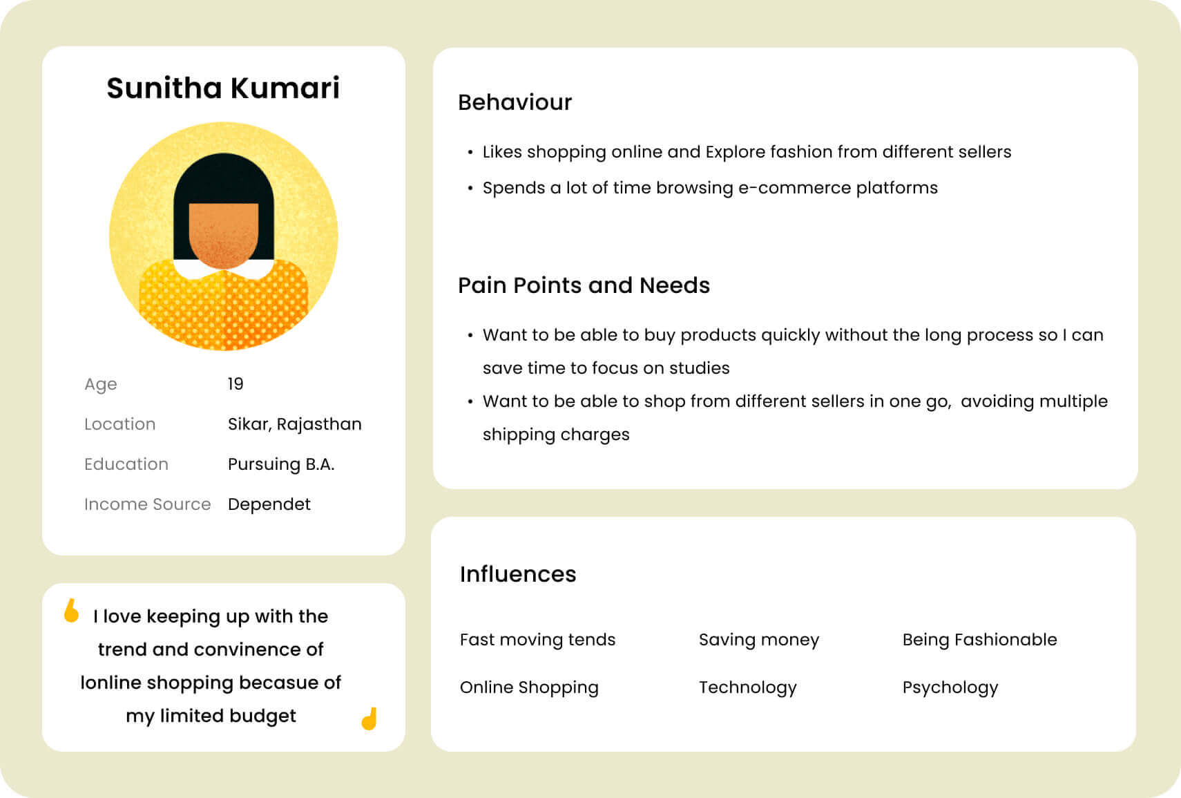
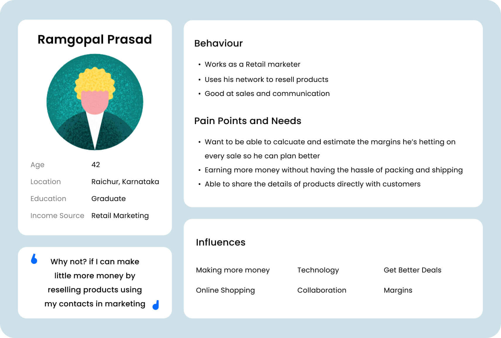
Two personas covered most of the user base and framed the insights we needed.
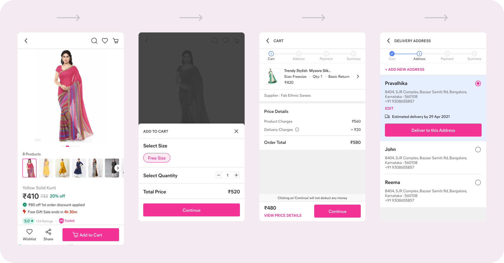
The old flow
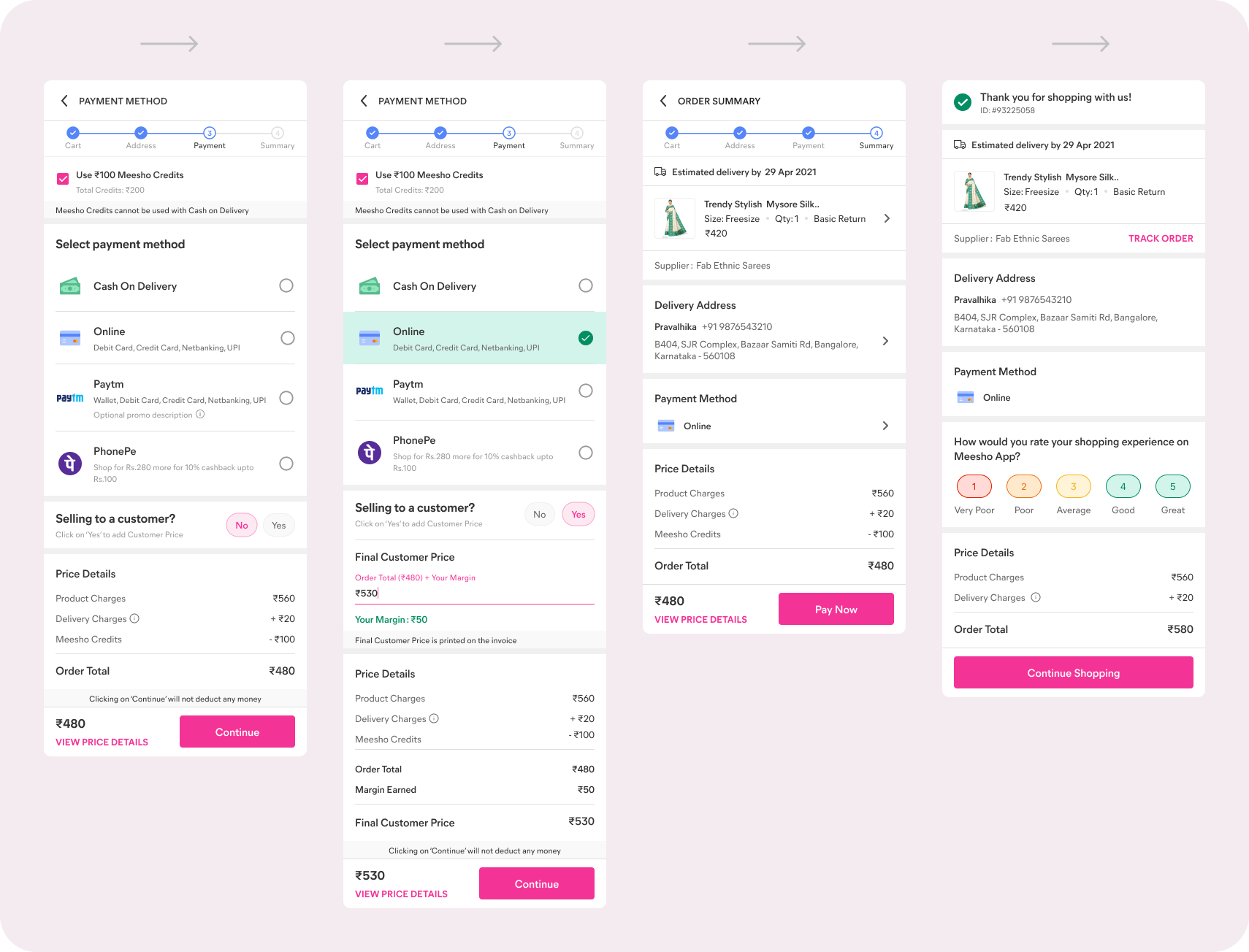
User pain points
Consumers
- Retaining quick-checkout behaviour — users want to buy fast despite the multi-supplier option; B2C checkout converted 30% higher than the cart icon.
- Comprehension of a multi-supplier cart — optimisations so shipping charges read clearly when unbundled, and a way to de-prioritise products.
- Partial cart serviceability — guiding users with the right information to move forward.
- Discovering offers — clear grouping so supplier- and cart-level offers and charges are easy to understand.
Entrepreneurs
- Margin addition across products — the logic for adding and distributing margin had to be conveyed simply.
- Sharing from anywhere — they rely on real images and reviews before sharing, so that had to stay accessible.
Competitive analysis
Studying Flipkart and Amazon surfaced patterns — both let users add to cart or check out directly with buy-now.
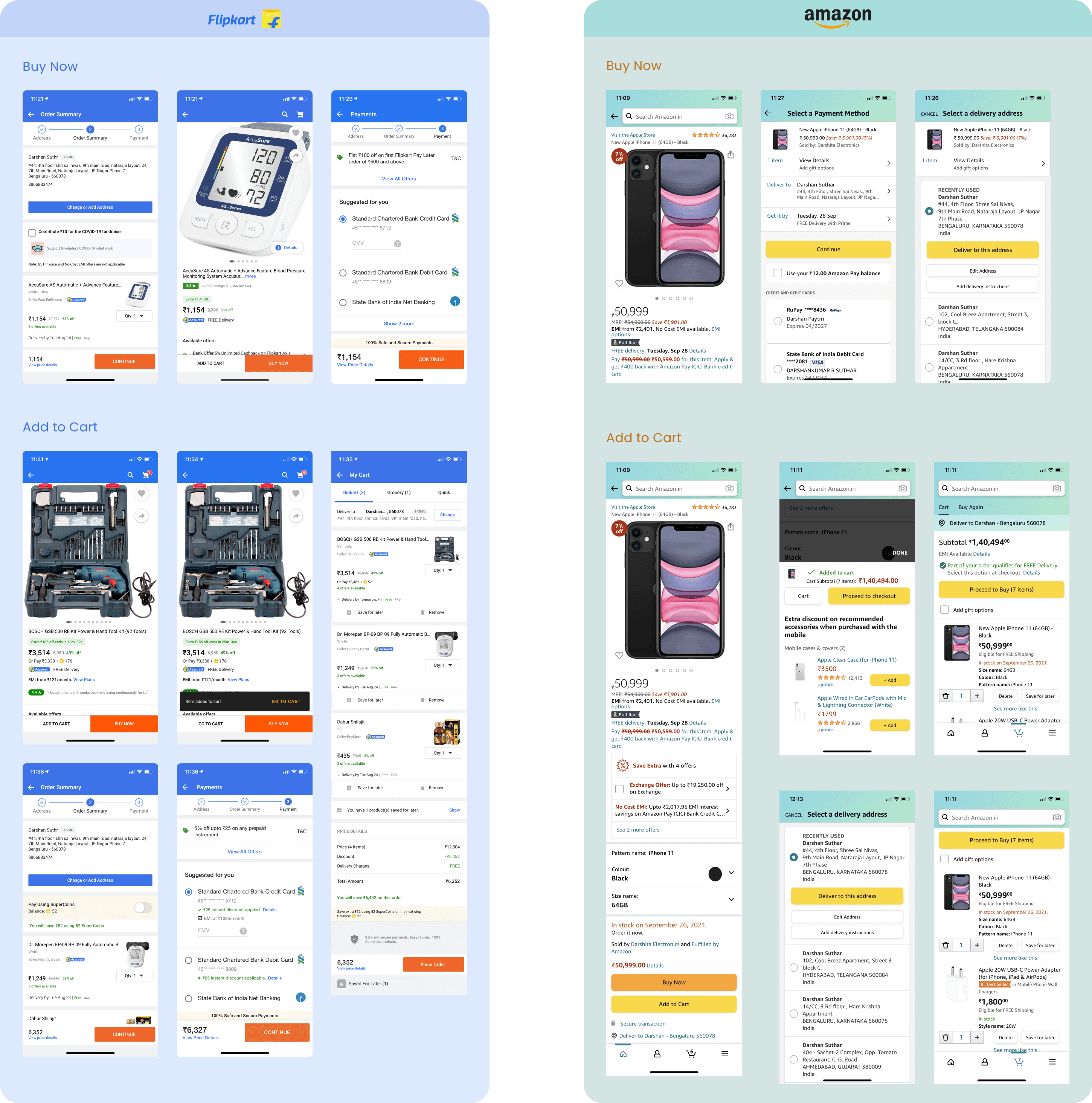
Key learnings
- Users want to buy quickly despite the multi-supplier option.
- Emphasise the CTA for better order conversion.
- Keep product images, ratings and reviews accessible for entrepreneurs.
- Group at supplier level for offers and promotions.
- Treat cart and wishlist as parallel concepts.
- Chunk price info for easier comprehension.
User flow
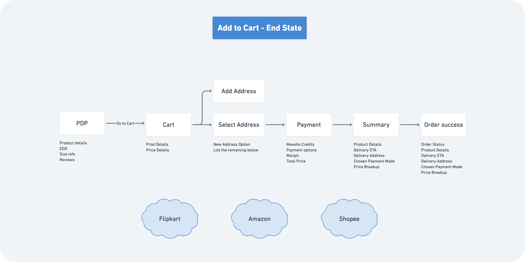
Add to cart
Multiple solutions were explored and compared at each step of the journey to build the best experience for Meesho's customers.
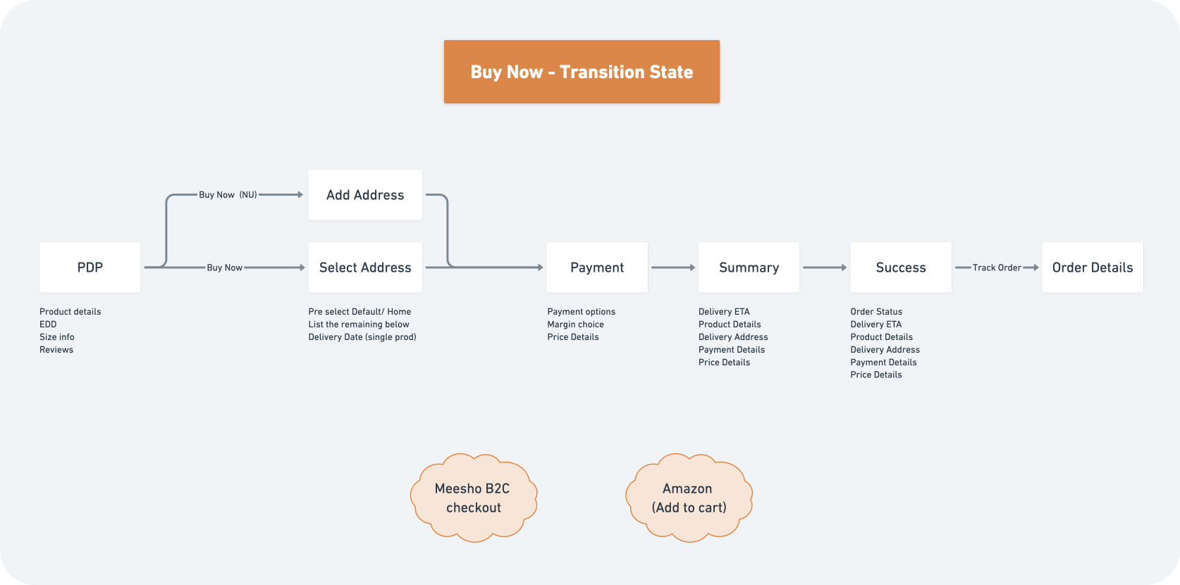
Buy Now
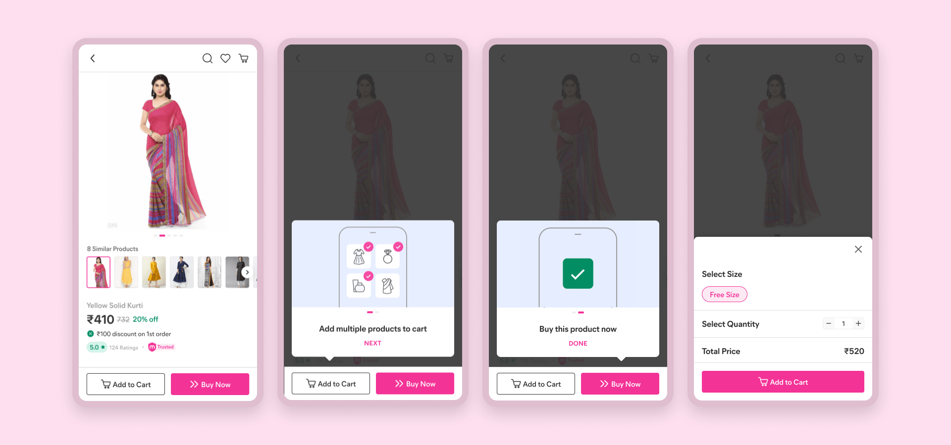
Introduced to retain B2C checkout behaviour — a 30% higher conversion than the header cart. 'Buy Now' also carries the right connotation for an immediate, single-product purchase.
Solution discovery
Product detail page
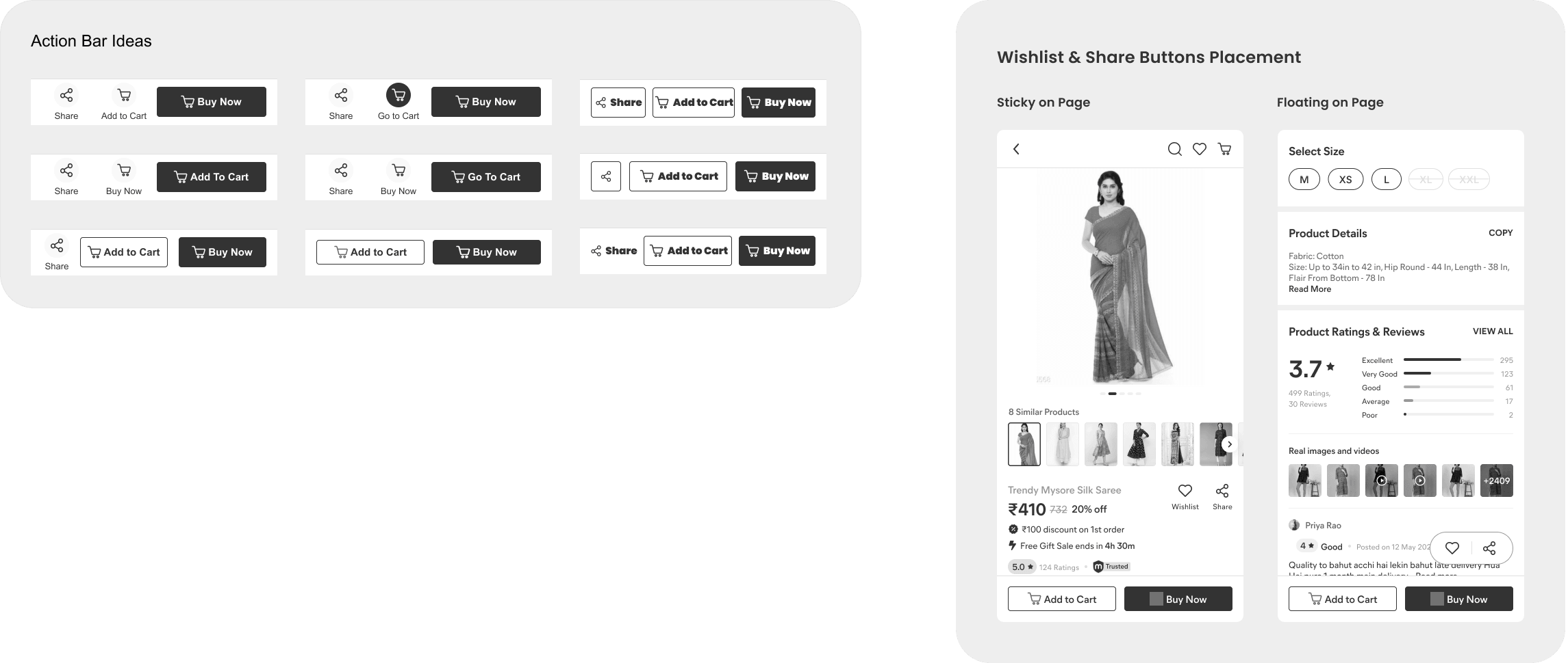
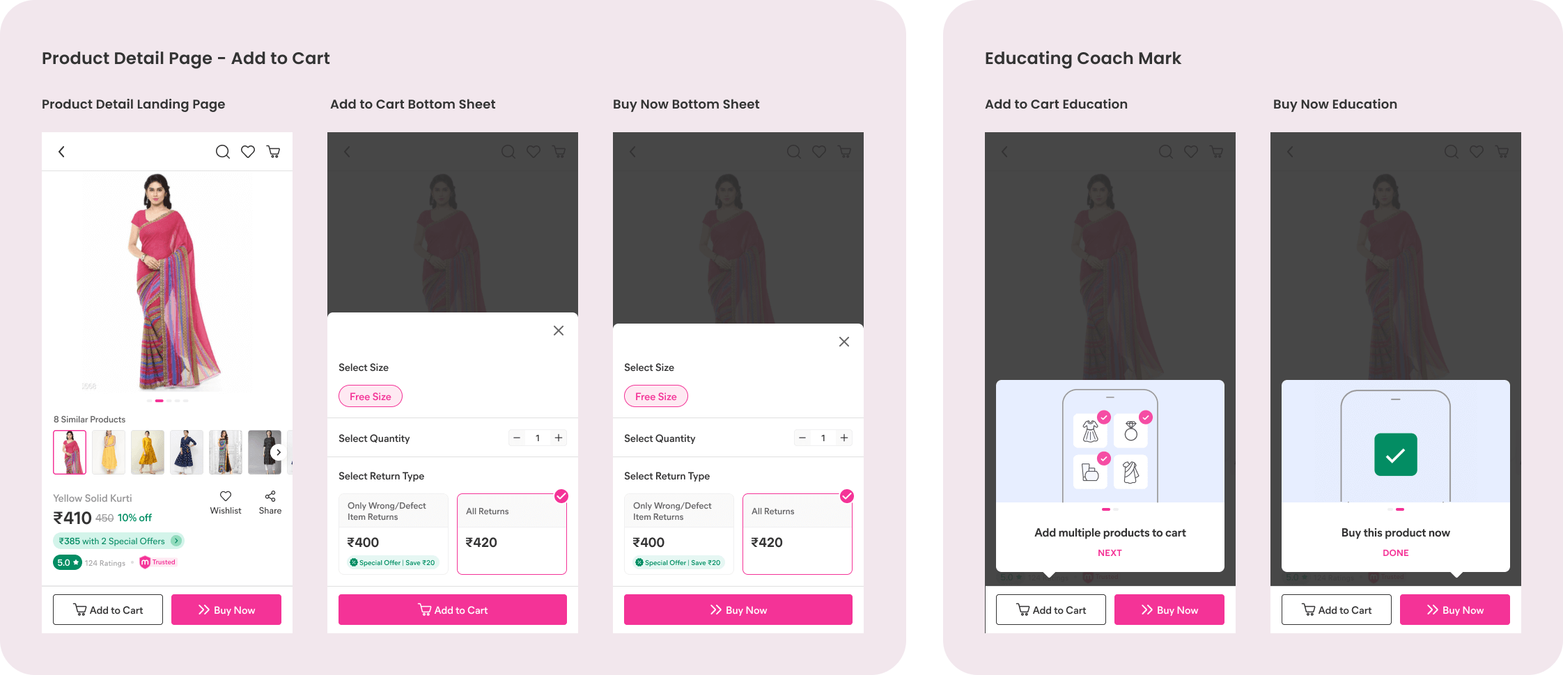
- Introduced 'Buy Now' so users can purchase quickly.
- Regrouped CTAs by intent — pre-decision actions (Wishlist, Share) vs order actions (Add to Cart, Buy Now).
- Surfaced 'Share' upfront for entrepreneurs.
Cart
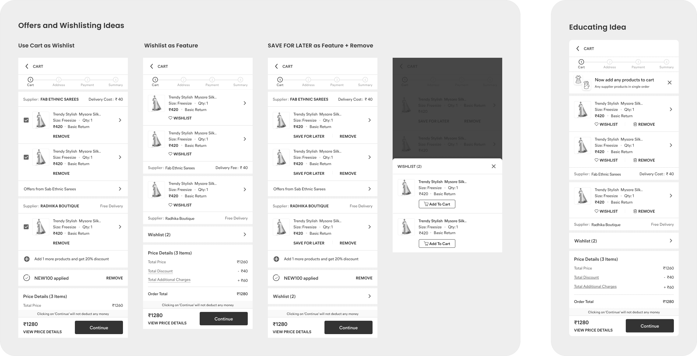
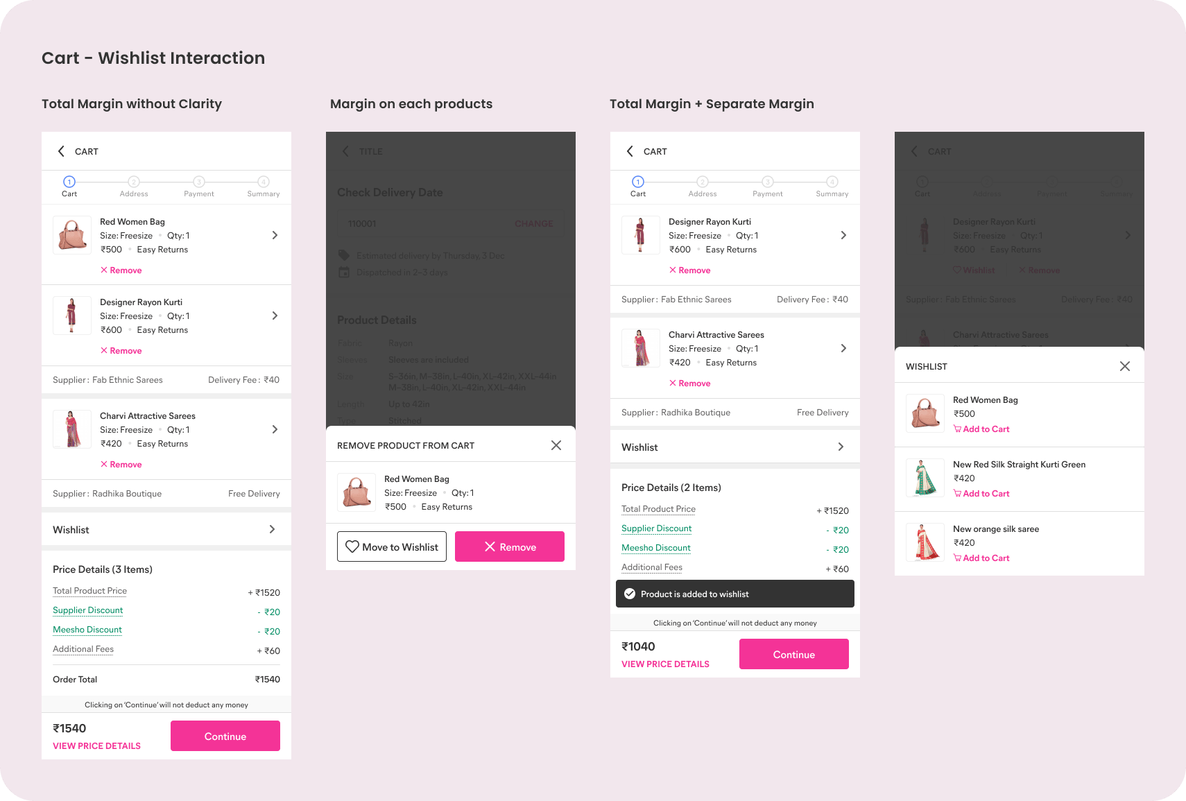
- Supplier-level grouping for offers and delivery comms.
- Cart and wishlist as parallel concepts for delayed decisions.
- Price-info chunking into positives (discounts) and negatives (charges) to reduce cognitive load.
Address
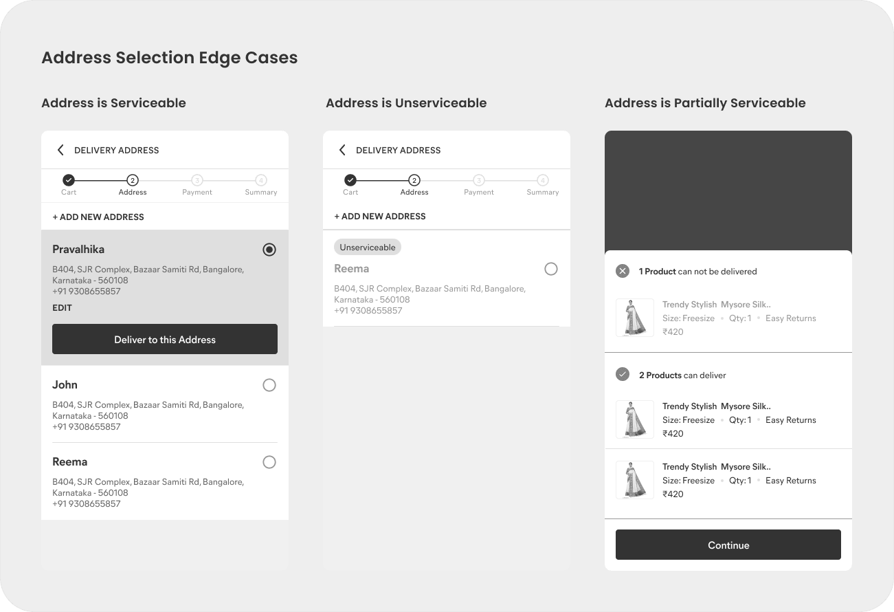
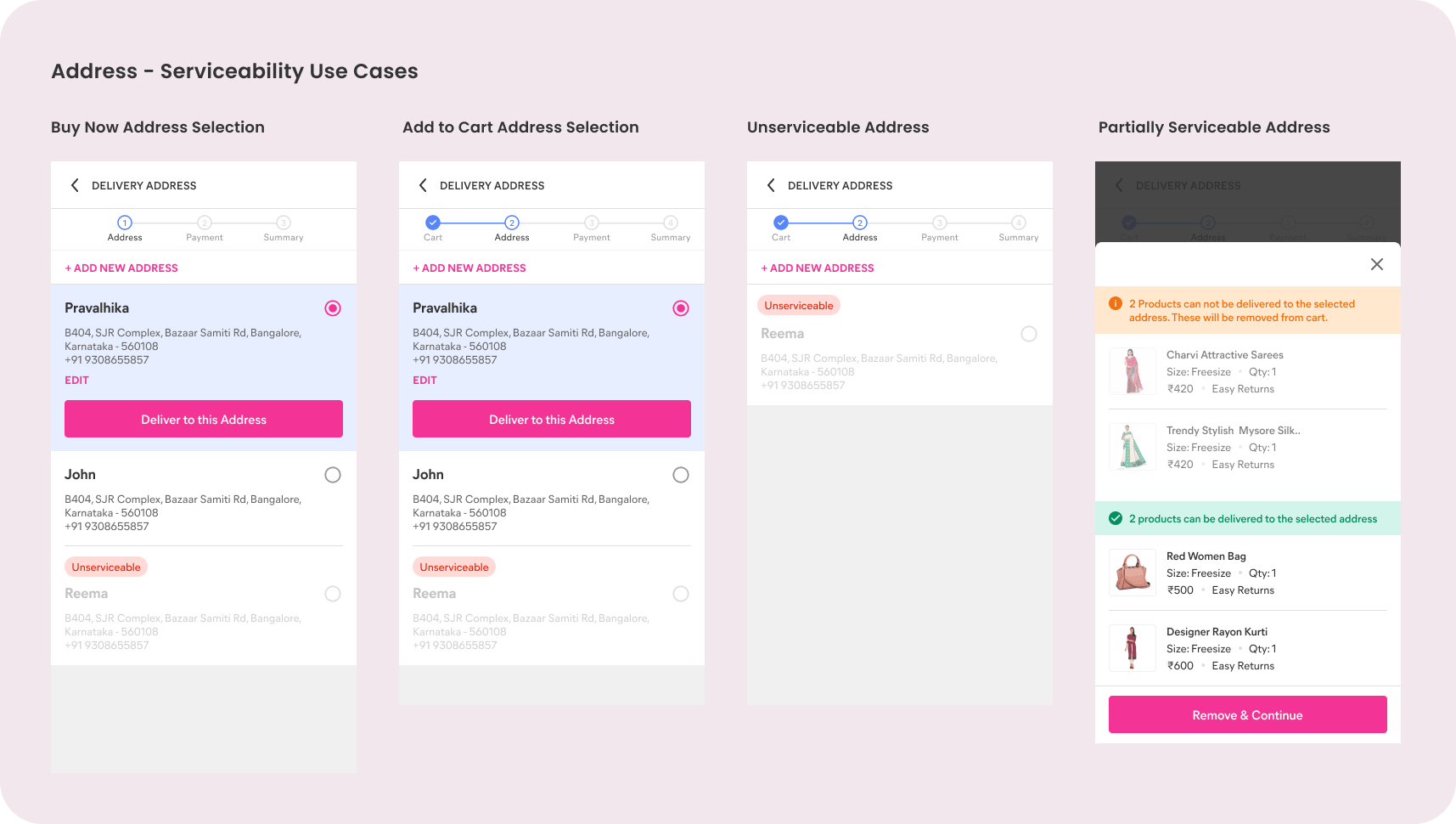
- Delivery date shown at address level (it can't be reliably estimated across products).
- Handled partial serviceability — move on without a product, choose a different address, or return to the PDP.
Payment with margin
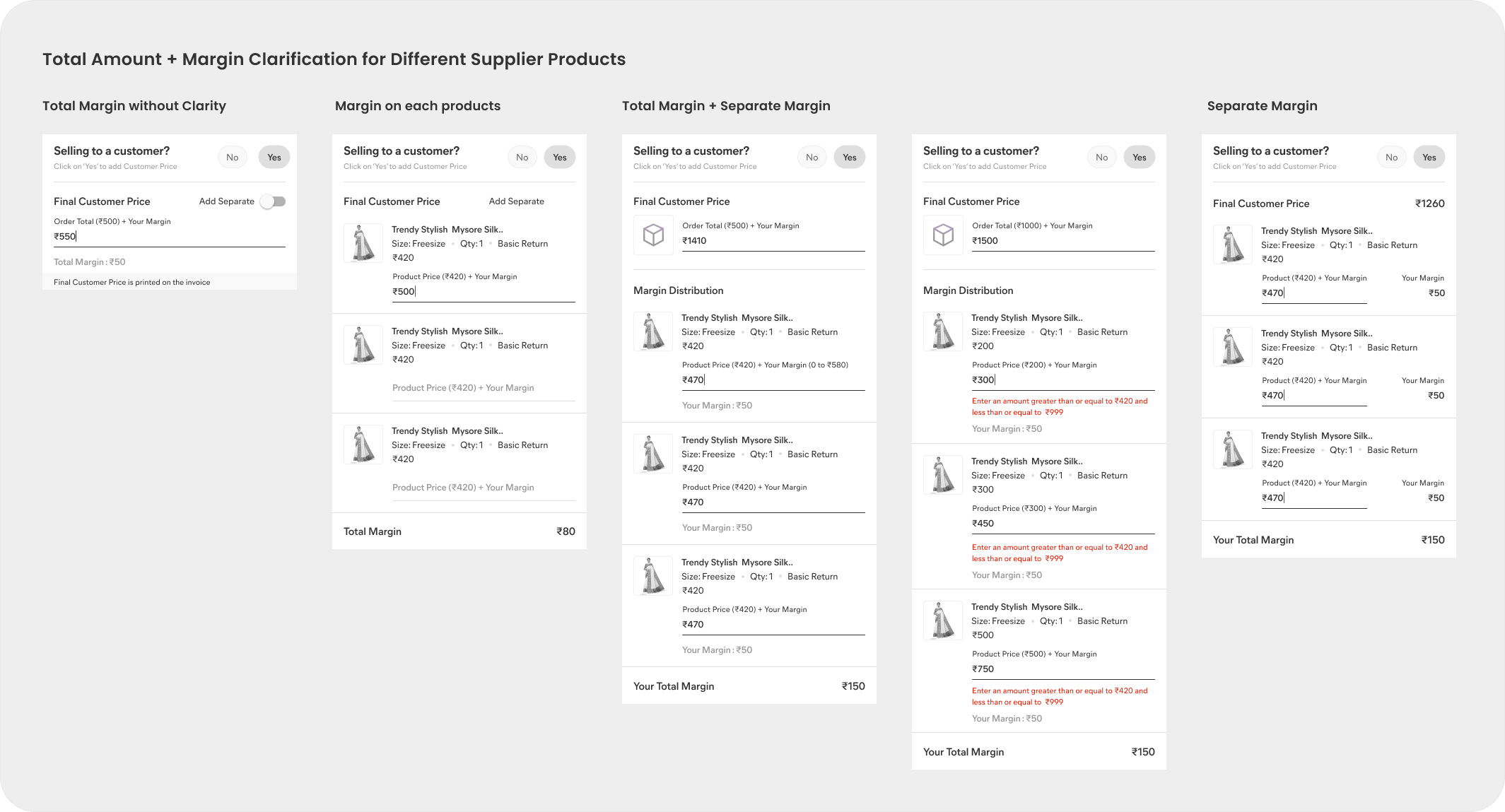
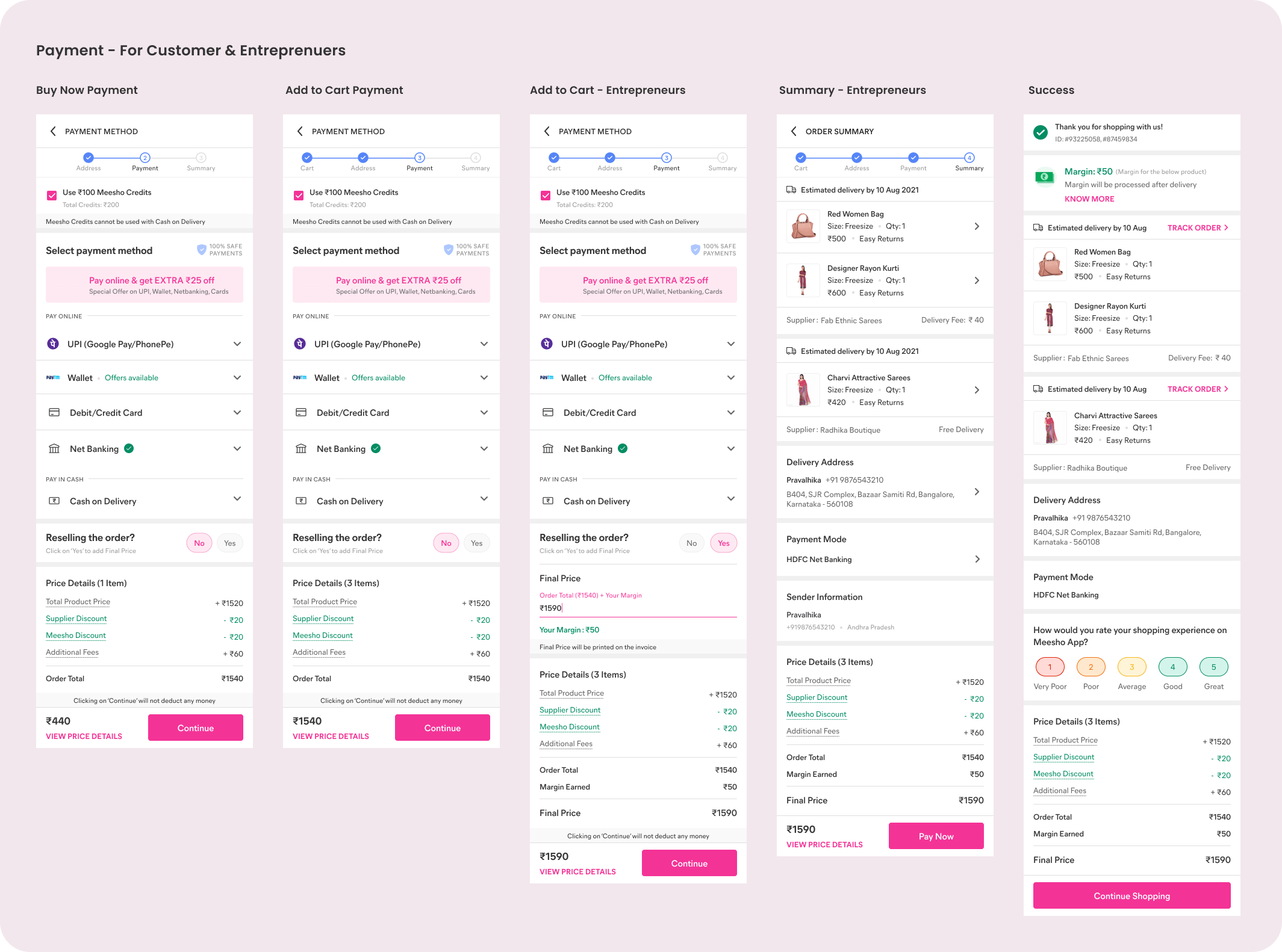
- Kept it simple — a single action to add order-level margin, avoiding MRP error cases.
- Made margin distribution across products visible to reduce support queries.
Final screens
Product detail page
Add to cart or place an order seamlessly via Buy Now, with education for existing users landing after an update.
Cart
A wishlist lets users quickly park products for later. 'Remove' sits outside so removing from cart flows naturally into the wishlist.
Address
Every case is covered — fully serviceable, partially serviceable and unserviceable — so users always know what to do.
Payment
Payment leaves no room for ambiguity, so margin was simplified to a single, clear add for the order total.
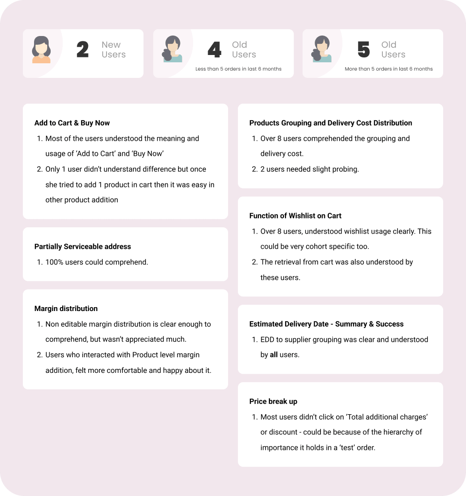
Usability testing
Impact

Takeaways
- Simplicity wins when it serves the same purpose.
- Data gives you the power to make hard calls.
- Use visuals to communicate complex, educational steps.
- Be uncompromisingly clear when it comes to payment.
- Every edge case matters.