Overview
Aspora is a fintech for the Indian diaspora, built on Shivalik Small Finance Bank's rails — remittance, NRI banking and gold. Digital gold in the UAE worked as a product: people trusted the insured vault and bought from it. It didn't work as a habit.
The problem — people bought once, then left
Across 3,248 gold transactions from 1,126 users, most people bought exactly once. The ones who came back weren't returning monthly — they were topping up in the same session. From June to August, money started leaving faster than it came in. Every month we were re-acquiring most of our buyers from scratch.
of UAE gold buyers bought exactly once
month-1 transacting retention (39% → 31% → 27%, May–Jul cohorts)
sell value as a share of buy value in August, up from 15% in June
of repeat gaps fell in a 25–35 day window. Almost nobody had a monthly rhythm.
Source: Gold SIP PRD, internal UAE gold data, Jun–Aug 2026.
The opportunity
In funnel tests, a SIP proposition drew 2× the intent of plain gold (44% vs 22%). Gold icon → funnel conversion was a healthy 52%, but the funnel itself converted at ~3%. The bet: make SIP the primary job on the gold page, keep one-time buying as a guardrail, and scale Digital Gold from 10–15% of traffic to 100%.
“Today a repeat purchase needs intent, a session and a decision. After SIP it needs a working card.”
The thesis we rallied around — turn retention into a mandate-uptime problem.Where it started — a transaction, not a relationship
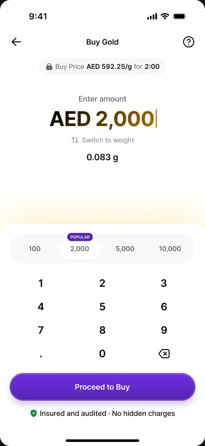
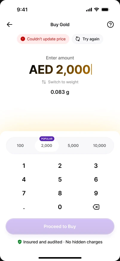
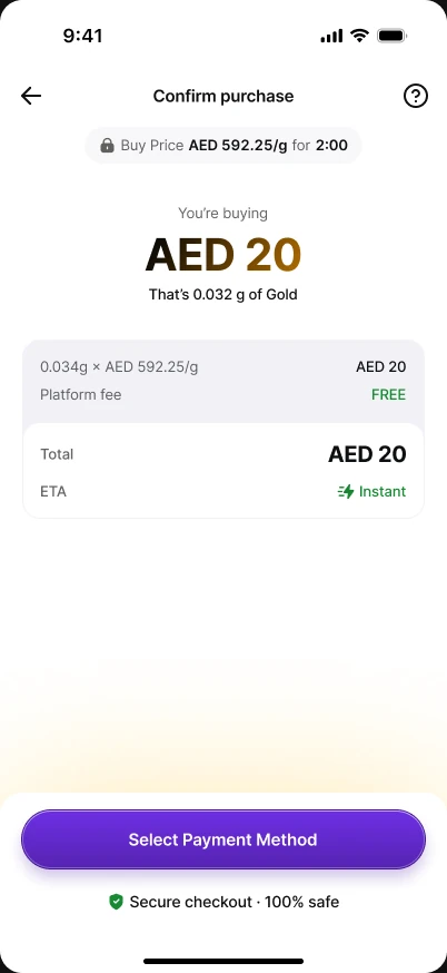
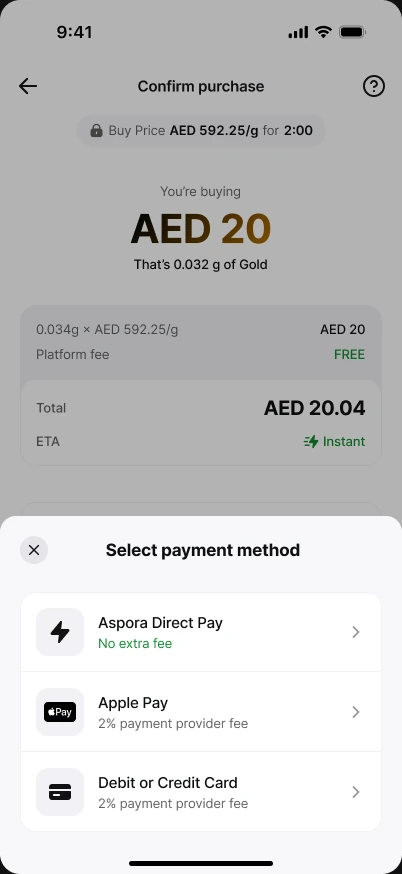
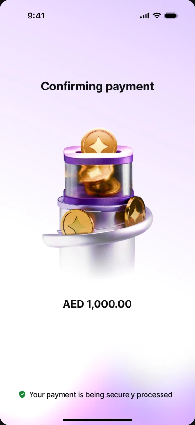
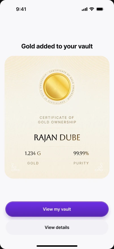
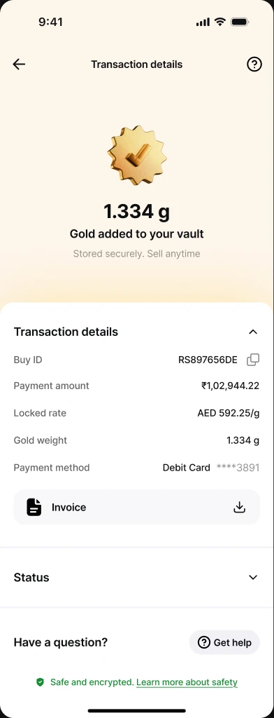
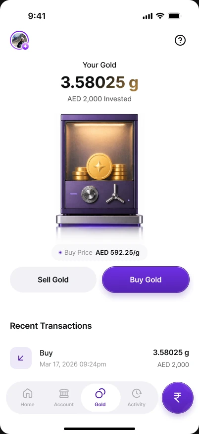
Before SIP, gold on Aspora was a careful three-step purchase: order form, review & pay, confirmation. It handled price locks, limits, gateway failures and refunds well. But nothing in it brought you back.
The research — apps our users already know
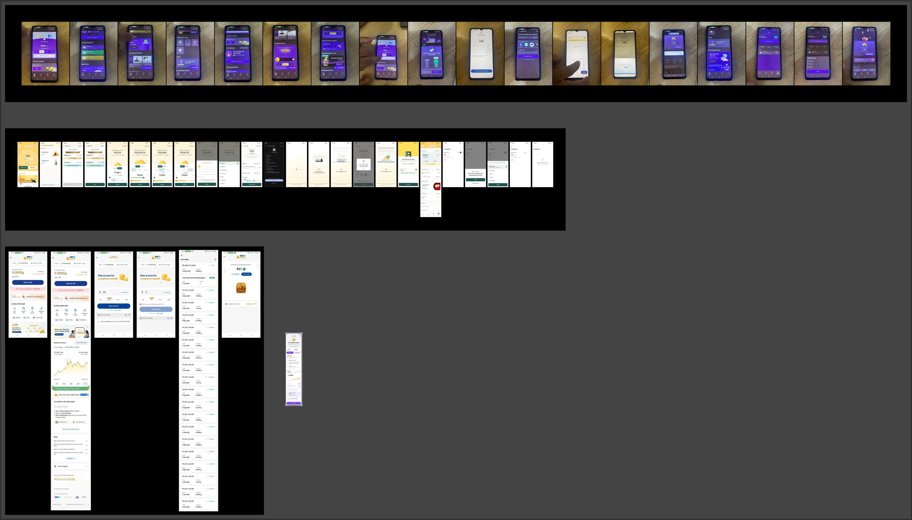
Our users are Indian. Most have used Jar, Gullak or Paytm Gold back home, and fintechs like CRED and Jupiter have shaped what “rewarding” and “premium” feel like. So rather than benchmarking global brokers, I recorded the Indian gold-savings apps on device and mapped them end to end — onboarding, setup, the first buy and, especially, what happens after setup. For each, one question: what does it anchor the user on?
| App | Anchors on | What we took |
|---|---|---|
| Jar | A tiny daily habit; playful retention storytelling | Emotional reasons to stay; daily as a real cadence |
| Gullak | The future value — “what this becomes” | Projection as the hook |
| Paytm Gold | Utility: start from ₹51, a long plain ledger | Very low minimums; a trustworthy ledger |
| CRED · Jupiter | Rewards and premium polish | Reward moments that feel earned |
SIP detail page
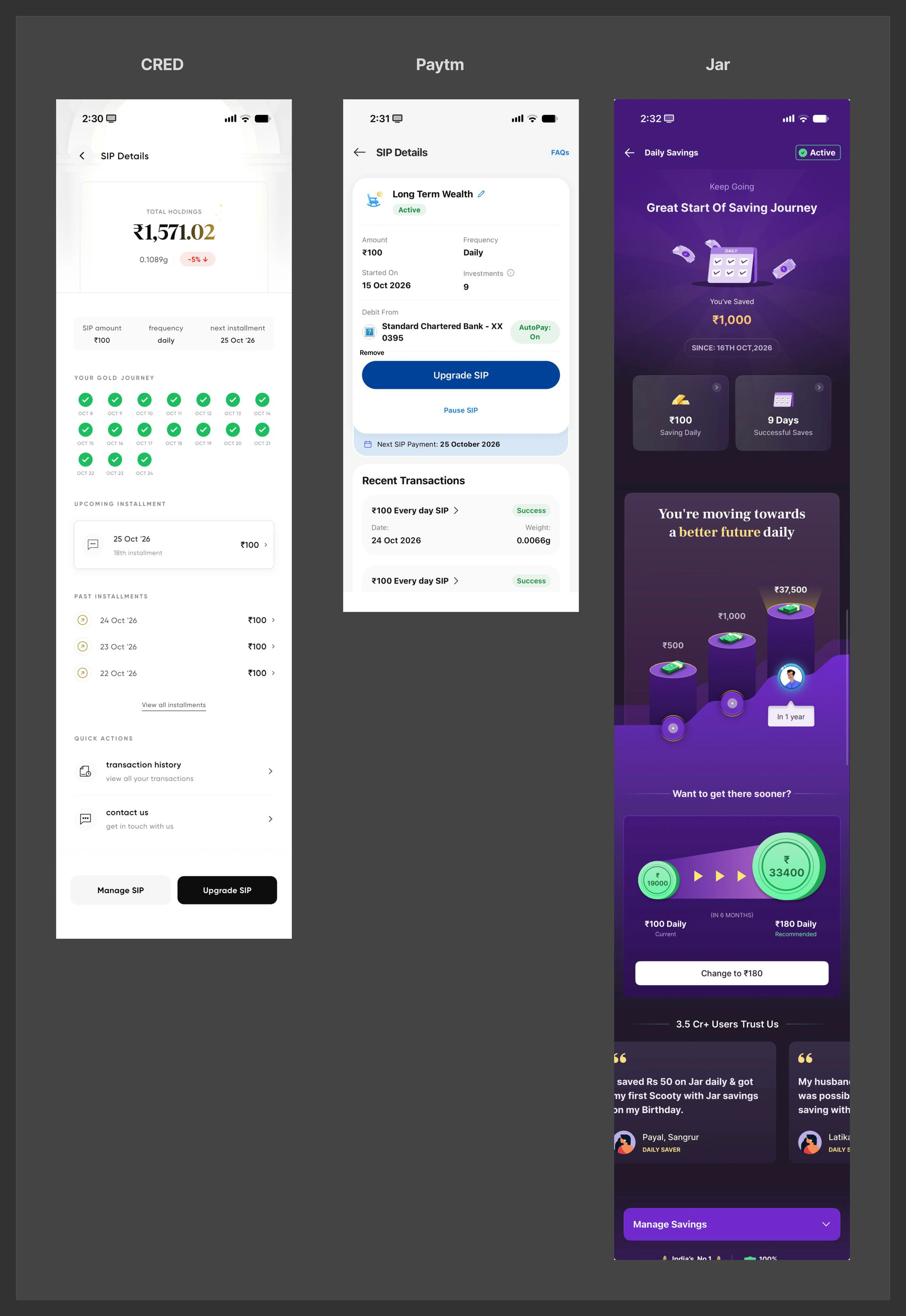
Once setup was settled, the harder question was the page people return to. I benchmarked the SIP detail pages of CRED, Paytm and Jar side by side.
| App | Leads with | What we took / left |
|---|---|---|
| CRED | Total holdings, then a grid of every instalment as a ticked “gold journey” | Took the journey of ticks. Left total holdings — on Aspora, vault gold can be sold anytime, so holdings don't map to a SIP. |
| Paytm | Plan facts, autopay status, Upgrade and Pause | Took the plain, scannable SIP facts. Left Upgrade and Pause for v1. |
| Jar | Emotion: “Great start”, a future-value climb, a step-up nudge, social proof | Took the emotional register and the forward look. Left step-up and testimonials. |
What we heard, again and again
- Everyone front-loads the decision. Amount, frequency, date and reward — all before you've committed to anything.
- The best ones sell the outcome. Gullak doesn't sell a SIP; it sells what your gold could be worth in five years.
- Almost nobody designs month four. Setup gets the polish; the weeks where people actually quit get a list of transactions.
Six directions, four waves
The work moved in four waves. Each answered one question and opened the next. I've kept the dead ends in, because the reasons we killed them are the reasons the final design looks the way it does.
We put every wave in front of users as we went, not in one study at the end. What they told us is called out in the purple User research notes, right next to the work it changed.
SIP as its own product
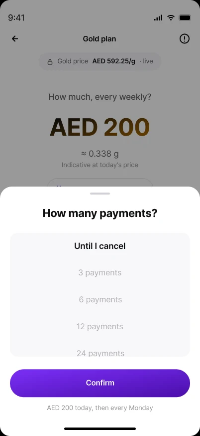
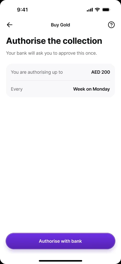
A separate “Gold plan” flow from the vault: amount, SIP day, how many payments, authorise the collection, then a manage area and lock-screen notifications. A clear model — but two doors to the same gold, and a fixed-term question nobody needed (later struck from the PRD).
Educate, then reward, then commit
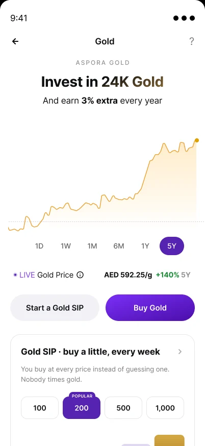
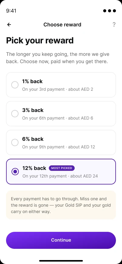
A long first-time page (“Invest in 24K Gold”, a returns calculator, delivery, FAQs), a “Pick your reward” step inside setup, multiple SIPs, home-page nudges and a “Grow it as you go” step-up. Rewards and education are real levers, and nudges for lapsed savers survived. But every extra choice sat before the commitment — the start of our first real disagreement (see “Rewards” below).
Celebrate the plan, not the gold
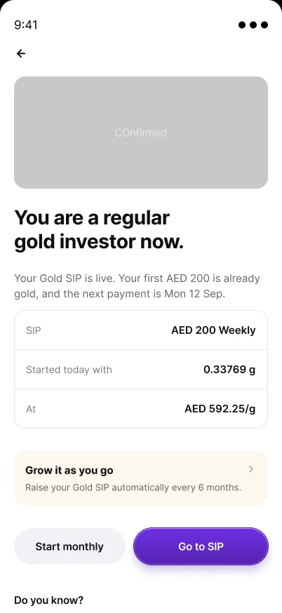
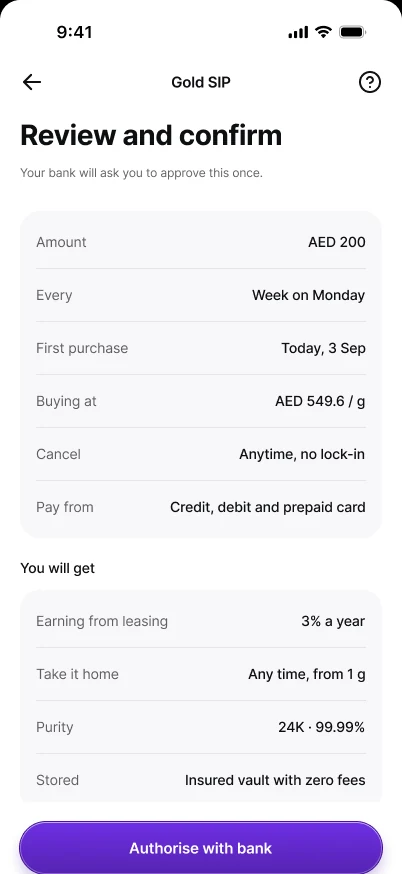
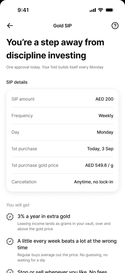
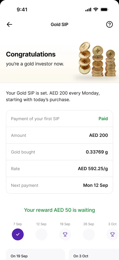
A review screen titled “Thank you for investing with us” and a “Congratulations on choosing disciplined investing” success page. The review thanked people before anything was charged; the success page talked about the user rather than what had just happened. Both were rewritten around state honesty.
Black and white, one question per screen
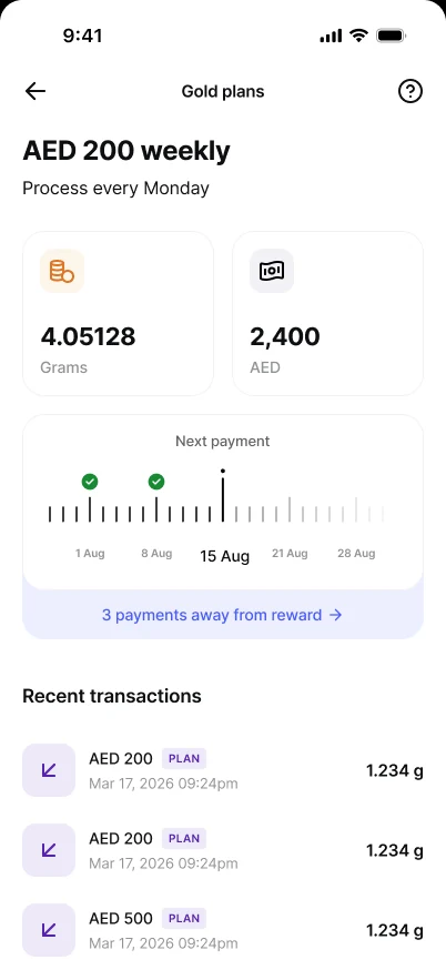
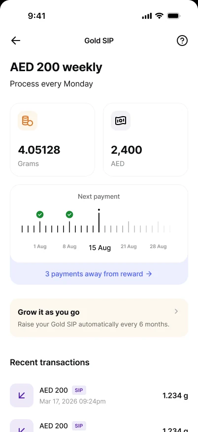
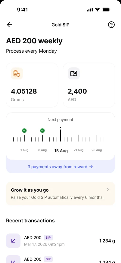
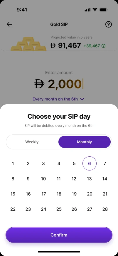
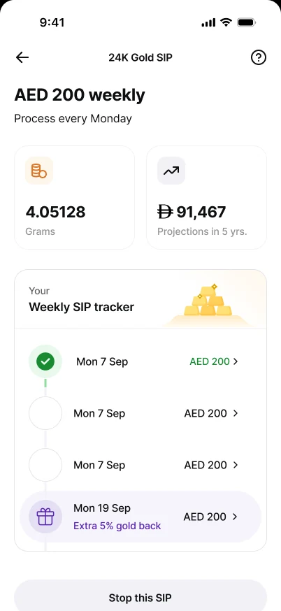
We stripped colour and re-cut the IA: amount first, one “Choose your SIP day” sheet, payment, review, and a weekly SIP tracker on the detail page. The schedule-as-a-sheet and the tracker survived. Three stacked controls (SIP/One-time, Weekly/Monthly, SIP-day dropdown) were still too much — the dense decision screen became our main open problem.
Processing everything
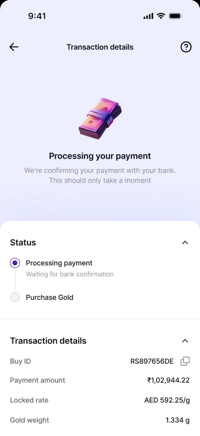
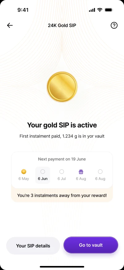
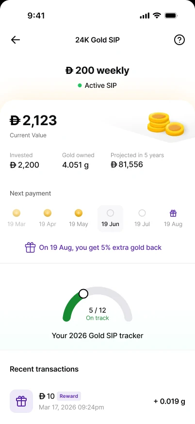
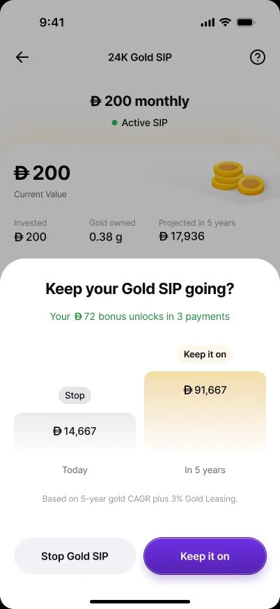
A processing state for every instalment, a “Keep your Gold SIP going?” nudge and a gauge-style yearly tracker. A processing state on every instalment over-promised what the system knew in real time, so we cut it and let the backend own retries — keeping one only where someone is actually waiting: the first payment (see the final design).
One buy page, two intents
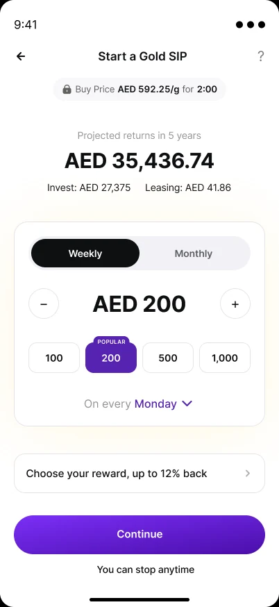
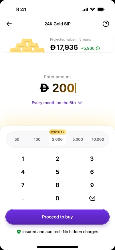
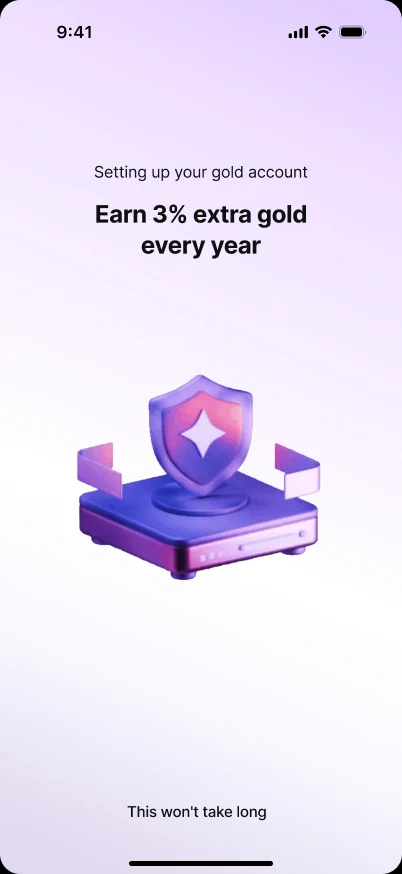
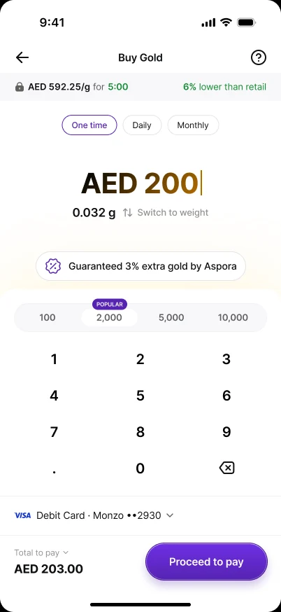
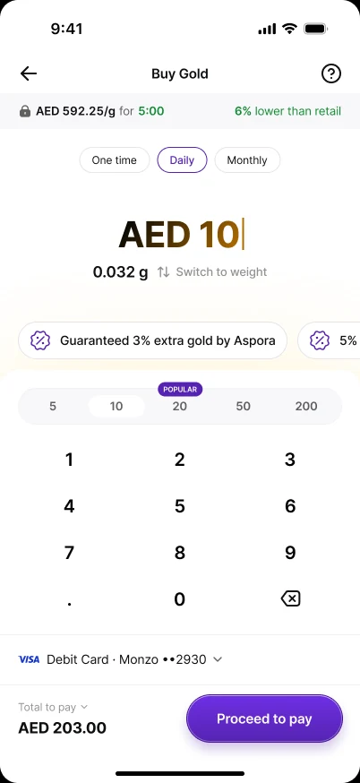
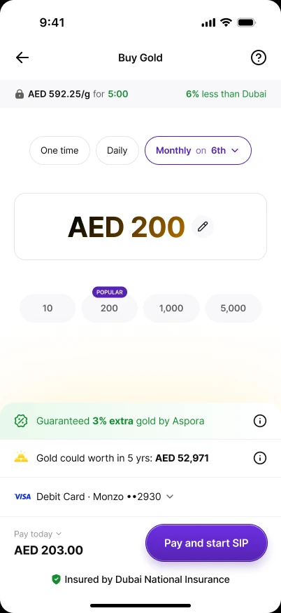
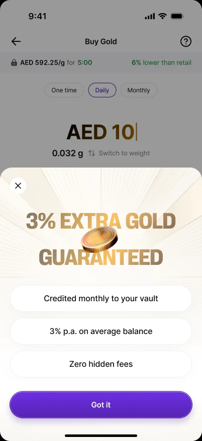
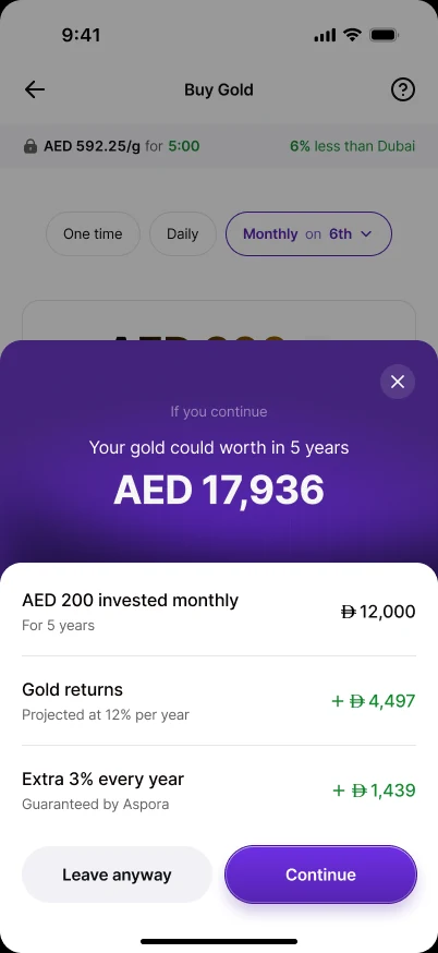
One-time and SIP on the same page, a short first-time intro, a projection breakdown and a 5-year exit-intent sheet. This became the spine of the final design. What changed: a big “3% EXTRA GOLD GUARANTEED” sheet read like a discount on the purchase, when it's really a leasing yield (see “Leasing” below).
The decisions that shaped it
Most of the value in this project came from a handful of contested calls. For each: the tension, what I recommended, and what we gave up.
SIP is the default, not a second product.
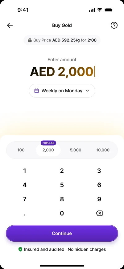
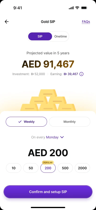
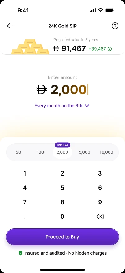
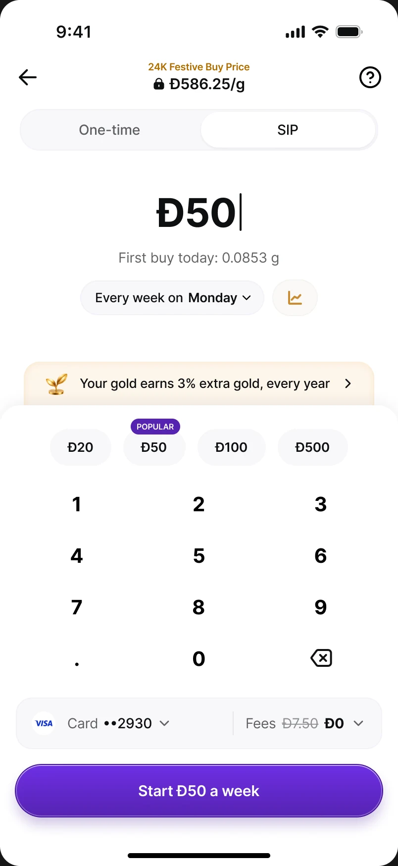
The cheapest way to change behaviour is to change the default. Amounts carry across tabs (Đ500 one-time stays Đ500 a week); an amount too small for SIP resets to the SIP default instead of throwing an error. Trade-off: we had to watch one-time activation in case the default cannibalised it.
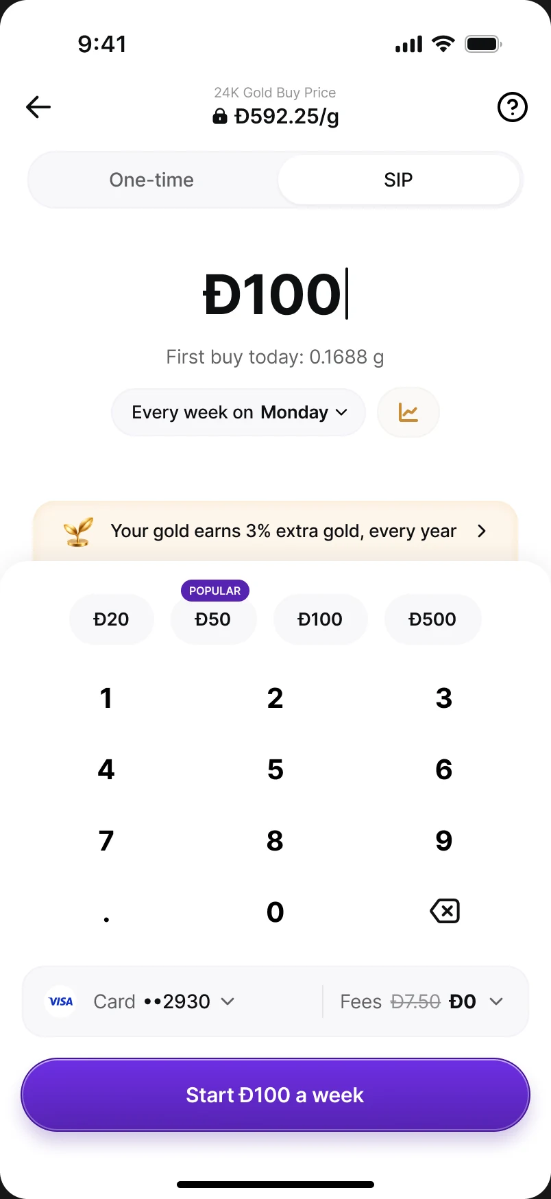
Weekly by default — even though “SIP” means monthly.
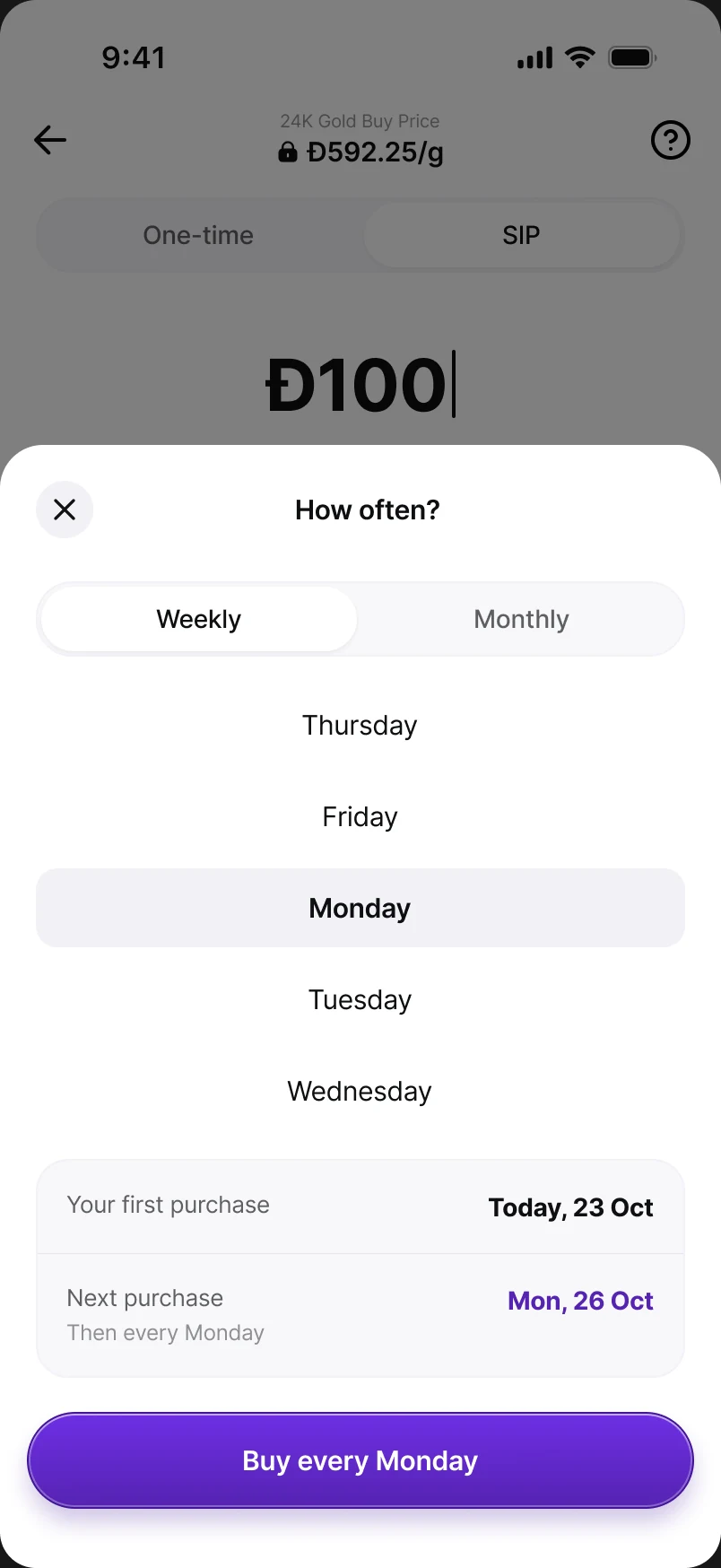
Design to observed behaviour, not to the category's vocabulary — and collapsing cadence into a sheet fixed the three-stacked-controls problem. Open conflict: the PRD scoped Daily out of v1. I kept it designed so turning it on is configuration, not a redesign.
Rewards are applied, never chosen.
The first reward arrives in weeks, not a year, and missing a payment never wipes out progress. Trade-off: we gave up the lock-in of an escalating scheme for trust and simpler offer maths.
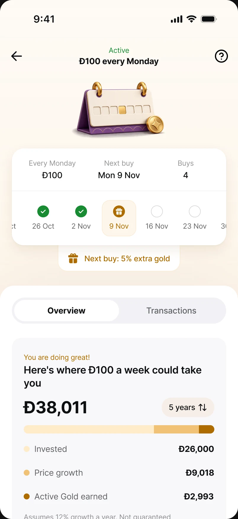
Sell the outcome — and show your working.
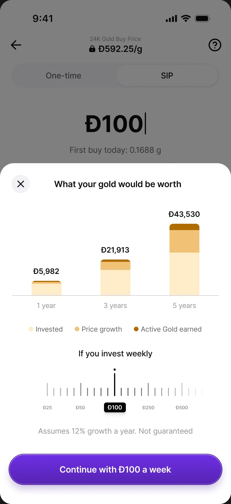
The projection ends on a total, not a percentage, because people plan in dirhams. Splitting price growth (uncertain) from leasing (contractual) let us be persuasive and honest in one chart. Trade-off: a smaller headline effect.
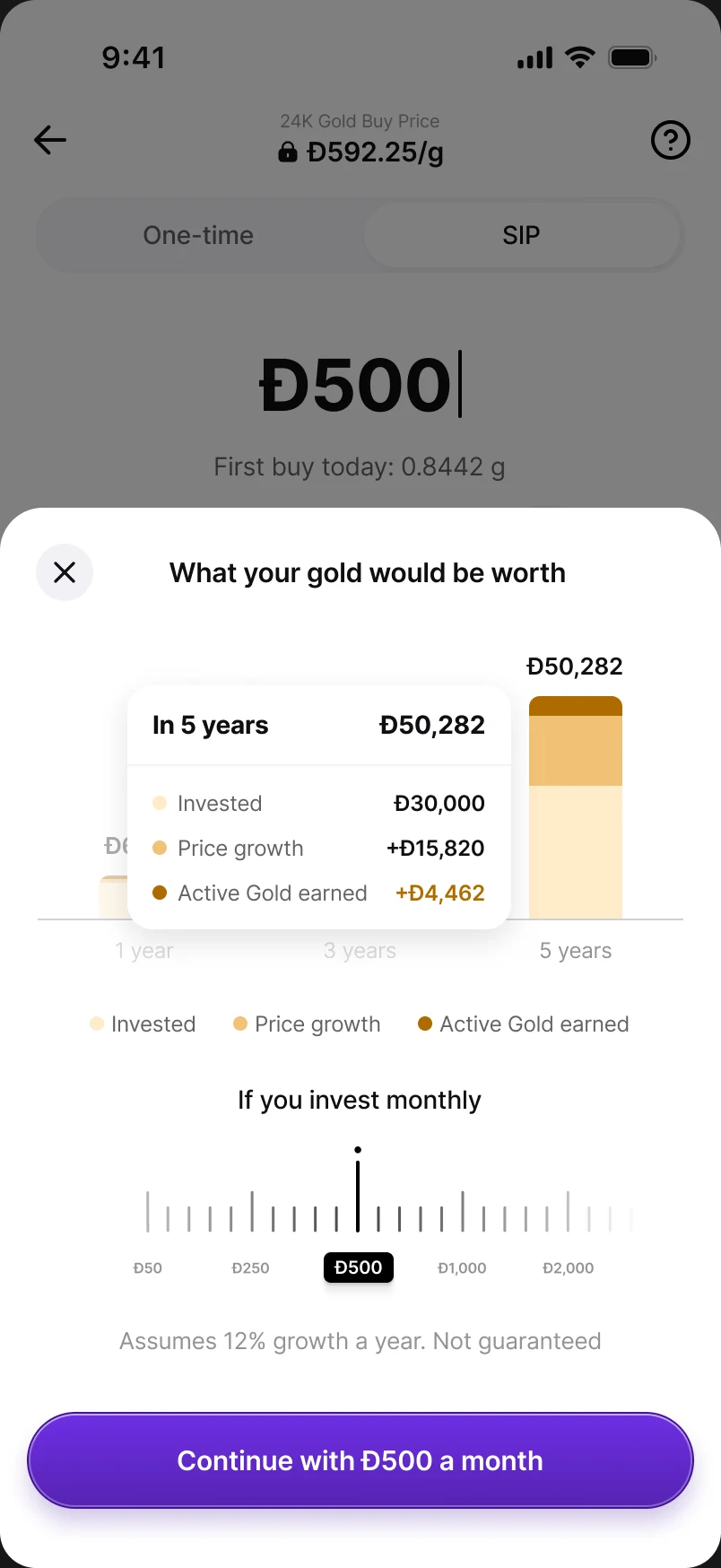
“3% extra gold” is a yield, not a discount.
Offers (which change this purchase) and leasing (which changes your holdings over time) needed different visual grammar, or neither could be trusted. Trade-off: on very short phones the strip is dropped — leasing is still on, just not said here.
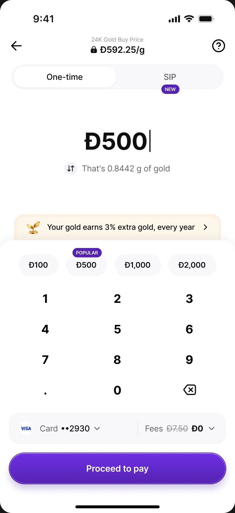
Stop is the only lever in v1.
A pause we can't honour perfectly is worse than no pause, and fewer states meant fewer ways for the tracker to lie. Trade-off: the exit nudge lost its best alternative, “take a break” — which shaped the final exit nudge.
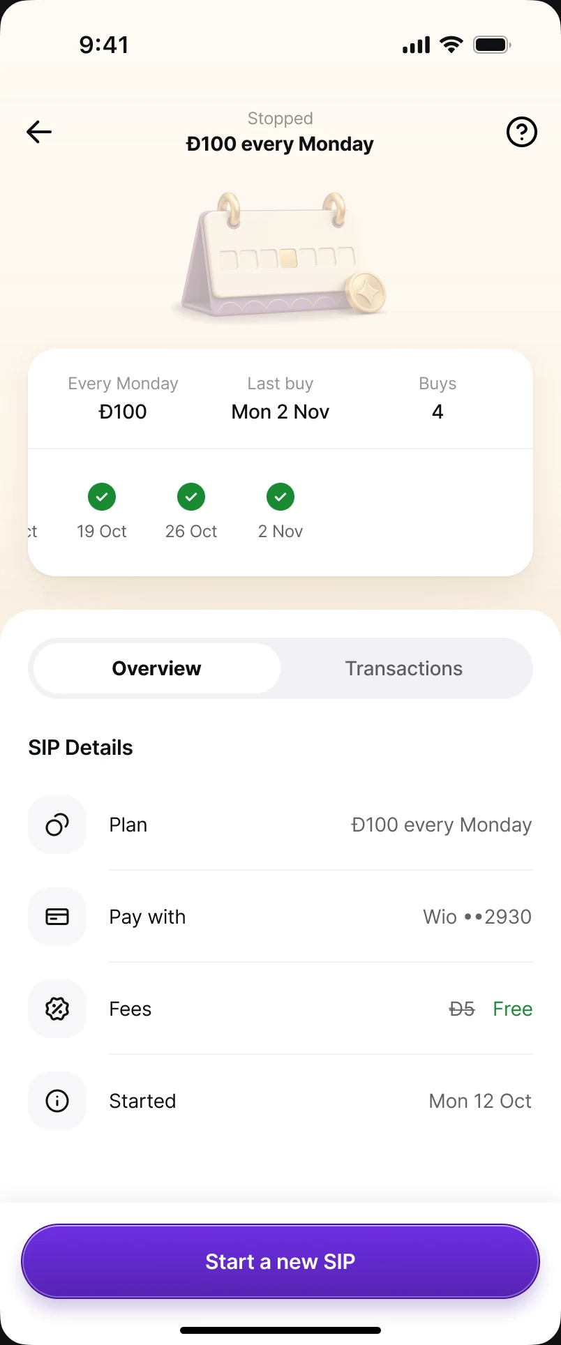
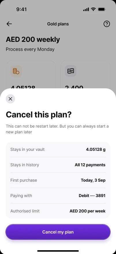
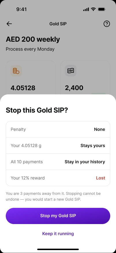
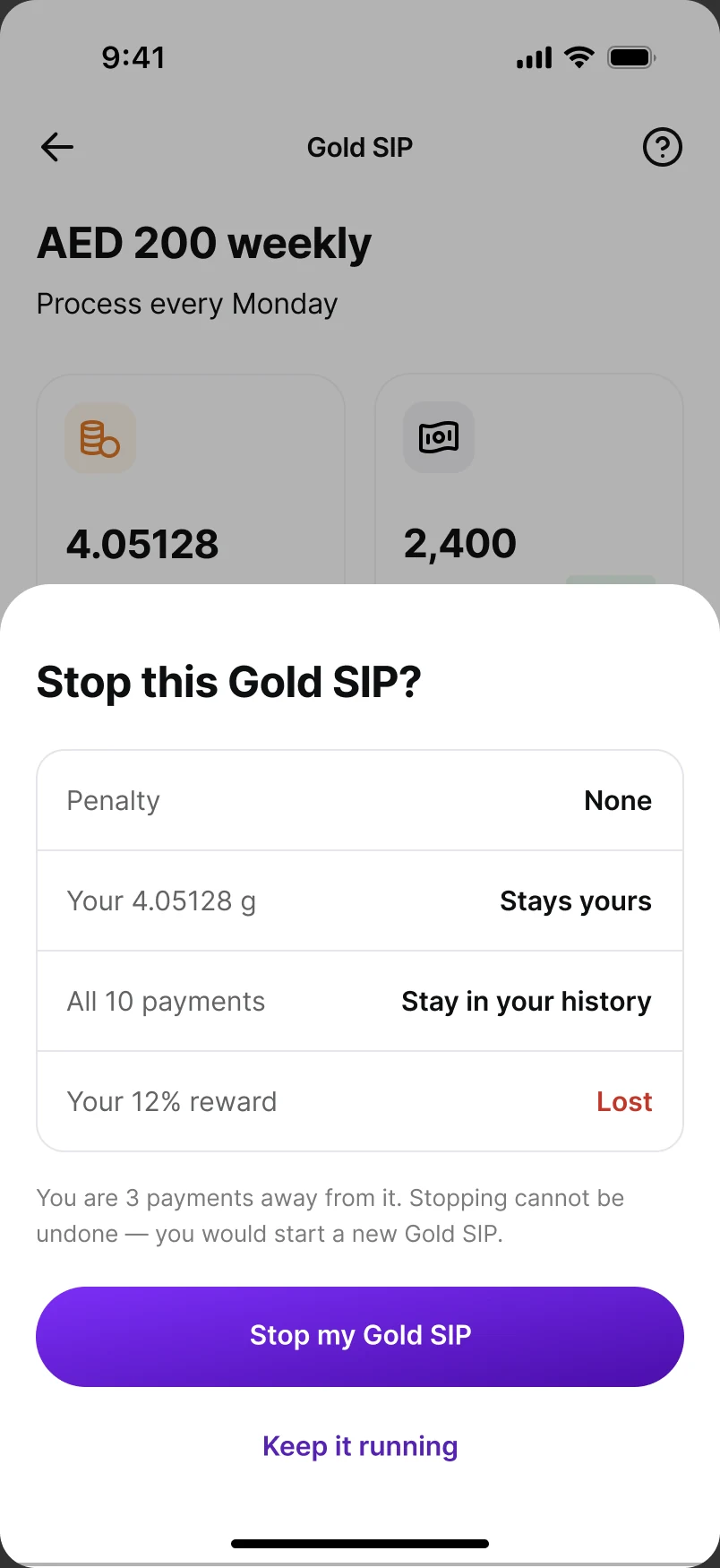
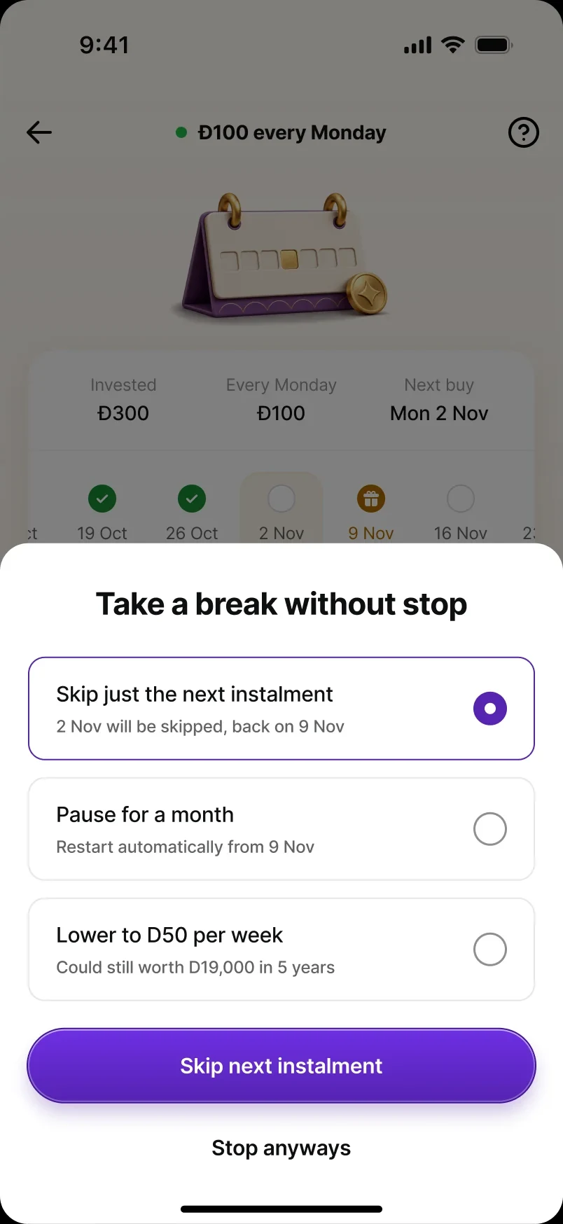
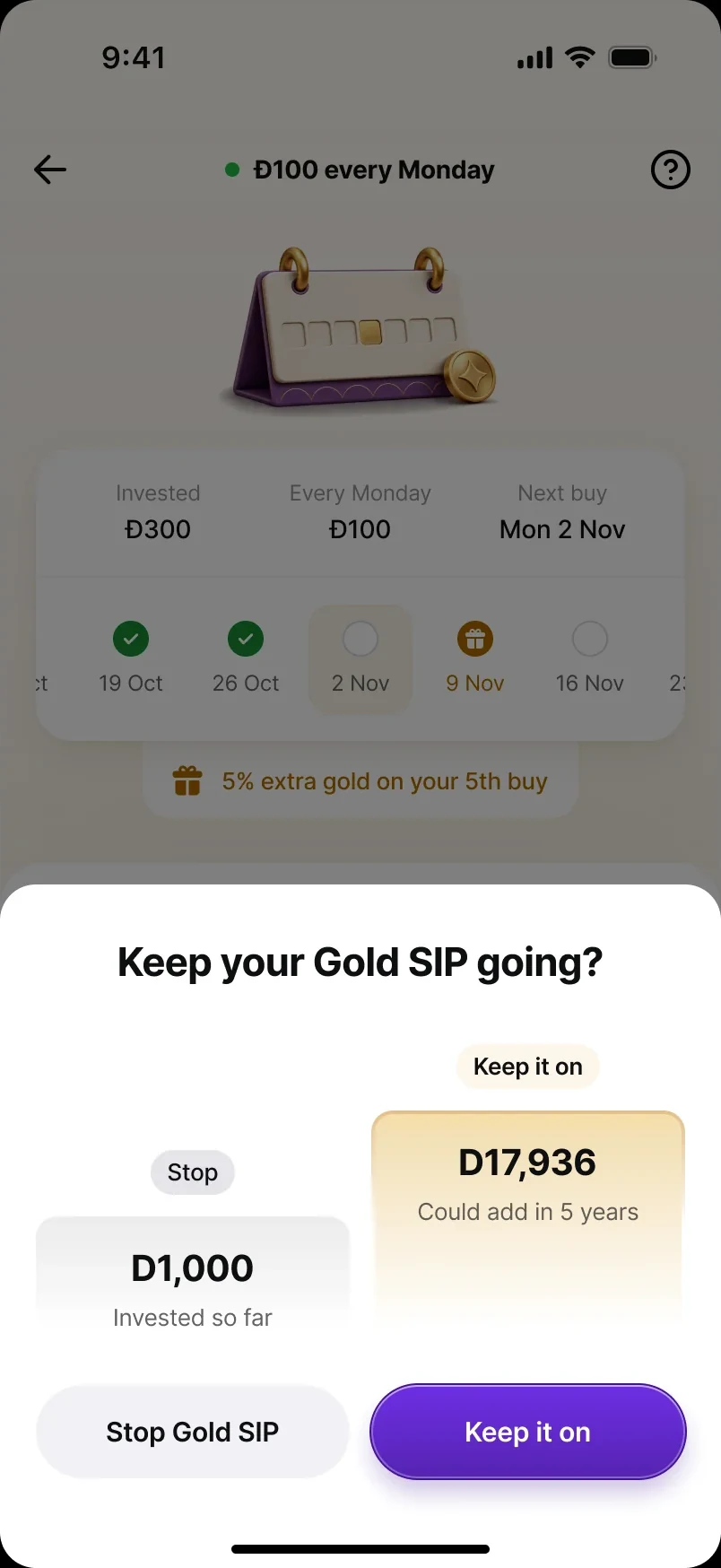
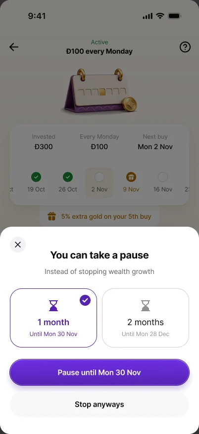
Four ways to ask “are you sure?”
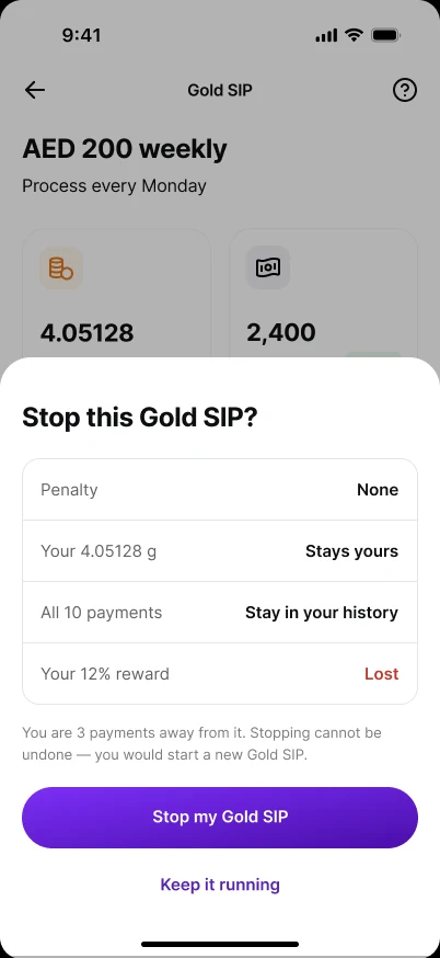
Stopping is the most important moment in a recurring product, so the exit nudge went through more rounds than any other sheet. Each exploration answered the question differently — and each ran into a constraint.
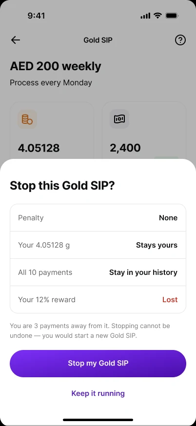
- Loss framing. A table of what you give up — penalty none, gold stays yours, history kept, “Your 12% reward: Lost”. Effective on paper, corrosive to trust, and built on a reward model we later dropped.
- Take a break without stopping. Skip just the next instalment, pause for a month, or lower the amount (“could still be worth Đ19,000 in 5 years”). The kindest option — but pause, skip and step-down weren't in v1.
- Stop vs keep, in numbers. Đ1,000 invested so far against Đ17,936 it could add in five years. Persuasive — but accumulated value and projections weren't allowed here, because vault holdings don't map one-to-one to a SIP.
- A short pause. 1 or 2 months, “instead of stopping wealth growth”. Simpler, but still a lever the engine couldn't honour in v1.
From “you'll lose” to “here's what it's been doing”.
Gain framing keeps the decision with the user. The four explorations above each depended on something v1 couldn't honour; this is what survived — the emotional core, without the levers. Trade-off: possibly a lower save rate than a loss-framed sheet — worth measuring, not worth the trust.
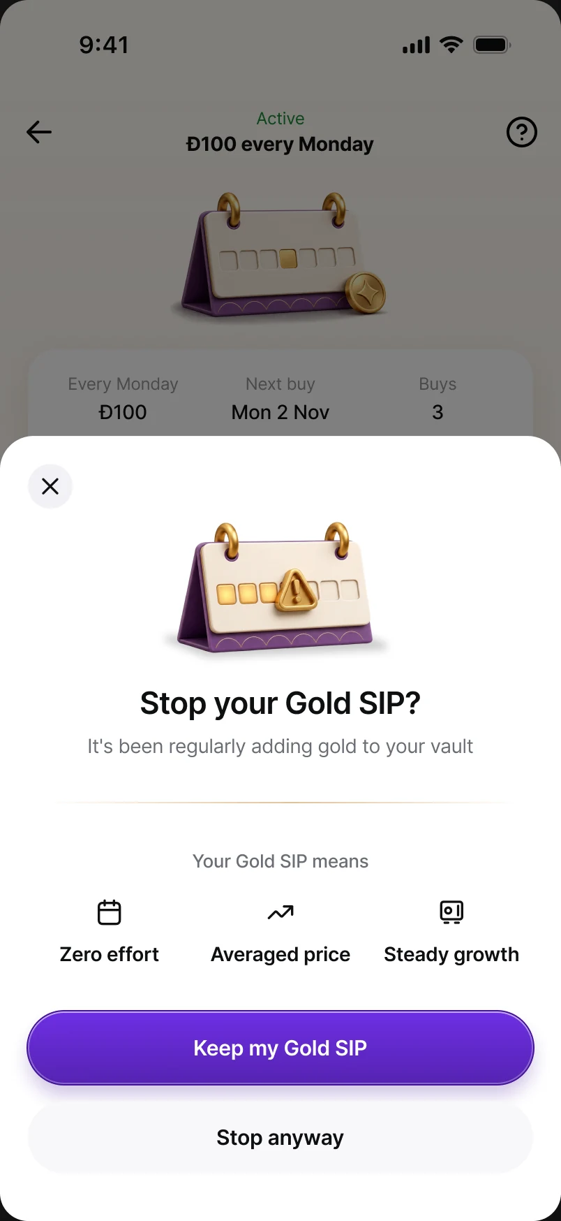
Other nudges — and what we cut
A SIP lives or dies on what happens around setup: the weeks after setup, the moment they come back, and the moment they consider doing more. Beyond the exit nudge (covered above, with the decisions), I explored four more. All four were descoped so v1 could ship the core loop well.
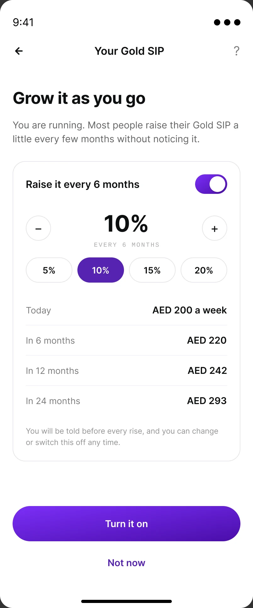
Step-up — “Grow it as you go”
After the first few instalments, offer to raise the SIP automatically — 10% every six months by default, user-editable, with the next three amounts previewed before you turn it on. Offered after setup, never inside it, so it couldn't slow the first commitment.
Why it was cut: step-up was an explicit PRD non-goal for v1, and every raise needs re-authorising the card mandate above its registered ceiling. It's designed and parked for when the base habit is proven.
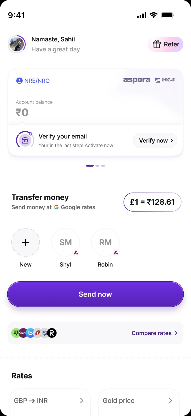
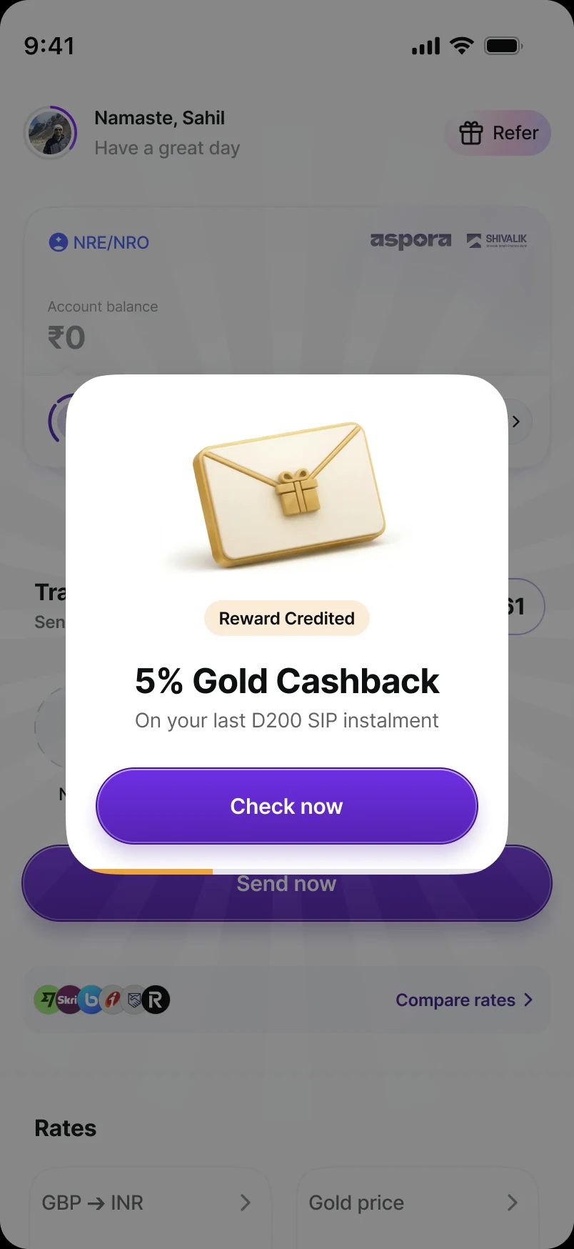
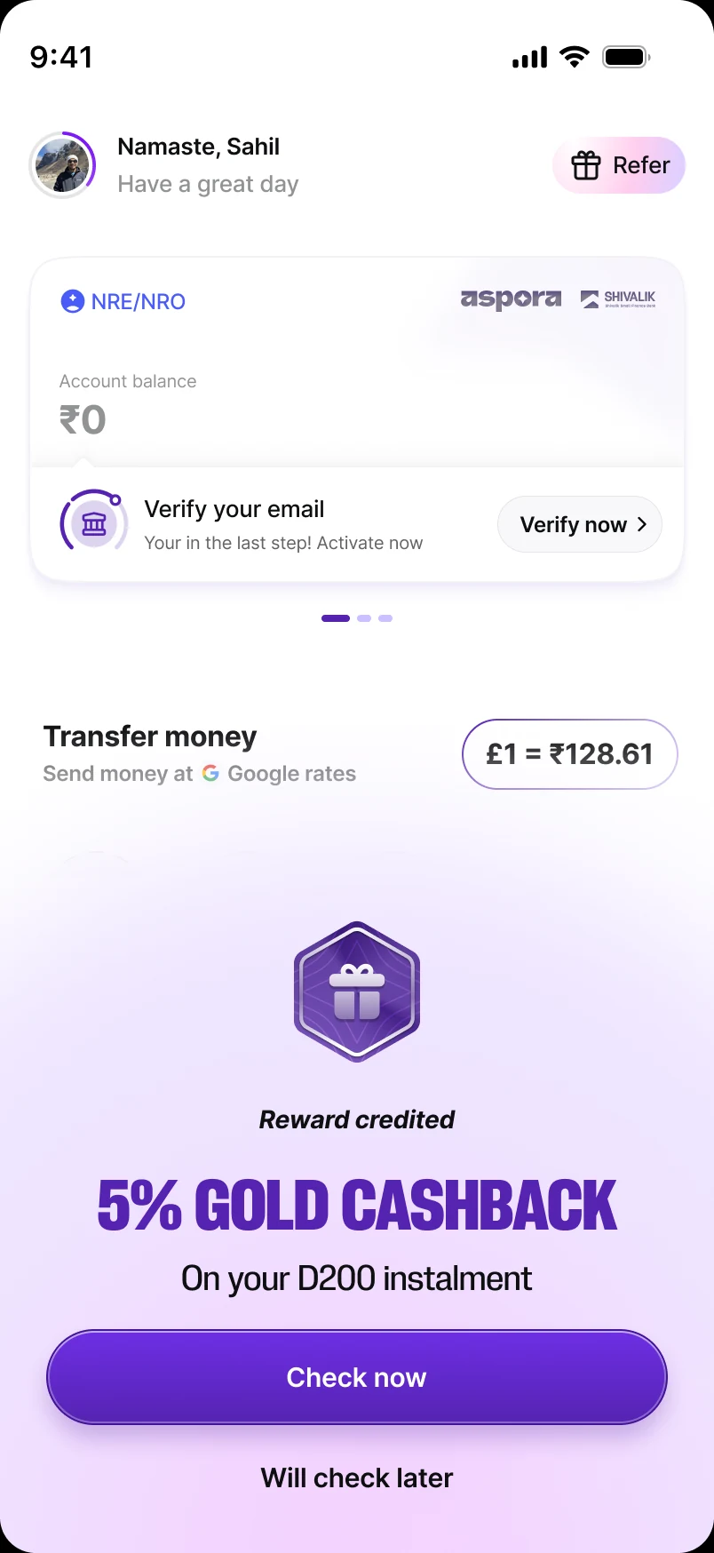
A reward that greets you when you come back
When the 5% gold cashback lands and the user hasn't opened the app for a couple of days, the next visit opens on a gifting-style moment — “Reward credited · 5% Gold Cashback · on your last Đ200 SIP instalment” — as a modal or a full-screen takeover over the Aspora home.
Why it was cut: it lives on the shared Aspora home, outside the gold surface, and the PRD deferred reward-led moments to a central reward engine. For v1 the reward shows up where the habit lives — on the tracker and in the ledger.
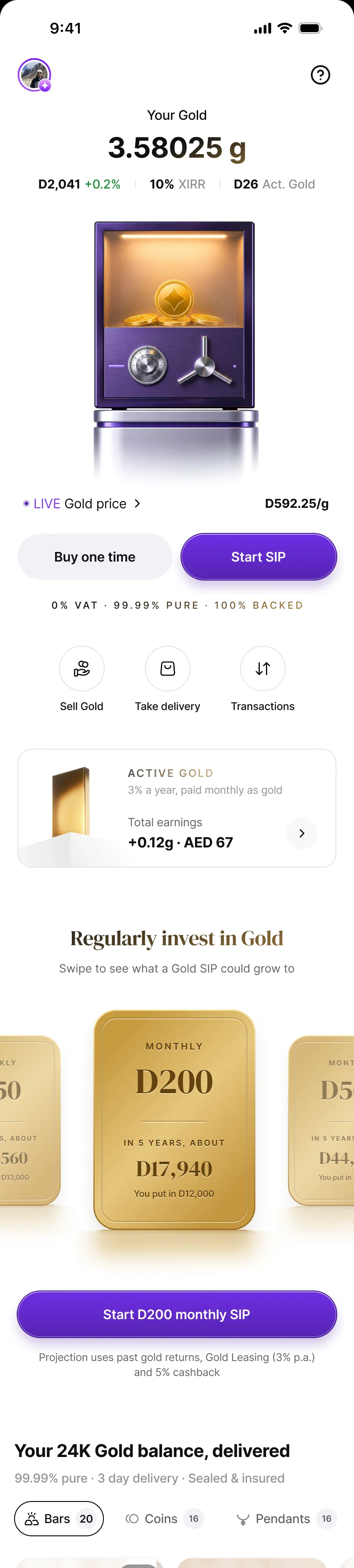
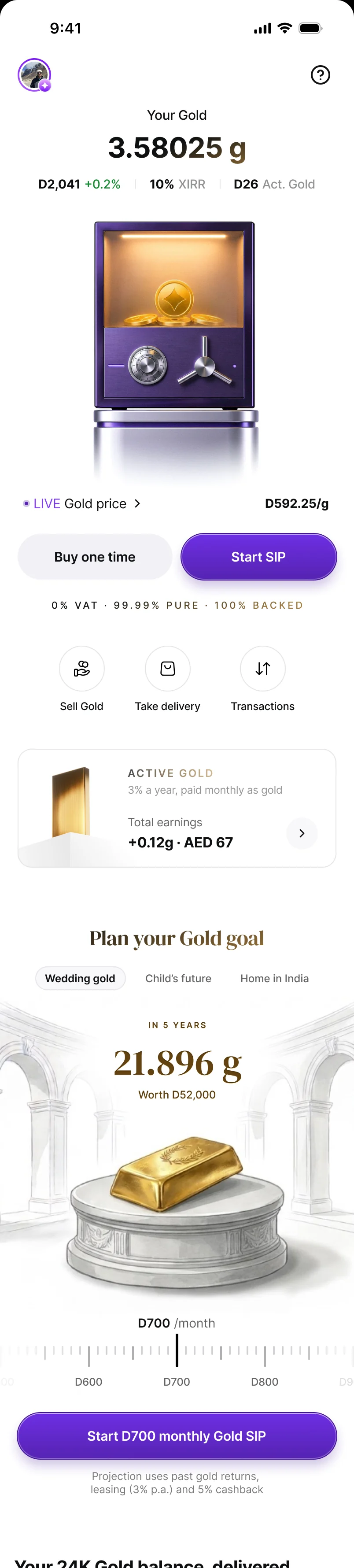
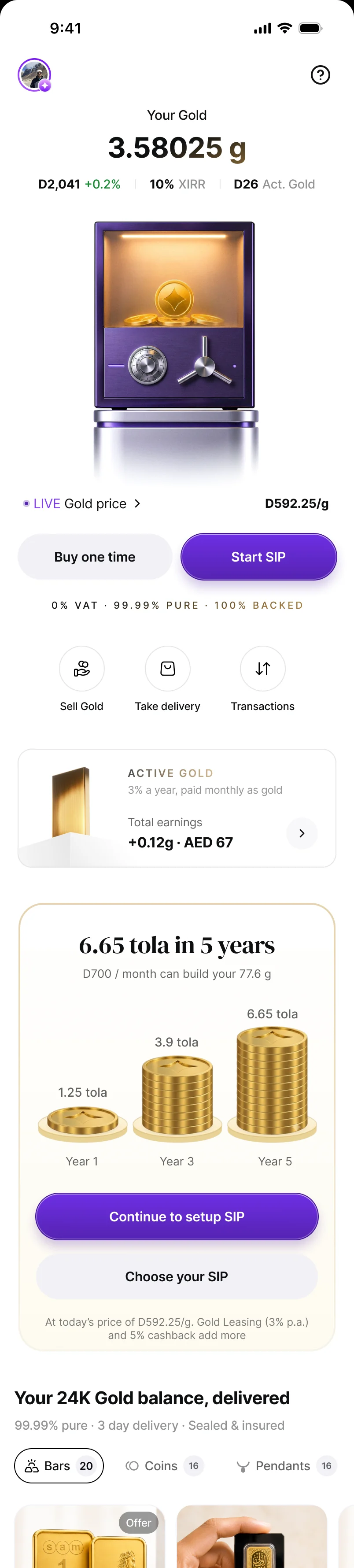
A goal-led SIP nudge on the Gold home
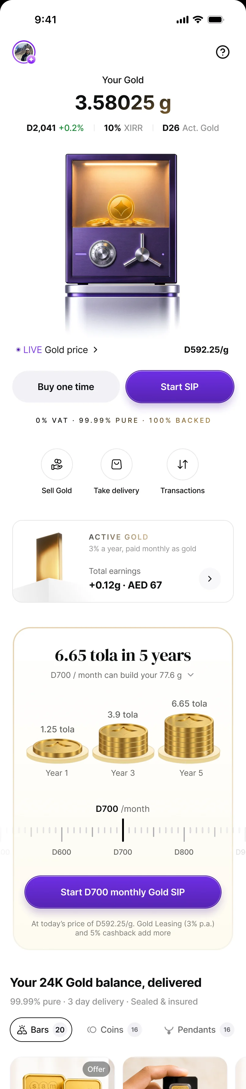
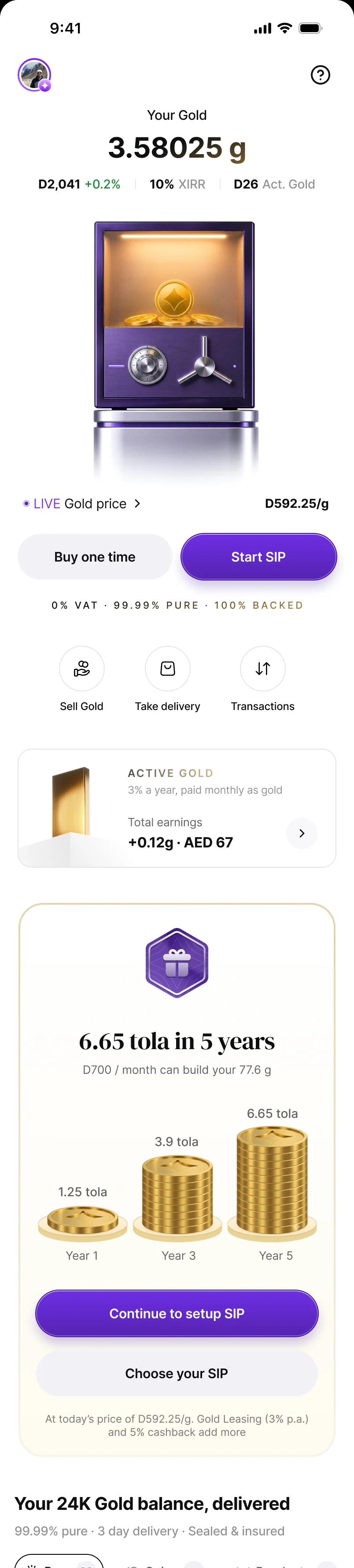
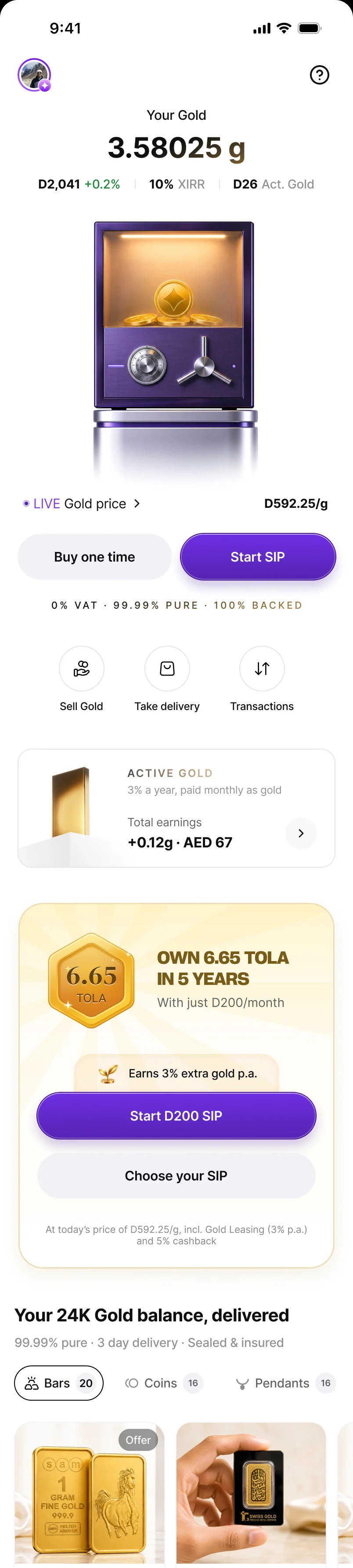
For people who own gold but haven't started a SIP, the Gold home would carry a goal widget instead of a plain banner: “Regularly invest in gold” with swipeable monthly amounts, “Plan your gold goal” (wedding gold, a child's future, a home in India), and a tola version — “6.65 tola in 5 years” — built on the existing ruler slider. Tola, not grams, because that's how our users talk about gold.
Why it was cut: v1 already made SIP the default on the buy page, which covered the same intent with less surface. Goal-based plans were also an explicit PRD non-goal, so the widget would have promised something the product didn't do yet.
Long-term gratification on the SIP detail page
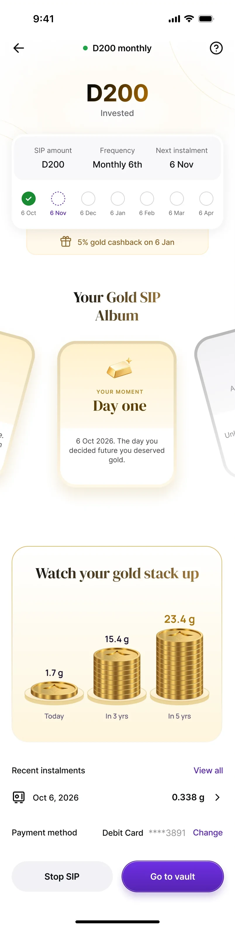
The most ambitious idea: a detail page that changes over time. A Gold SIP Album of collectible cards — “Your moments” (Day one, and milestones every saver reaches at the same pace) and “Then and now” (“you now hold about as much gold as… a Vijayanagara fanam”, from the 0.03 g in a smartphone to a 1 kg bar) — plus “Watch your gold stack up” at today, 3 and 5 years. Day one, three months in and a daily SIP each get a different page.
Why it was cut: the album needed a content system (copy, illustration and trigger rules for 25 cards) and backend milestones that v1 didn't have. The detail page shipped with the tracker and the growth carousel; the album is designed and parked for v1.1.
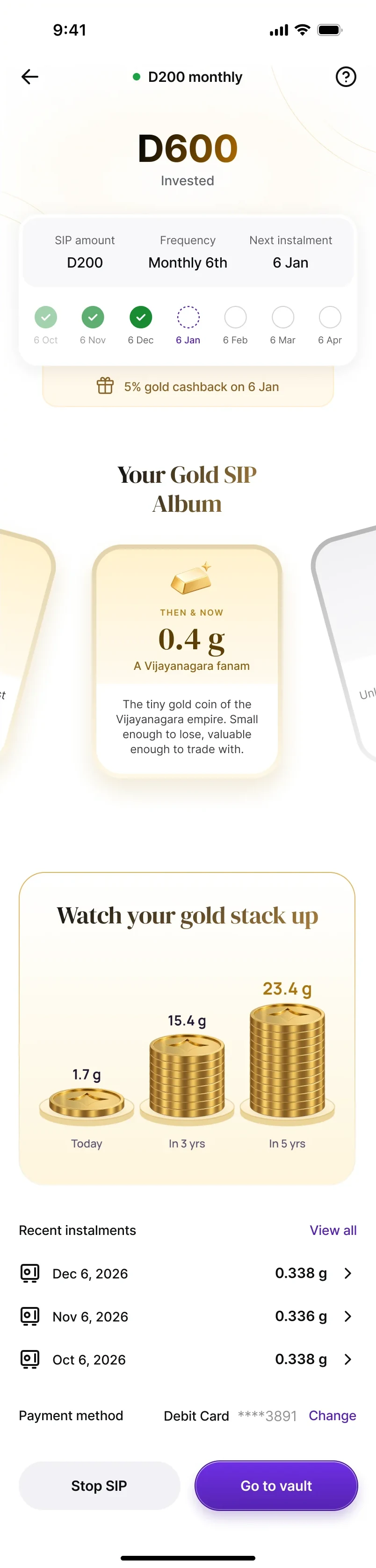
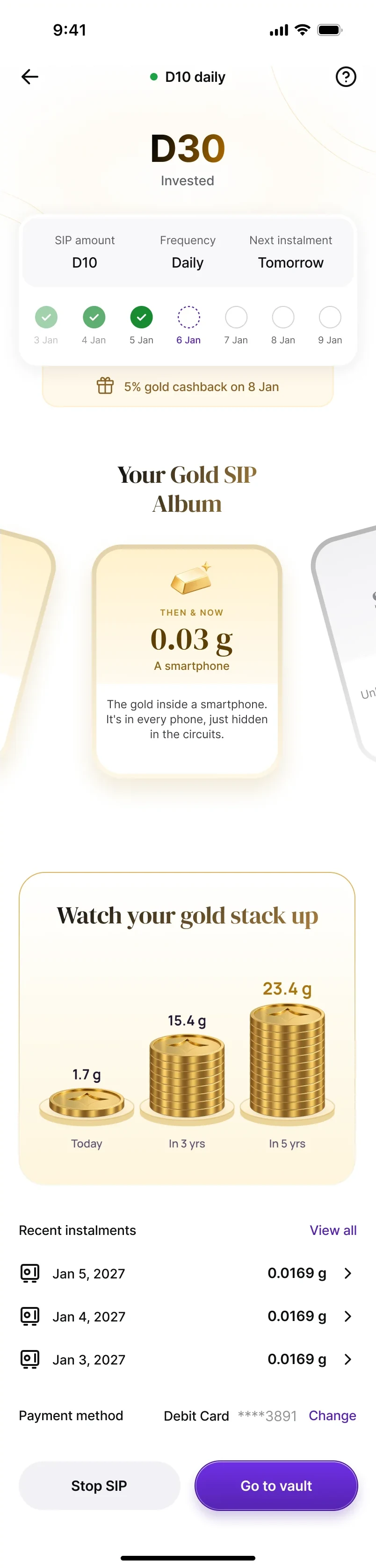
Each of these was weighed against one test — does v1 need this to form the habit? — and the answer was “not yet”. They're the v1.1 backlog, already designed.
The final design — six moments
Discover, set up, pay, celebrate, live with it — and sell. Each moment had its own job, and its own definition of honest.
Discover: a Gold home that changes with you
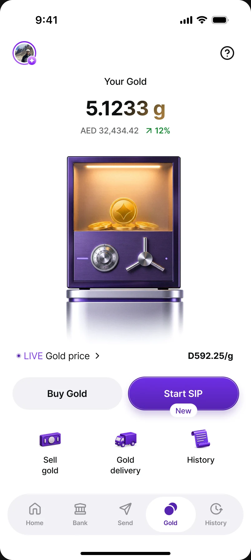
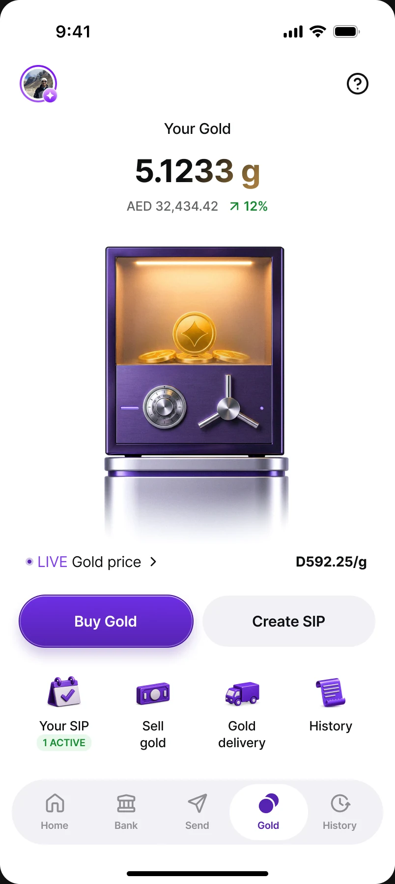
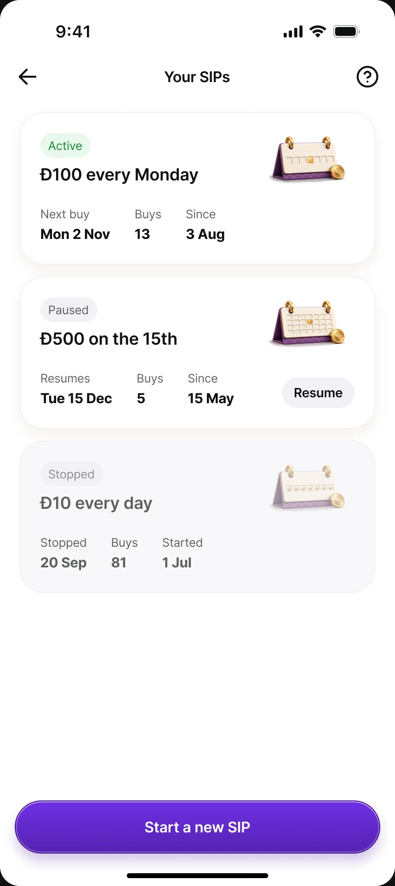
Three states — no SIP yet, SIP active, past SIPs only. A new user sees Start SIP marked as new; an active saver gets a “Your SIP” tile with its live count; a lapsed saver is invited to create a new one. Home transactions show only successful instalments with a SIP pill; skipped or retrying buys live in the SIP's own ledger, where they have context.
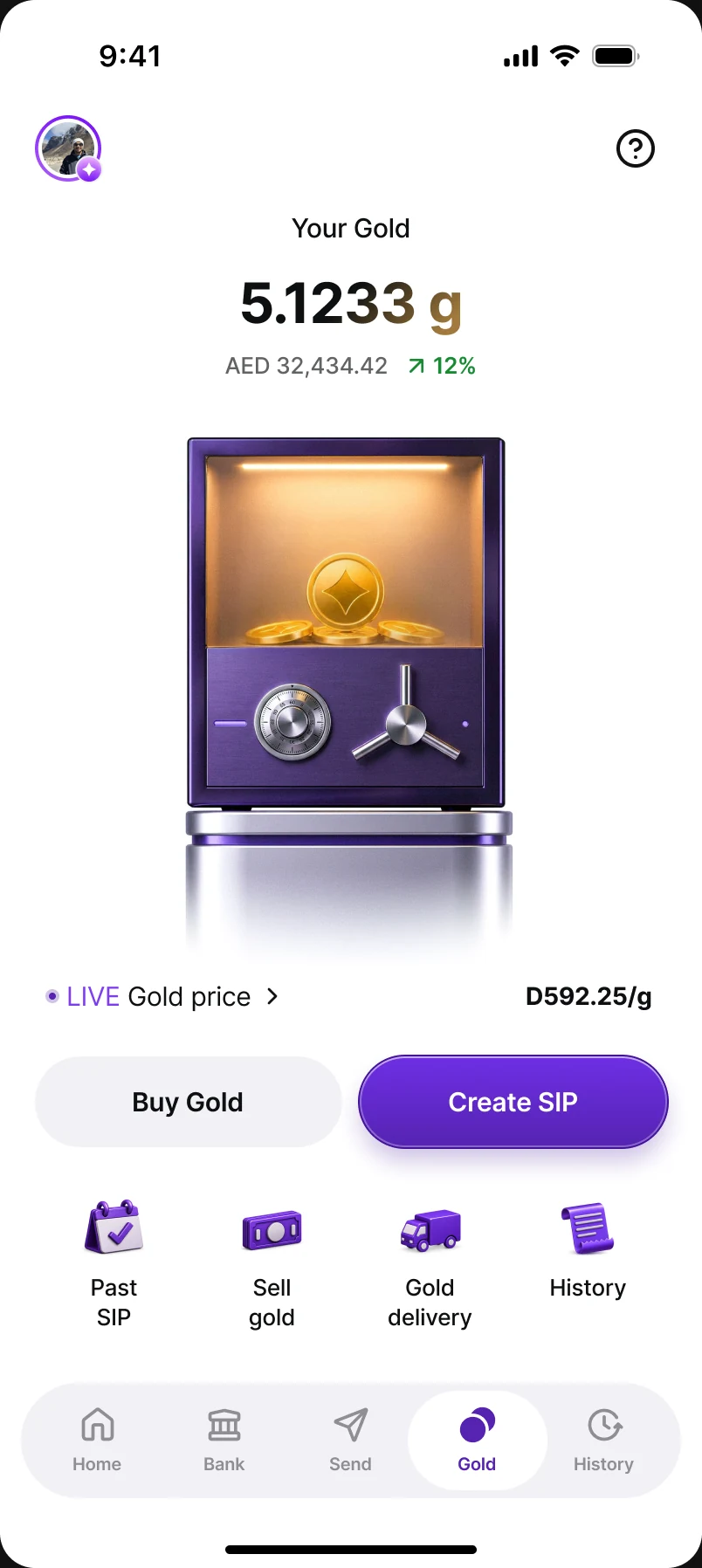
Set up: one page, one decision at a time
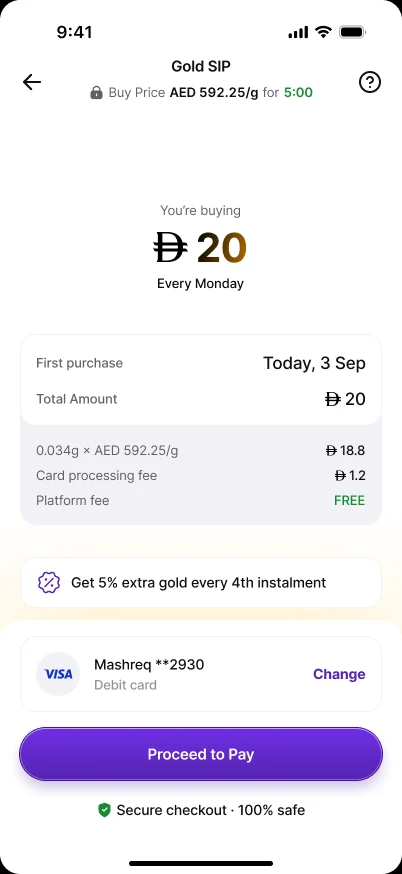
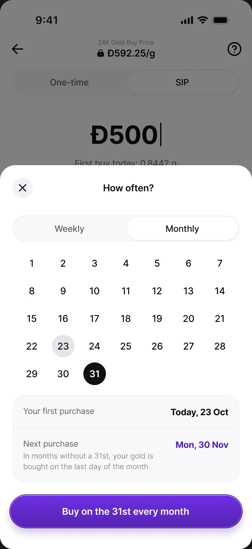
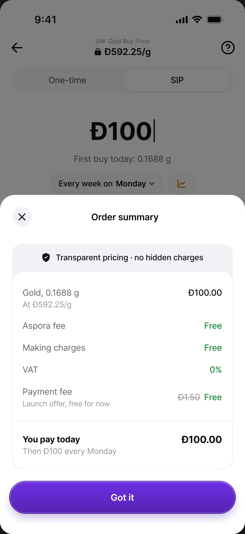
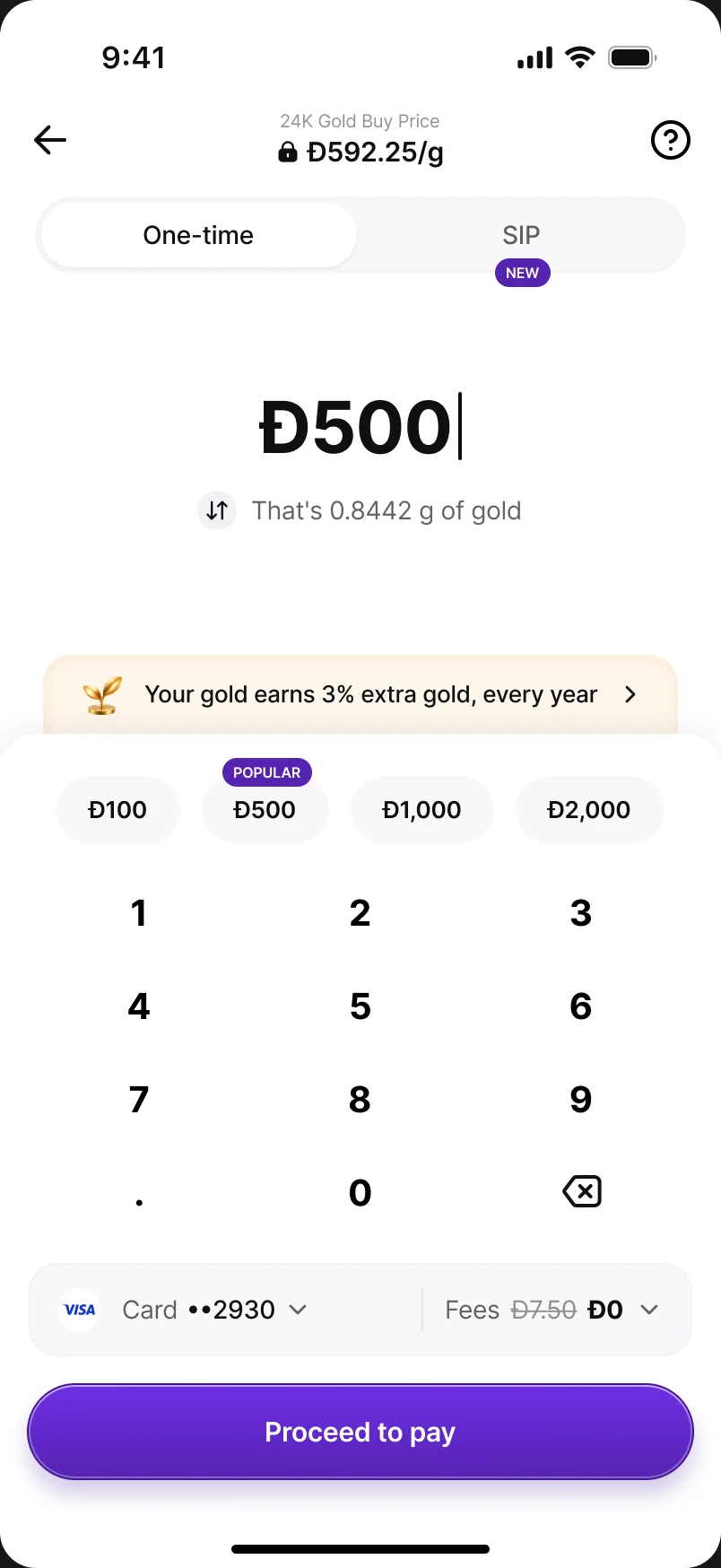
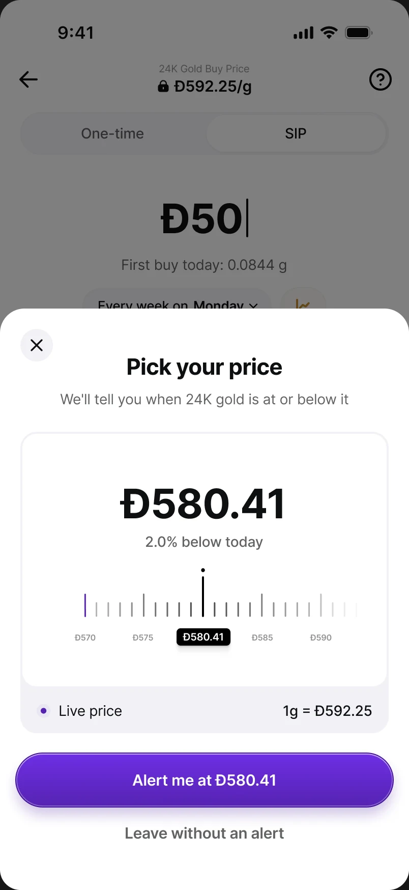
The buy page carries exactly what you need to commit: the locked price, One-time / SIP tabs, the amount with quick-pick chips, one schedule line — “Every week on Monday” — and a button that states the commitment in plain words: “Start Đ100 a week”. Grams update on every keypress; minimum errors wait until you stop typing so nobody is scolded mid-number. Pick the 31st and the sheet tells you shorter months buy on their last day.
Pay: when the first payment is still processing, or fails
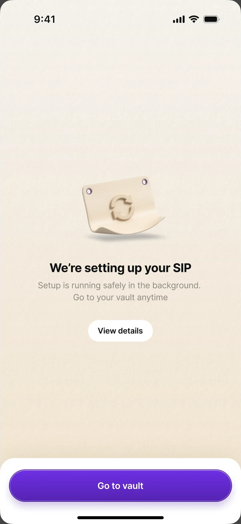
Most first payments confirm in seconds. When one doesn't, the worst thing we could do is hold someone on a spinner — or celebrate a plan that might not exist. So the flow says exactly what the system knows:
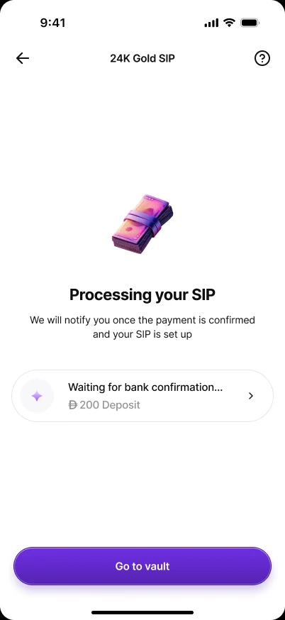
- Still processing. “We're setting up your SIP — setup is running safely in the background. Go to your vault anytime.” No certificate, no celebration yet; View details and Go to vault are both safe exits.
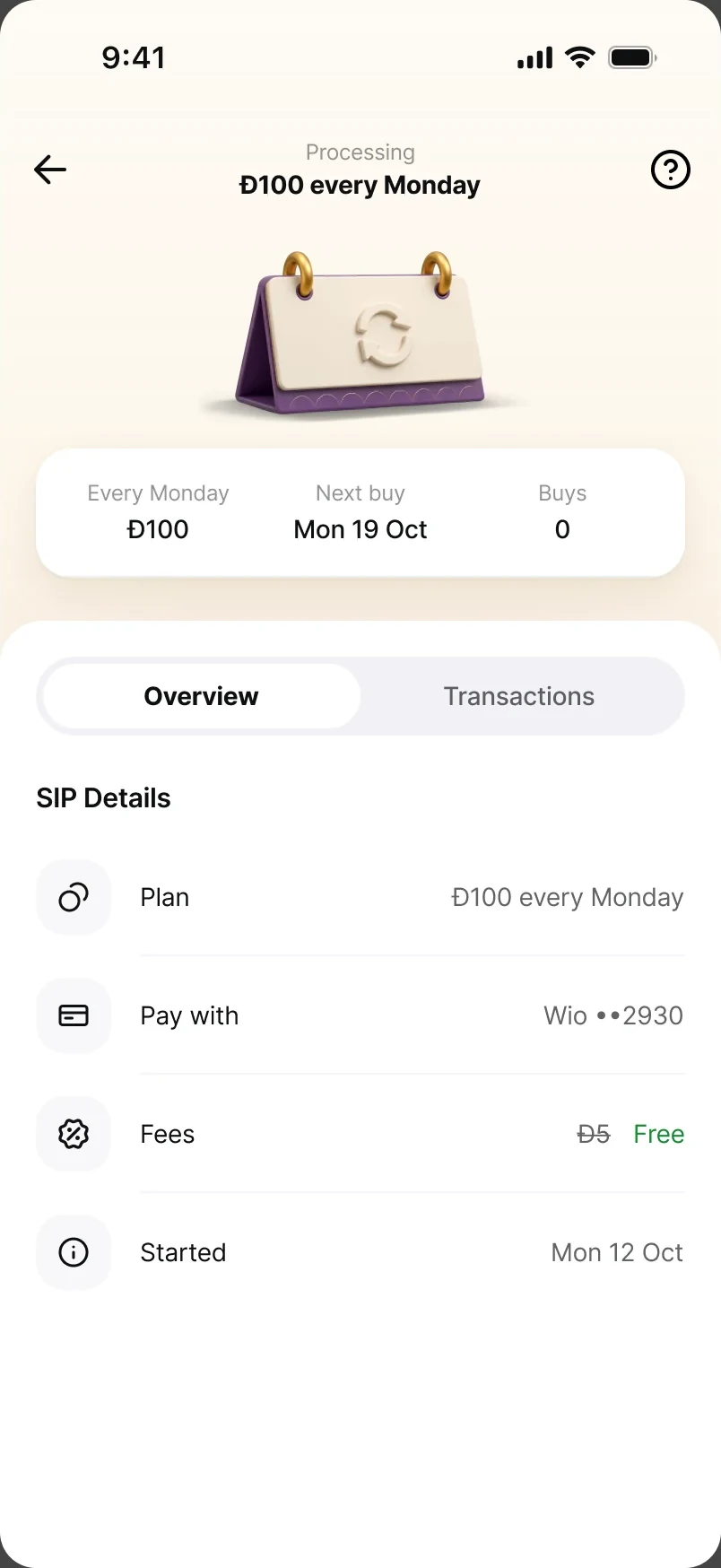
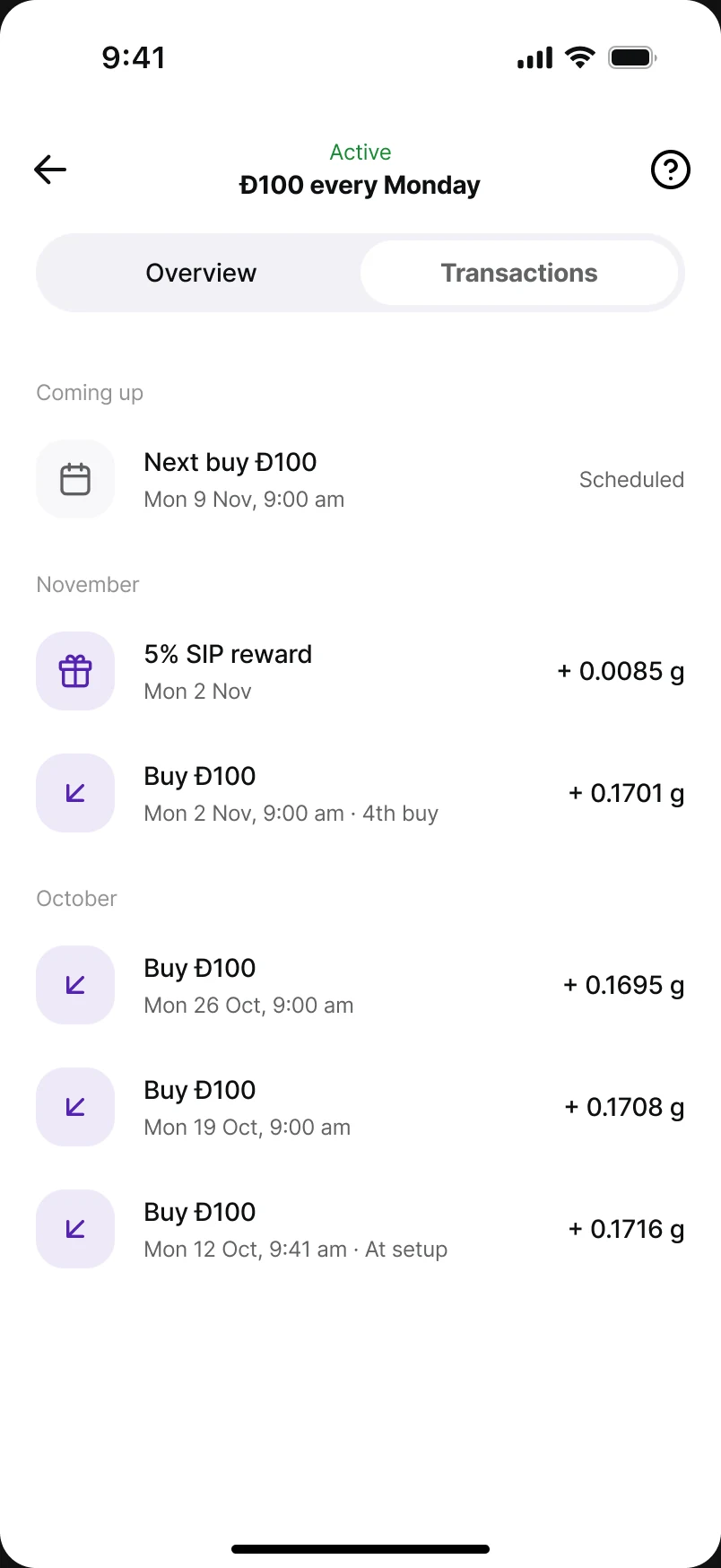
- The SIP page while it's processing. The header reads Processing, the calendar shows a sync mark, and the summary is honest: Buys 0, next buy Mon 19 Oct. No tracker until the first buy is confirmed — nothing to tick yet.
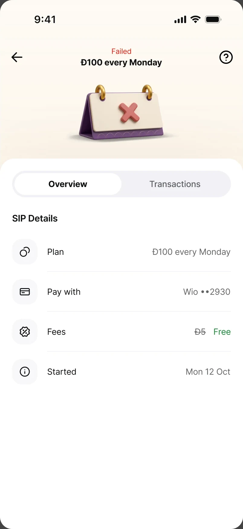
- If it fails. The header turns to Failed and the calendar carries a cross. The schedule and next-buy line disappear, because there is no schedule to keep; only the SIP details stay, so the user can see exactly what was attempted.
This is the one place I kept a processing state after cutting it everywhere else — because it's the one moment someone is actually waiting.
Celebrate: a certificate, not confetti
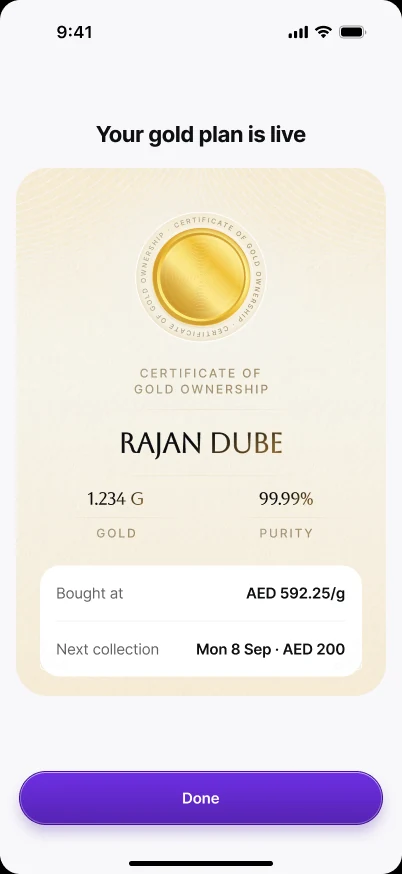
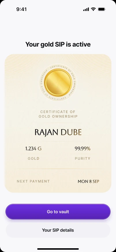
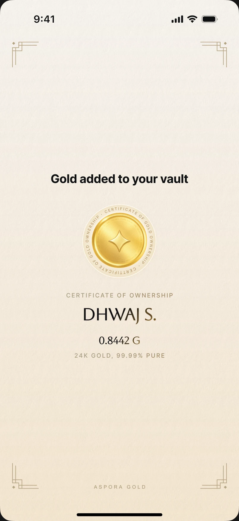
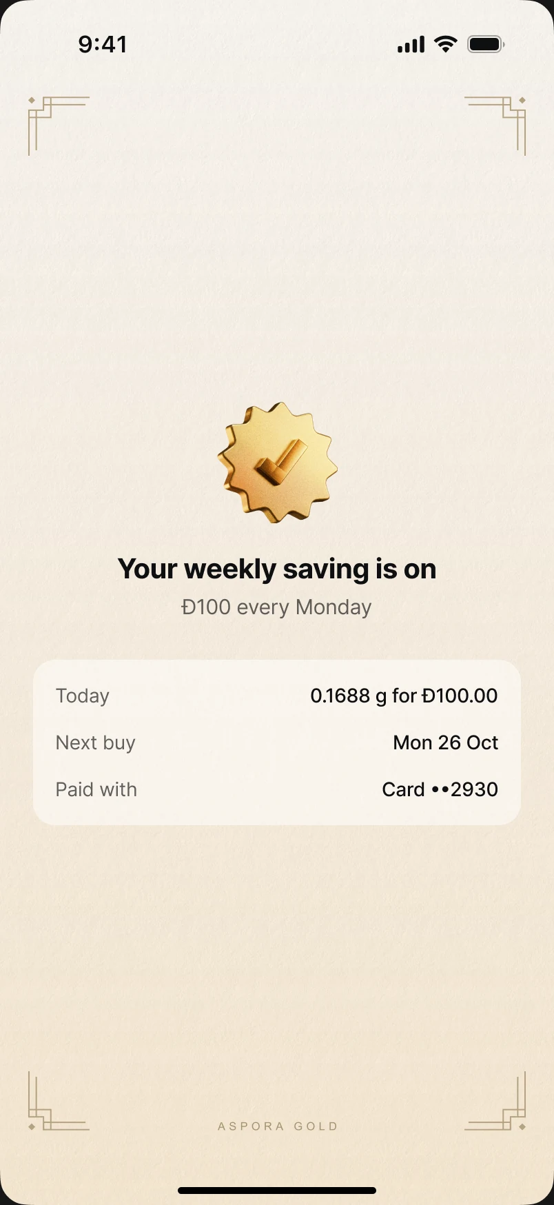
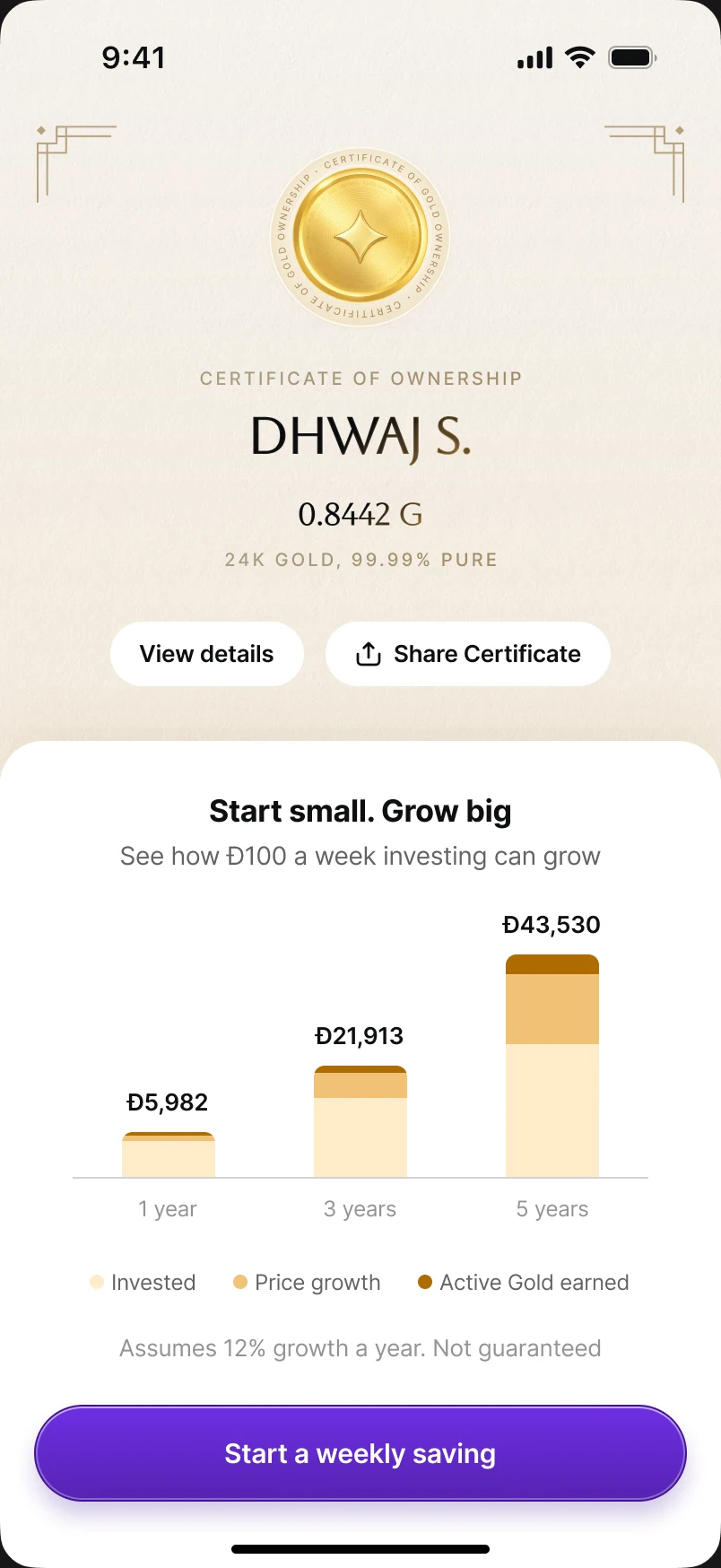
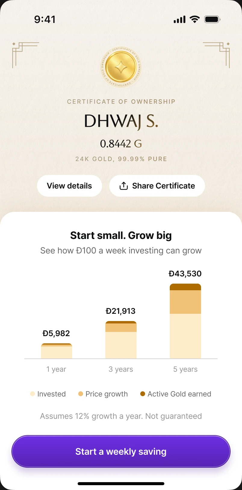
Gold is physical and personal, and users had singled out the certificate in research, so the success moment is a Certificate of ownership with your name and the exact grams — shareable and quietly premium. SIPs land on “Your weekly saving is on” with today's grams, the next buy and the card; then one sheet rises with exactly one next step. Names never shrink or wrap — they step down from full name to initials to first name. Buttons fade in only after the sheet lands, and Reduce Motion cross-fades everything.

Live with it: a page worth opening in week nine
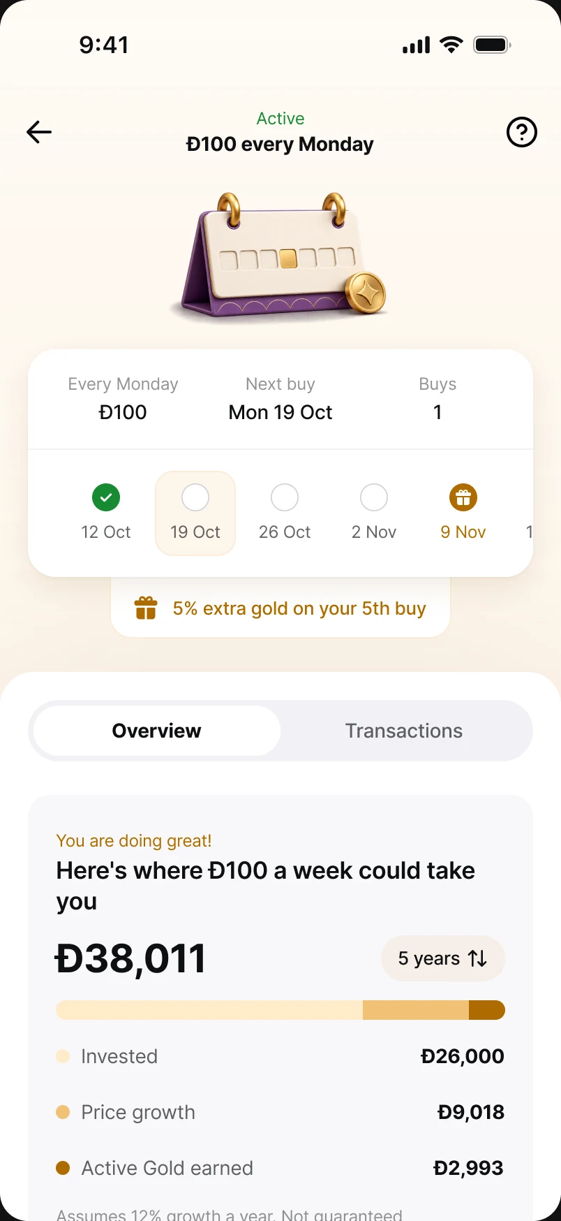
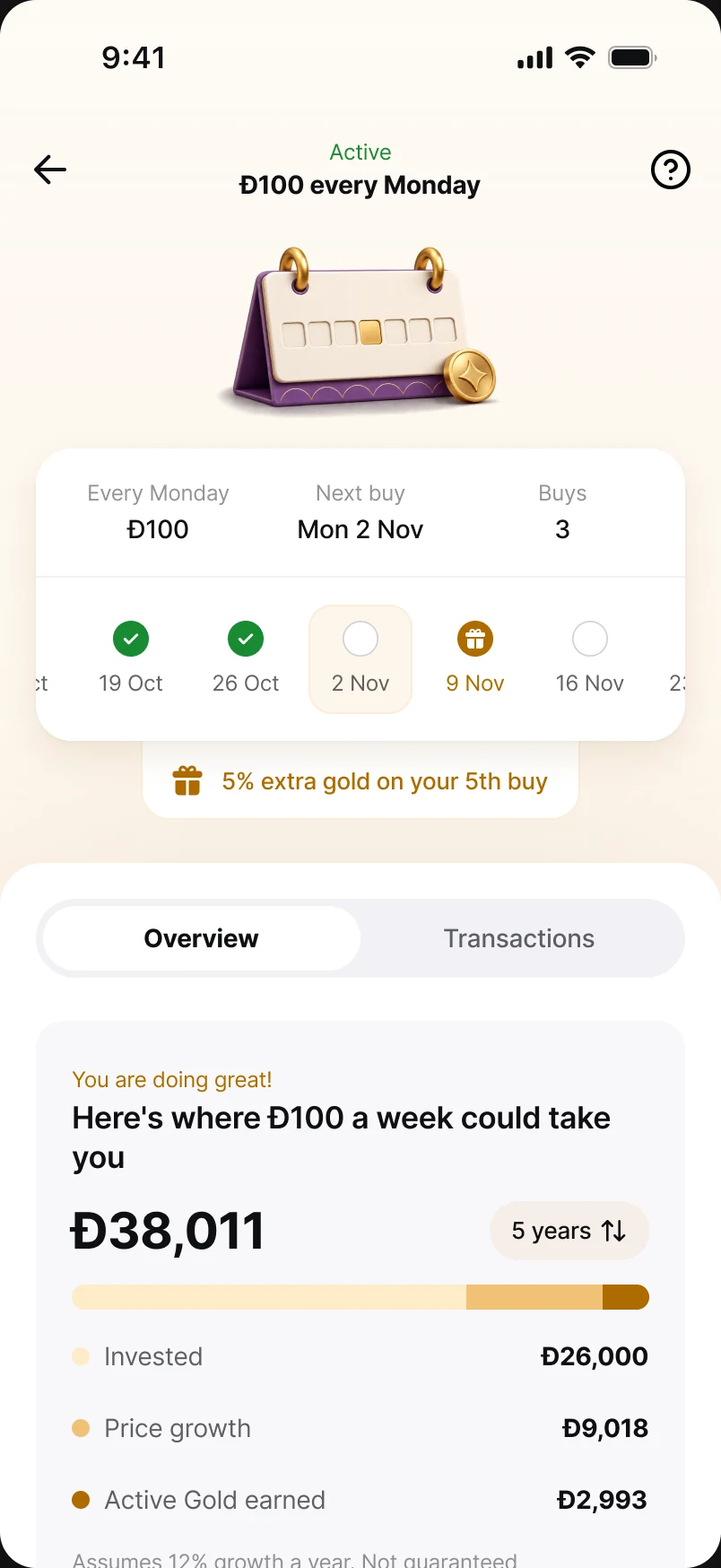
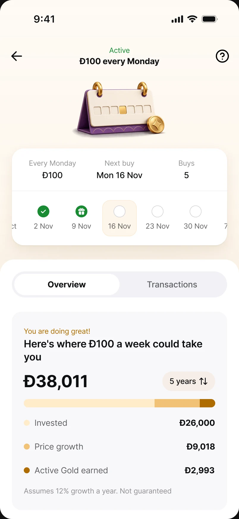
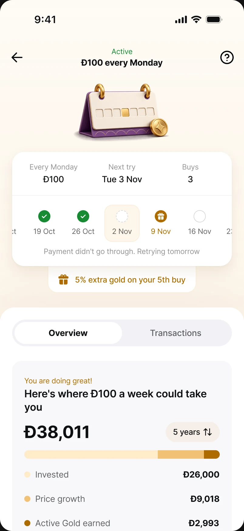
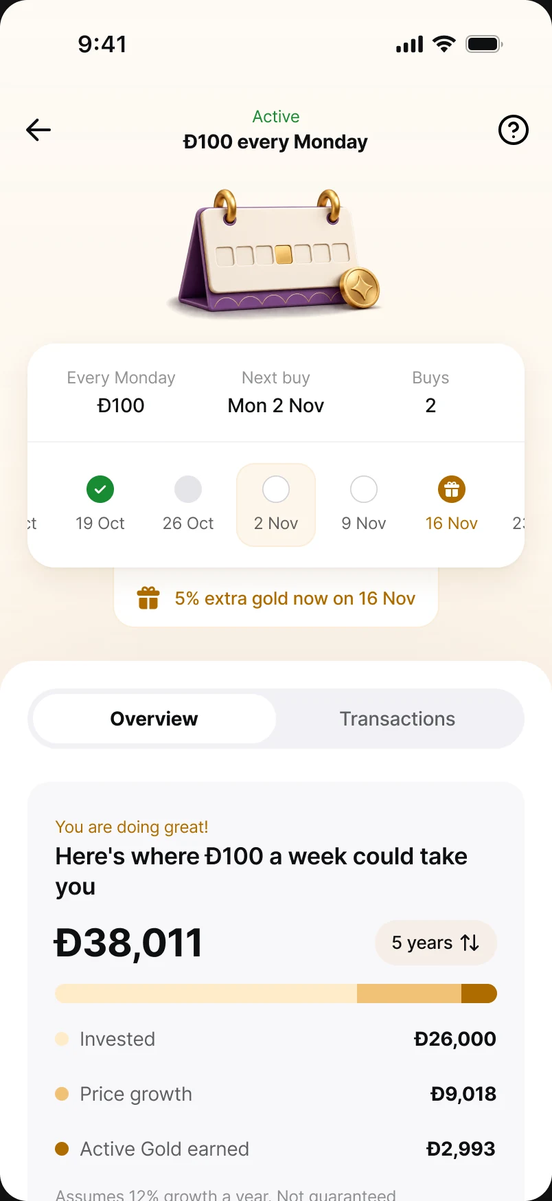
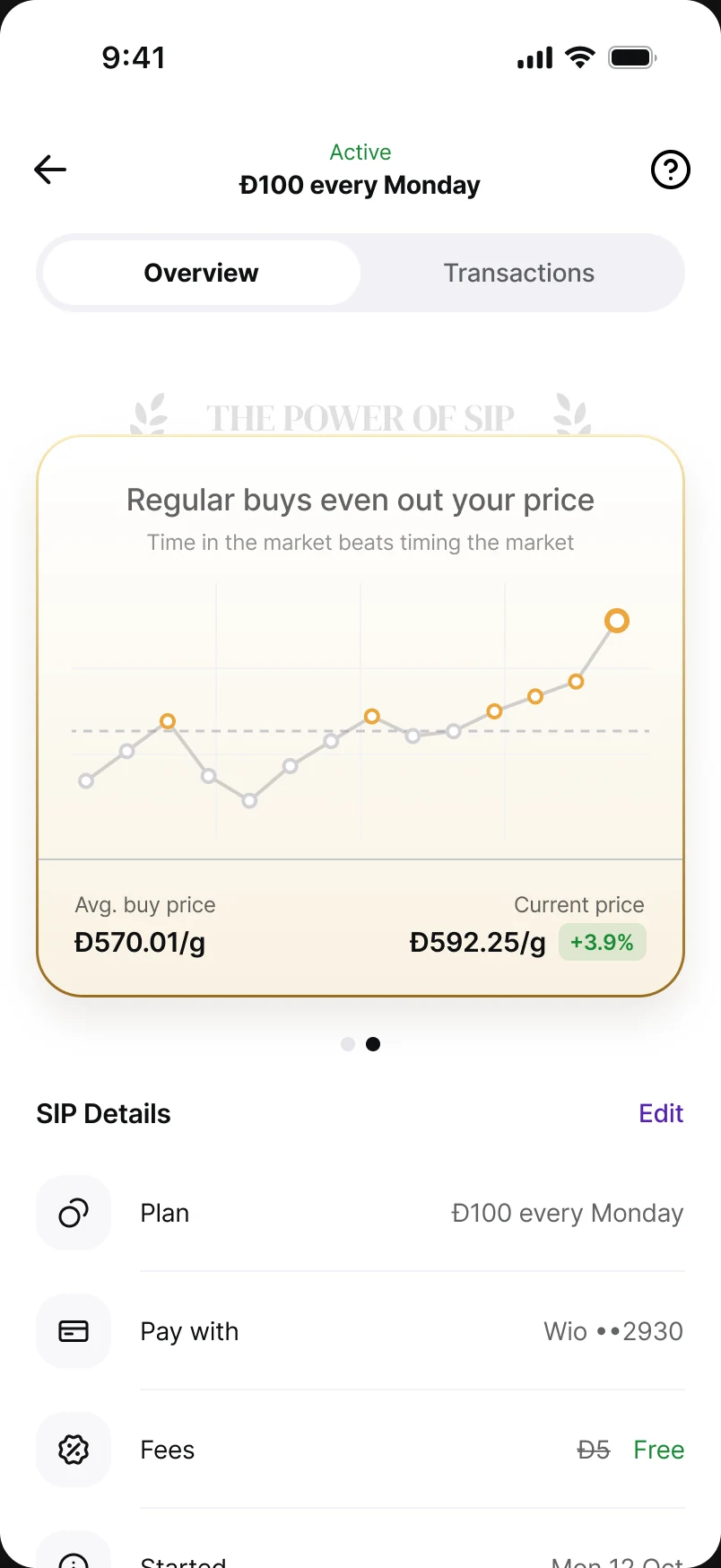
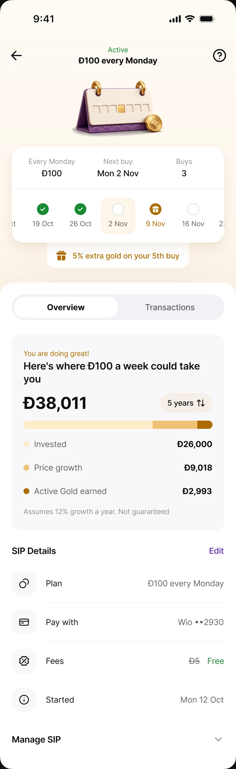
The SIP detail page is built around a tracker — a swipeable strip of dates, each a past buy, today or a future buy, with the next reward pinned to its date. It has honest states for every situation: starting, building, gift next, gift earned, retrying, missed, skipped, cap reached, stopped. Below it, a carousel argues for the habit: where Đ100 a week could take you, and your average buy price against today's.
Sell: the same calm, in reverse
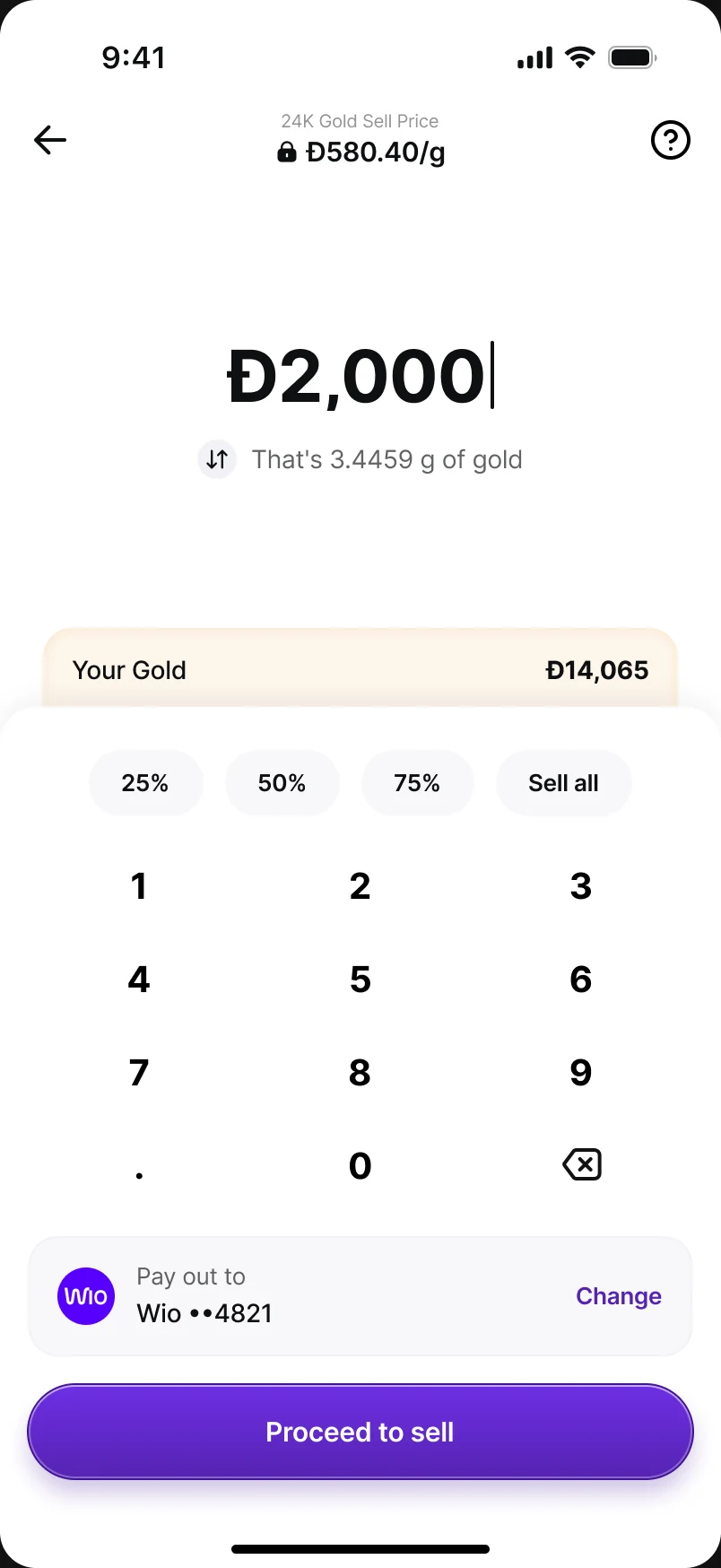
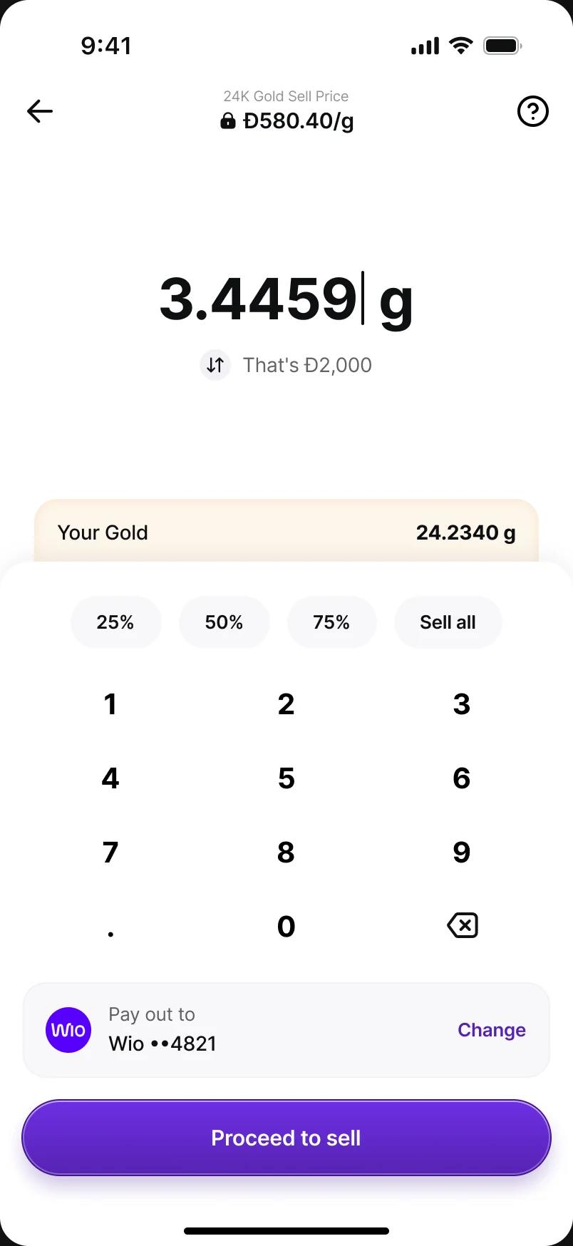
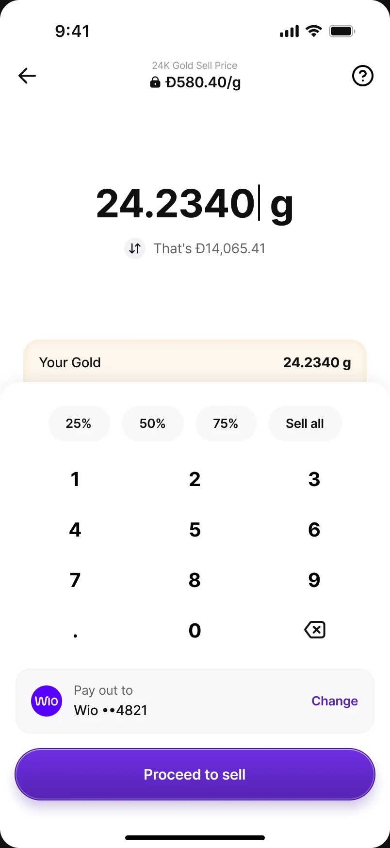
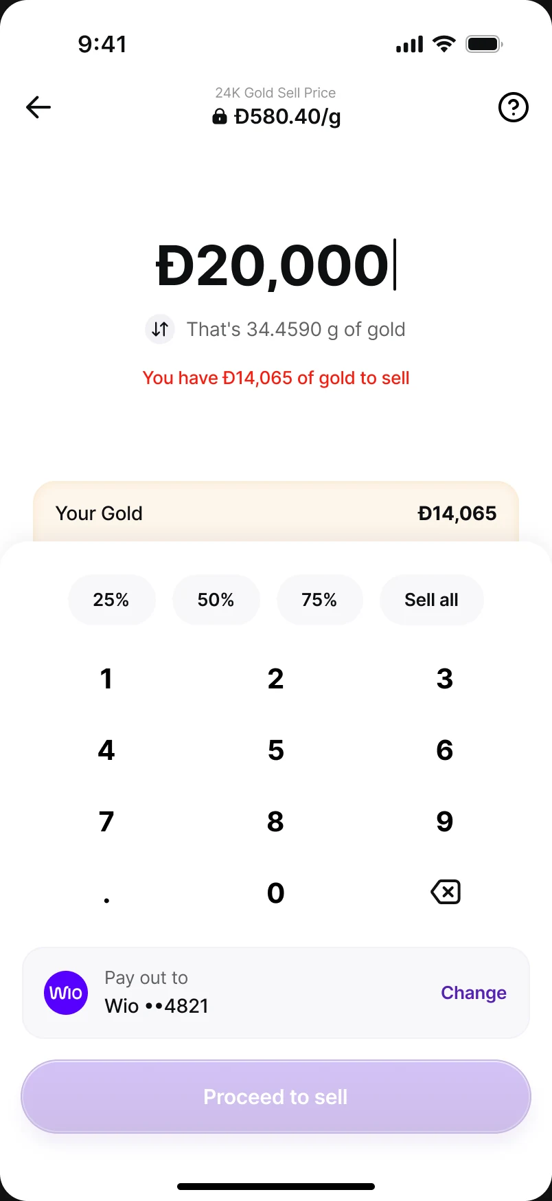
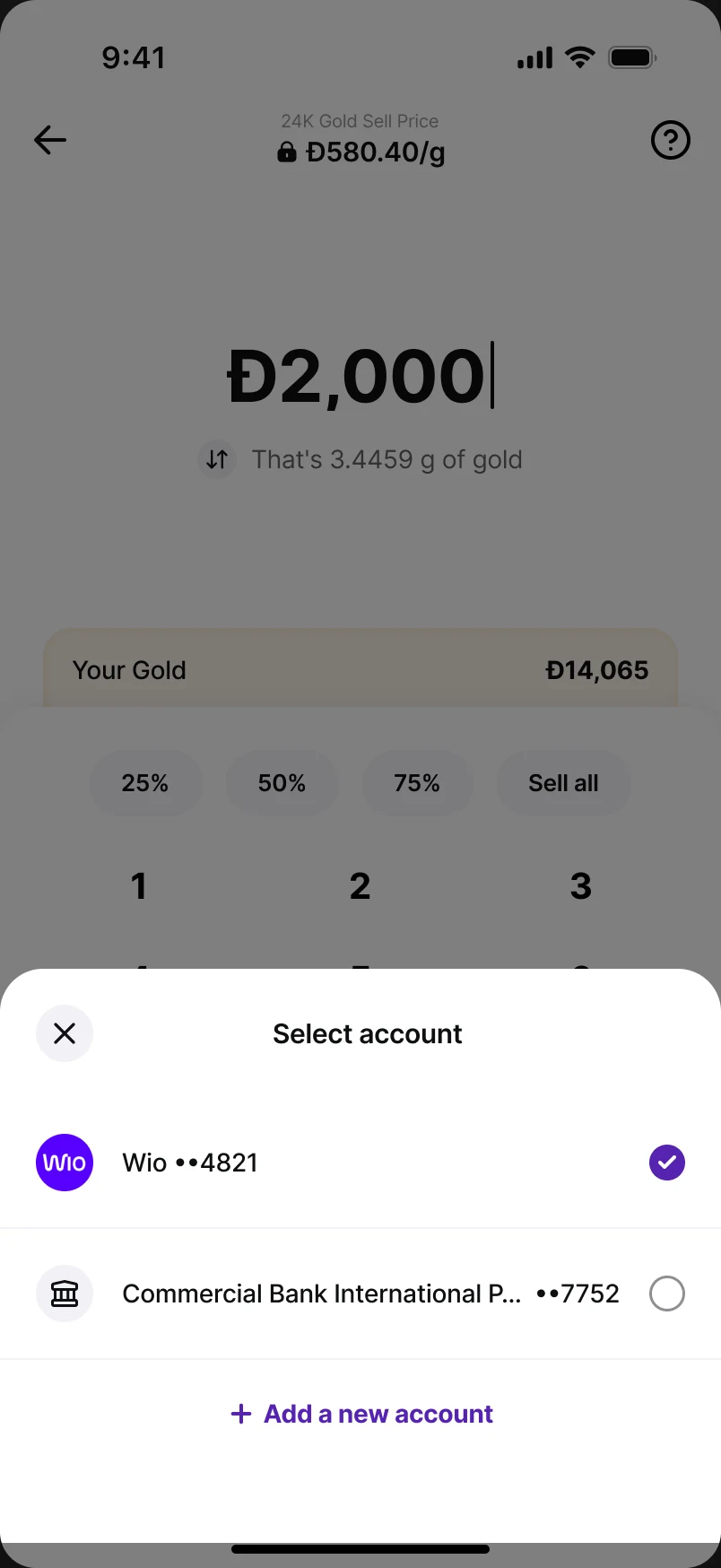
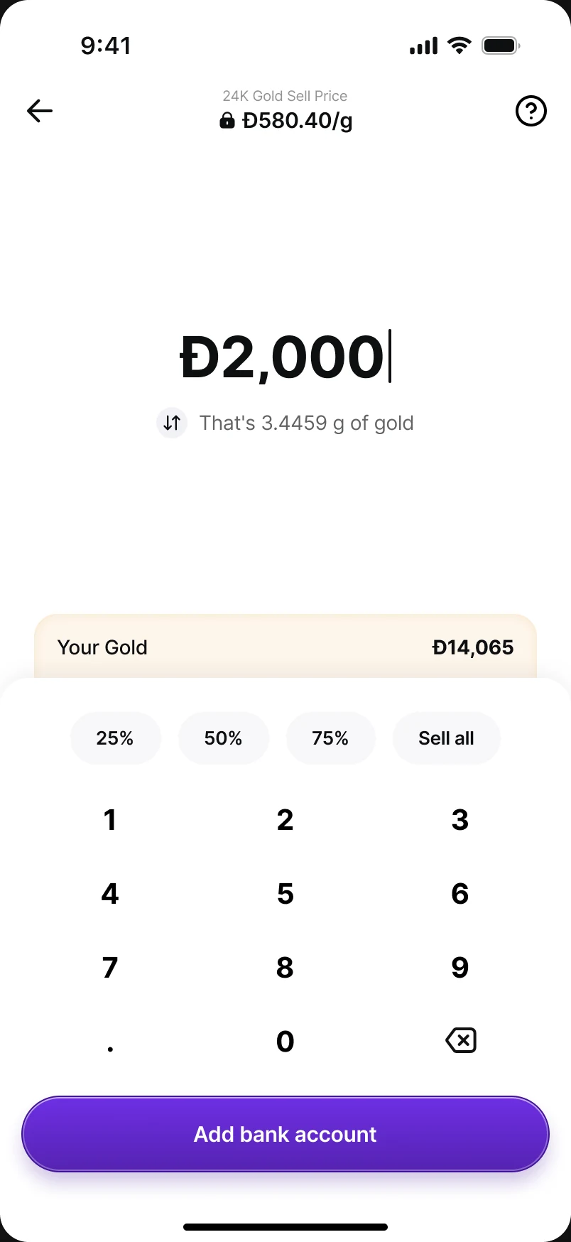
Selling got the same grammar as buying, so nothing has to be relearned: one page, the locked sell price at the top, your holding under the amount, and quick picks for 25%, 50%, 75% or all of it. You can sell by amount or by weight; ask for more than you own and the page says so before you can continue.
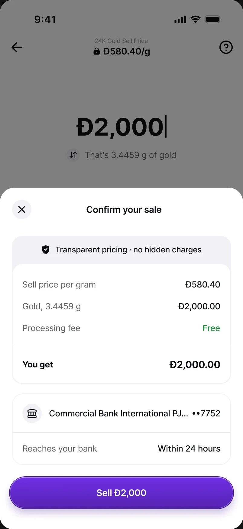
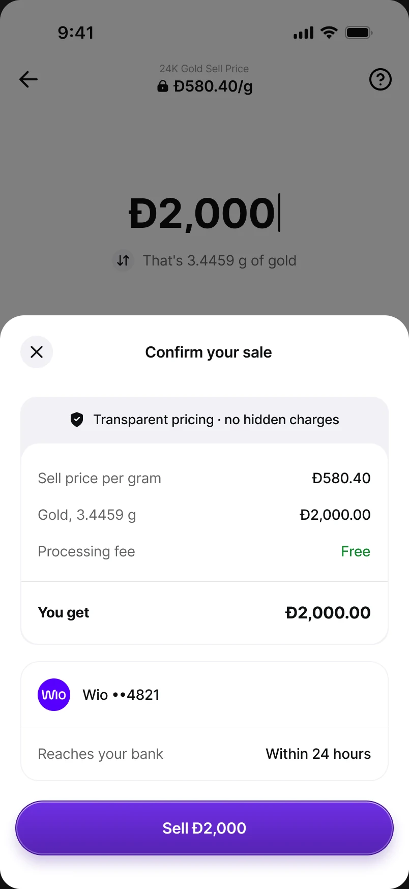
The confirm sheet is transparent about what you get — sell price per gram, grams, processing fee and the amount that reaches your bank within 24 hours. When you're selling below your average buy price, it says so plainly instead of hiding it. First-time sellers without a bank account are asked to add one before they can sell, not after.
The unglamorous half
One certificate, every screen height
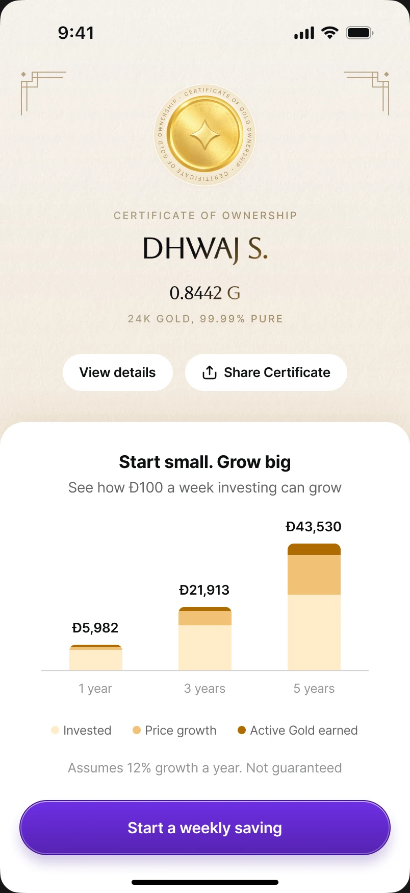
The certificate is the emotional payoff of the first buy, and many of our users are on older, smaller phones. Rather than let it scroll or crop, the layout adapts to the height available. On a 874 pt screen it shows in full, with the large seal, name, grams and purity above the “Start small. Grow big” projection. At 812 pt the seal shrinks and the spacing tightens, so the projection still starts in the first view. Never removed: the name, the grams, the purity line, and the View details and Share actions.
Limits without dead ends
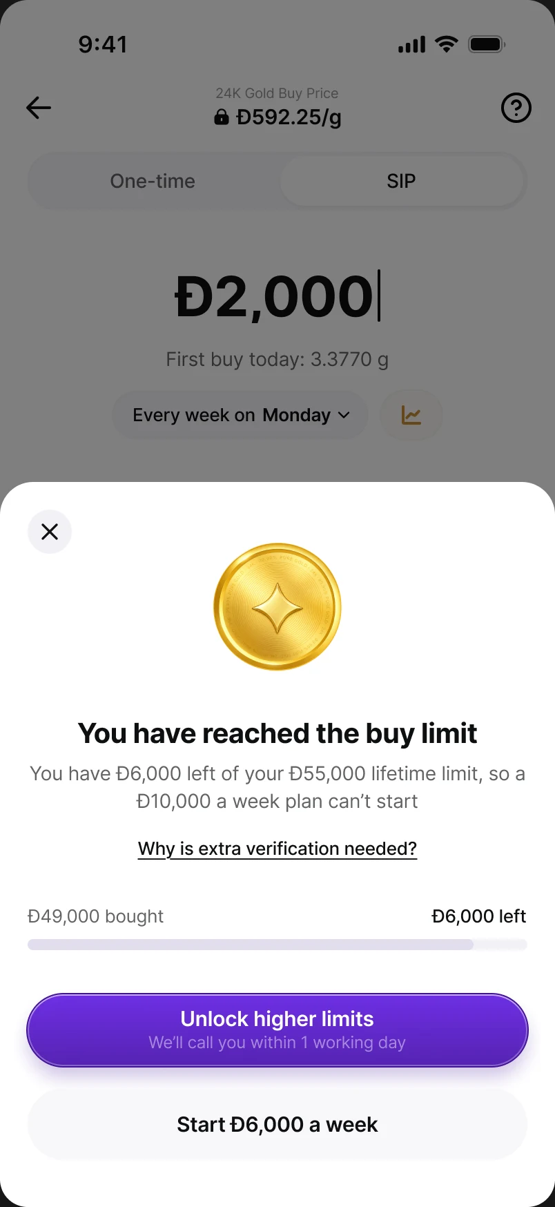
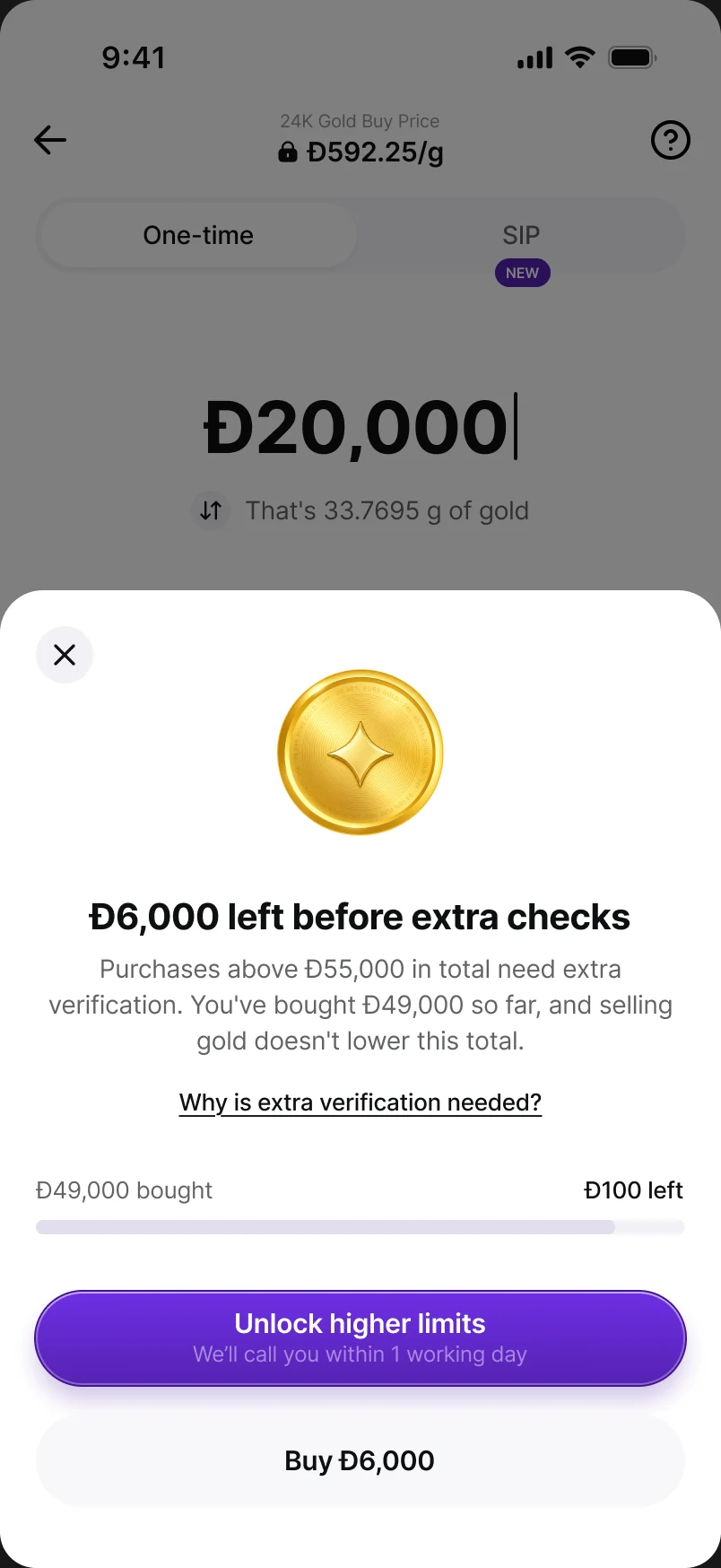
UAE gold has a Đ55,000 lifetime buy limit before extra verification. Instead of failing at payment, the page explains it in context — what you've bought, what's left, and what to do: buy what's left now, or unlock higher limits with a call-back within a working day. A weekly plan that will hit the limit only warns when three or fewer buys remain, so nobody is nagged a year in advance.
A system, not a set of screens
- Components with every state. Price title, frequency tabs, schedule line, keypad, payment row, leasing and offer strips, sheets and certificate parts — built once; screens use only instances.
- Motion with timing tables. Every animation plays once, sits beside its flow with a timing table, and cross-fades under Reduce Motion.
- Specs that answer questions. Screen-reader order, number formatting (grams rounded down so we never show more gold than was bought), and analytics events with a shared prefix.
Impact
We anchored success to the numbers the business already lived by, drawn straight from the PRD.
| Metric | Baseline | Target |
|---|---|---|
| SIP funnel conversion | ~3% | 7% in 3 months |
| M1 retention (UAE) | ~30% | 60% · ~80% SIP |
| M+3 SIP retention | 17% | 60% |
| Sell-to-buy ratio | 76% | < 40% |
| SIPs signed up | 0 | ~3,500 in 3 months |
| Recurring inflow | 0 | ~Đ350k / month |
Takeaways
- Competitors show you screens, not strategy — copying feature sets gave us density; asking what each app anchors on gave us direction.
- Black and white first saves weeks — grey-box reviews moved the debate from styling to structure.
- Recurring products are won after setup — the tracker, the ledger and the exit mattered as much as the buy page.
- Honesty is a growth feature — not thanking people before charging them, and saying returns aren't guaranteed, built the trust a weekly mandate needs.
- Cutting scope is a design decision — parking step-up and pause let us ship sooner, with fewer ways for the product to lie.
What I'd do differently
- Settle the offer model with the PM before designing reward UI — we redesigned reward surfaces three times as the maths changed.
- Put the dense decision screen in front of real users in week two, not week six.
- Agree the leasing vocabulary once, across product, marketing and legal, and enforce it in the component library.
What's next
- Turn on the parked levers: pause, skip, step-up and card change.
- Ship the Gold SIP Album and the comeback reward once the central reward engine lands.
- The same engine for silver, then equities.