Overview
ImpactCraft is a customer success platform for teams managing dozens of accounts at once. The Priorities page is the team's daily home — the first screen everyone opens each morning.
“Everyone” is where it got hard: one screen had to serve an entire hierarchy at once — individual CSMs, senior CSMs, managers and executives — each of whom cares about very different things. Rather than guess how to solve that, we started with research.
Where it started — one dump for everyone
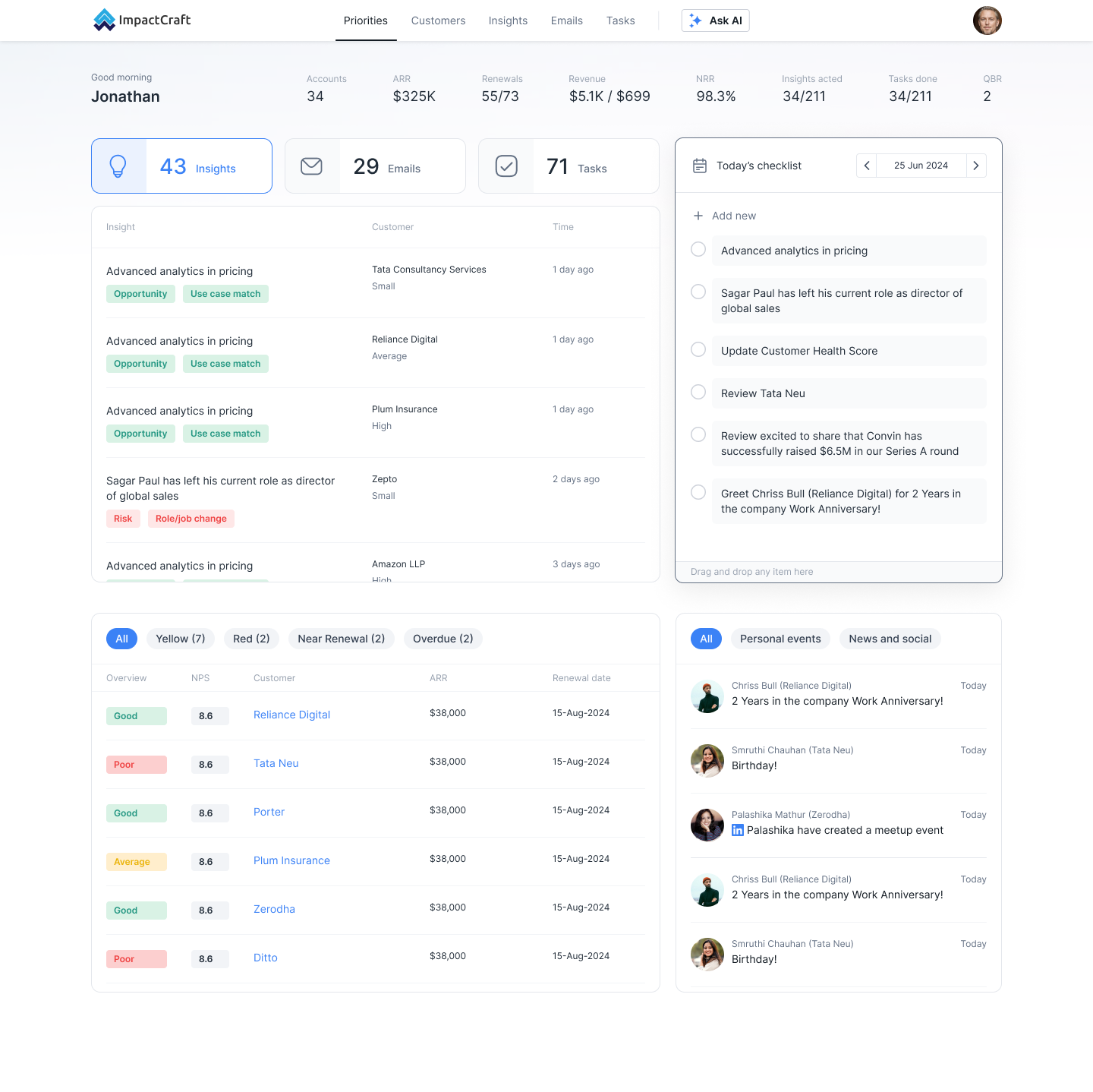
The first version tried to show everything: a wide metric strip, an insights table, today's checklist, a customer-health table and a live events feed. It handed the same undifferentiated information to every role.
Nothing was segmented by category or relevance, so there was no obvious starting point — just a lot to scan and interpret. A format that tried to satisfy everyone ended up serving no one particularly well. The research would later put a name to what that felt like.
The research
This redesign was led by fieldwork, not assumption. We ran interviews and workflow shadowing with an enterprise customer-success team, mapping their entire day — from the sales handover through requirement gathering, documentation, implementation, testing and go-live, into hypercare and the eventual handover to account managers. At each stage we captured the tools in play and, crucially, the emotion the CSM felt.
Method: role and responsibility mapping, KPI review (time-to-go-live, adoption rate, change-request resolution, CSAT in hypercare), a stage-by-stage workflow audit with mediums and emotions, and a pains-vs-opportunities synthesis.
The emotional journey
Plotting emotion across the workflow made the problem impossible to ignore. The day is a long climb through friction that only releases right at the end — and then resets to overwhelm the moment they look across all their accounts.
Sales handoverNeutral
Requirement gatheringFrustration
**Documentation (BRD)**Overload
Scope sign-offStress
Custom buildsUncertainty
Internal collaborationOverload
Testing & go-liveAnxiety
HypercareRelief
Tracking many accountsOverwhelm
What we heard, again and again
Five findings surfaced across every conversation:
- Overwhelm from breadth. CSMs manage many clients at different phases and track them across scattered tools — the most-named feeling in the study.
- Blind spots surface late. Missed cases became change requests and timeline slips; problems were caught too far downstream.
- Everything is scattered. Context lived across separate systems, so nothing important was in one place.
- Low control, high interpretation. Clients were often vague or unresponsive — “you figure it out” — leaving the CSM to carry the load.
- Relevance is role-specific. Leadership wanted risks, updates and the high-level read; the people doing the work wanted the concrete next action.
Three directions we explored
With the findings as the brief, we built three genuinely different directions and tested each against them.
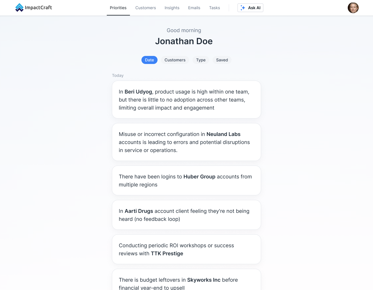
Direction 1 — one calm stream
Strip everything to a single simplified insight feed. It answered “reduce the noise,” but over-corrected: with no value, no action and no role relevance, every insight looked equally (un)important.
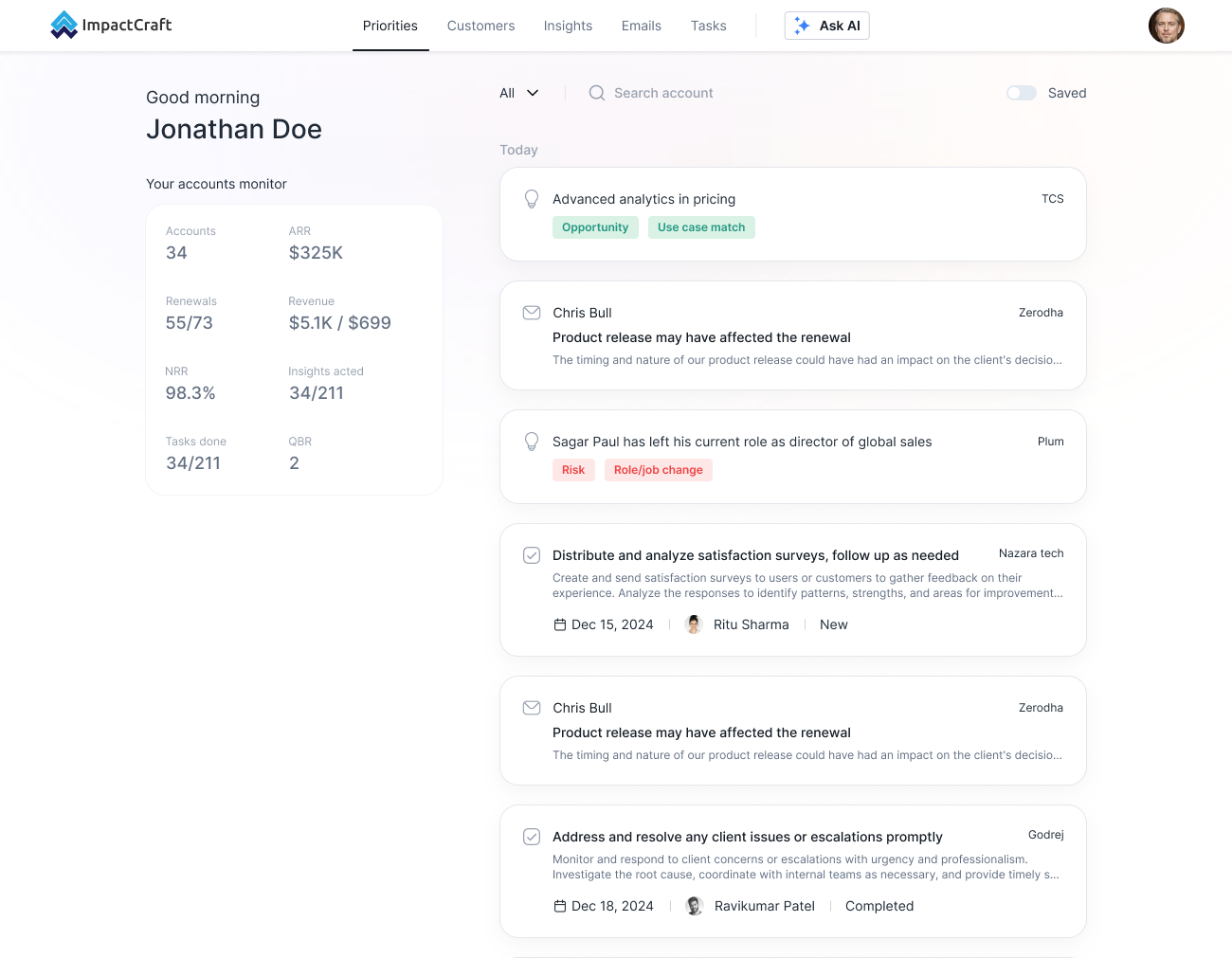
Direction 2 — a personal monitor + activity
A compact “accounts monitor” for the numbers beside a categorised activity feed. This answered the “scattered tools” finding — but signal types still mixed into one stream.
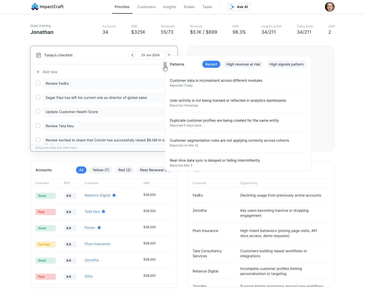
Direction 3 — patterns and signals
Group the raw dump into clusters — signal patterns, high-revenue-at-risk, opportunities and risks — directly answering the “blind spots surface late” and “overwhelm” findings by letting people scan categories, not rows.
The direction we landed on
No single direction satisfied every finding. The final design was a deliberate blend of two — the category and signal segmentation of Direction 3 with the ranked, action-first structure of Direction 2 — which became the priority feed.
It gives every role a version of the same screen: leadership can stay on risks, updates and patterns; a CSM can drop into just their tasks; and everyone sees information segmented by category, ranked by relevance and value, and light enough to read without the mental tax the research had flagged.
The final design — a priority feed
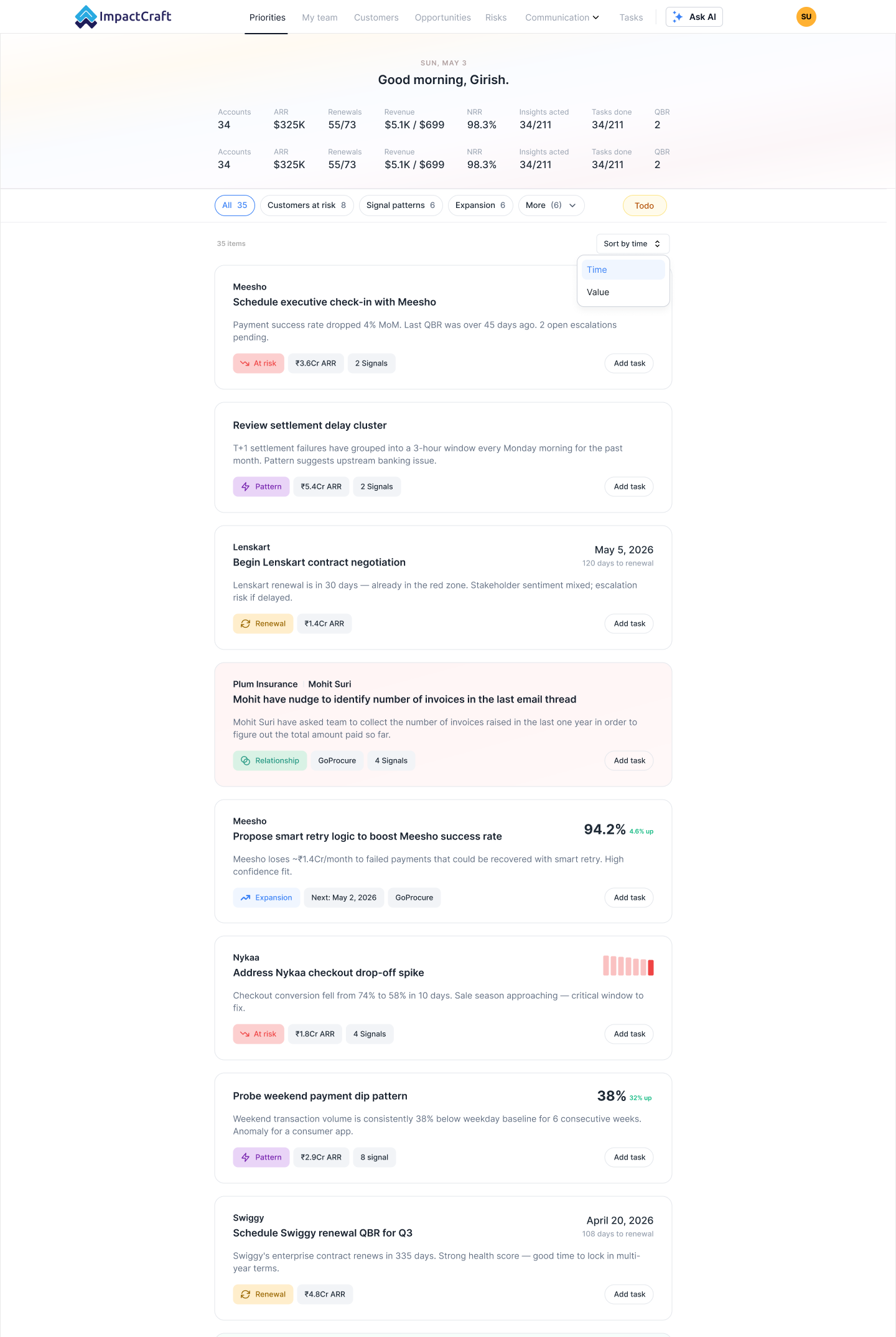
Every item is now a decision card, not a data point — and each choice maps back to a finding:
- Leads with the action — answering the “low control, high interpretation” pain: “Schedule executive check-in with Meesho,” not just “payment success dropped.”
- Typed by signal — At risk, Pattern, Renewal, Relationship or Expansion, so problems surface early instead of late.
- Ranked by value at stake — ARR on every card, sortable by time or value, so overwhelm becomes an ordered list.
- Shows its evidence — a signal count tells the CSM how much is feeding each recommendation.
- Personalised by filters — Customers at risk, Signal patterns, Expansion and more, so each role gets a relevant screen.
- One tap to act — “Add task” turns a priority into work without leaving the page.
Notably, the research also told us what not to touch: the integrations, tracking and BRD-drafting the team already relied on were working well, so the redesign preserved them and moved reporting-style depth into dedicated tabs.
From findings to design
We translated the research directly into the product — each pain answered by a specific decision:
What we heardWhat we built
CSMs juggle many accounts at different stages, tracked across three or four separate tools. The word they used most was overwhelm.
A single priority feed that ranks accounts and actions, so the day opens on what matters — not a scan.
Blind spots surfaced late and turned into change requests and delays.
Signal-typed cards (At risk, Pattern) surface problems early, with the evidence attached.
Information lived in scattered tools; nothing important was in one place.
The key context is pulled onto the Priorities page itself — no digging.
Leadership and the people doing the work wanted very different things from the same screen.
Filters and views let each role slice the same feed down to their own relevance.
High cognitive load — clients were often vague, so the CSM carried the interpretation.
Every card leads with a clear recommended action and a one-tap way to act on it.
How we aligned
Because the direction came out of research, internal debates resolved into shared principles rather than opinions: the page optimises for the next action; information is segmented by category and role-relevance; and control is offered through filters and views, not a blank canvas. When a call was contested, we went back to a finding.
The verdict: the priority feed became the default Priorities view, reporting-style depth moved into dedicated tabs, and the team committed to one shared success metric — insights acted on per session.
Impact
We anchored success to the metrics this team already lived by, drawn straight from the research: time-to-go-live, adoption rate, change-request resolution time, and CSAT in hypercare. The busiest screen in the product went from something every role had to interpret to one each role could act on immediately.
Takeaways
- Let research name the problem — “overwhelm” wasn't a guess, it was the word users kept using.
- One screen, many roles — design for relevance, not just density.
- Segment the dump — raw events become useful once grouped into categories and signals.
- Surface problems early — the design's job was to move blind spots upstream.
- The best direction was a blend — the strongest solution combined two explorations, each validated against the findings.